Darlene created RFA In 2013 with the goal of sharing simple yet detailed drawing tutorials with other artists on the world wide web. She is a self taught pencil portrait artist and Youtuber.
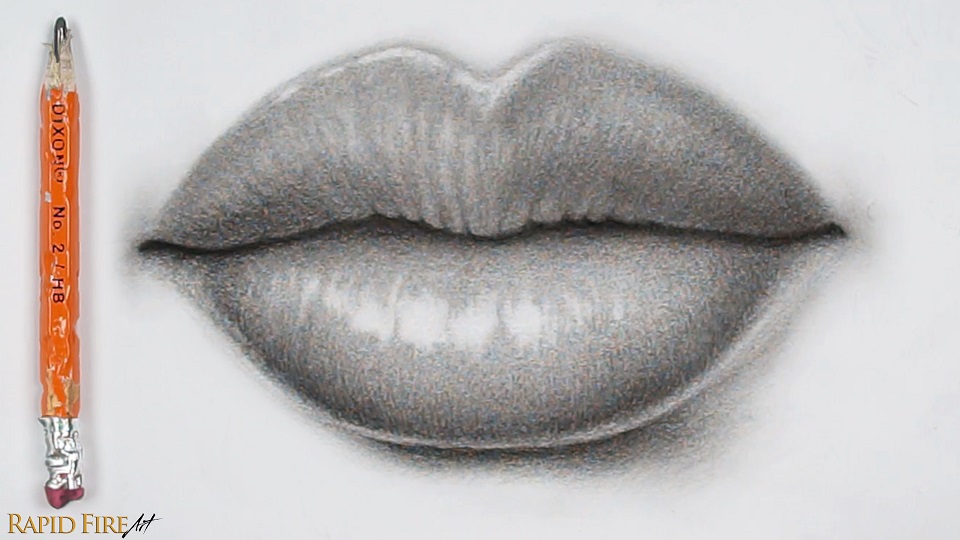
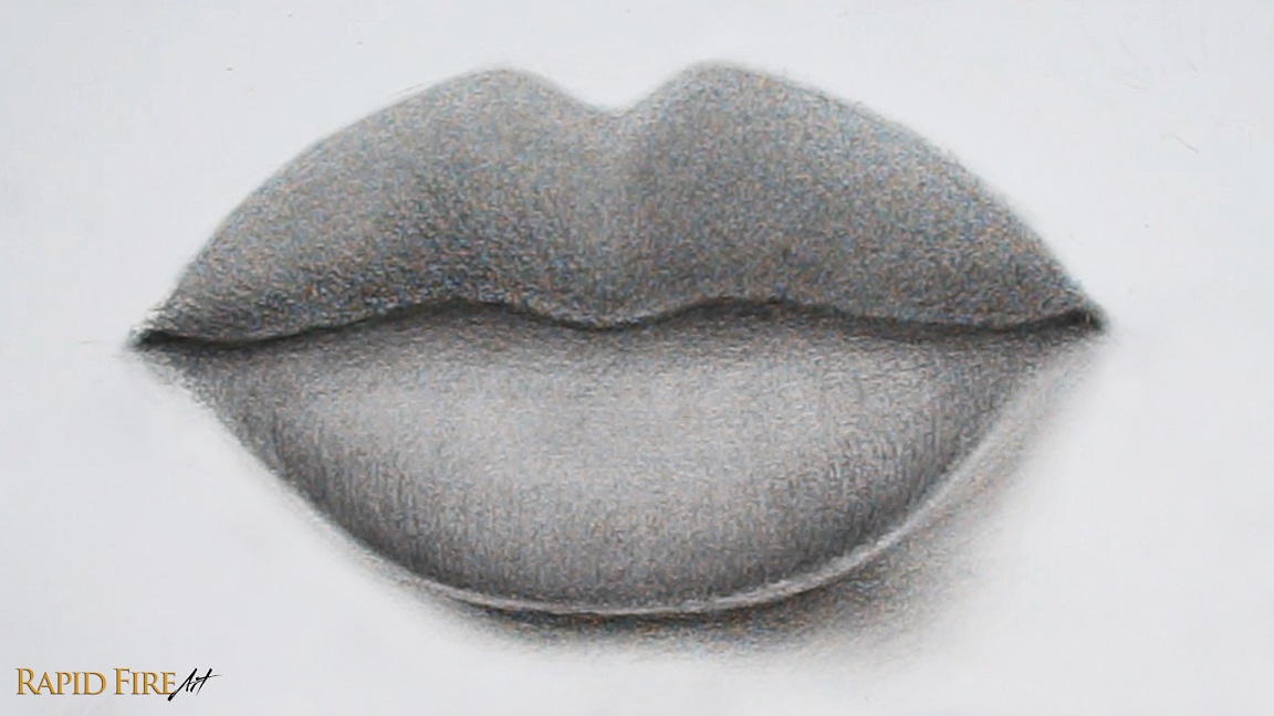
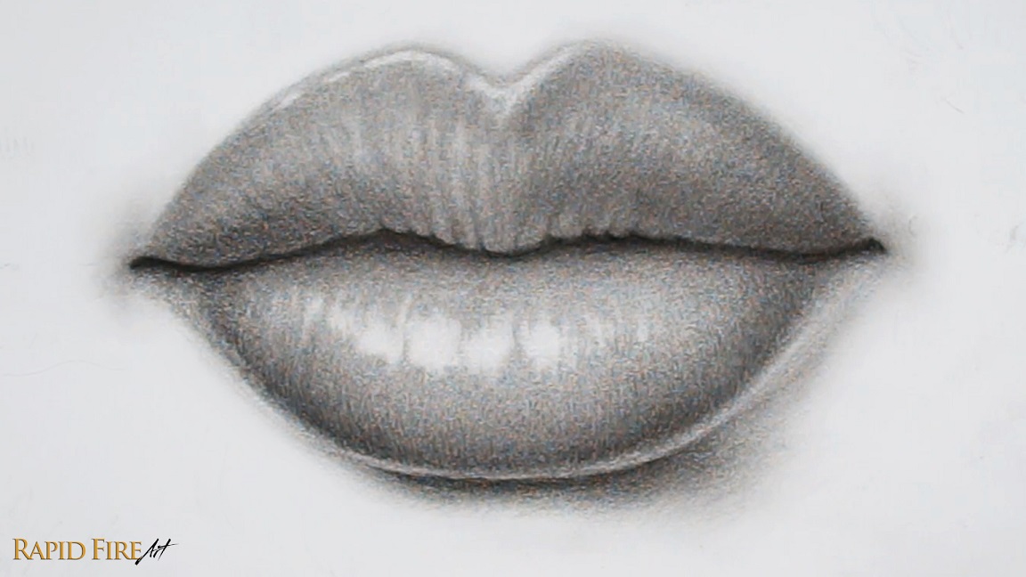
In this tutorial, I’ll be using a cheap HB pencil from the dollar store and a regular facial tissue to draw a pair of plump, realistic lips. This tutorial is adapted from my video instruction on Youtube and further simplified.
Tools:
Cheap Dixon dollar store HB pencil with eraser on the end
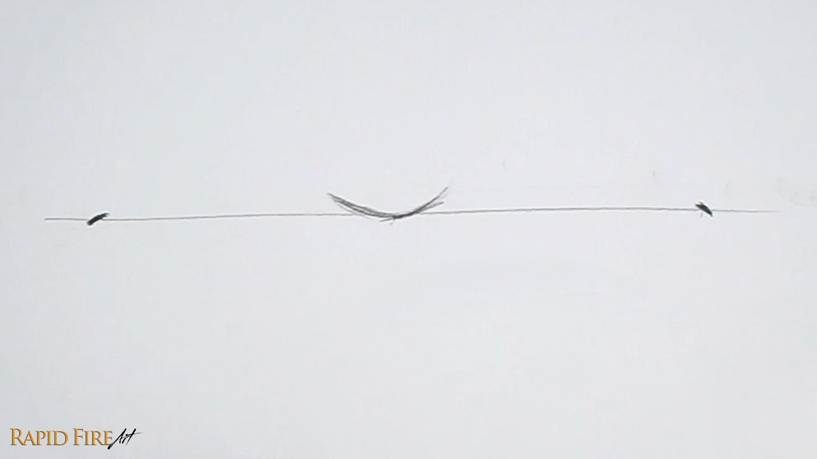
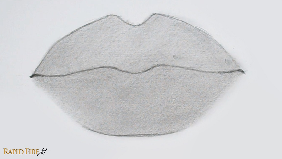
Start by drawing a long horizontal line across your page. In the middle, draw a shallow “U” shape. On each side, draw the corners of the mouth using little tick marks. Make sure they are spaced evenly apart.
Note: My line is approximately 18cm wide, in case you want to match it.
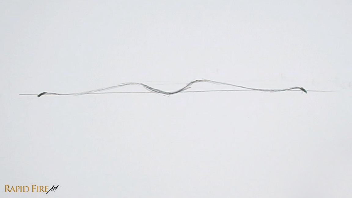
Now connect the shallow “U” and tick marks together using a wavy line. Once done, erase the horizontal line.
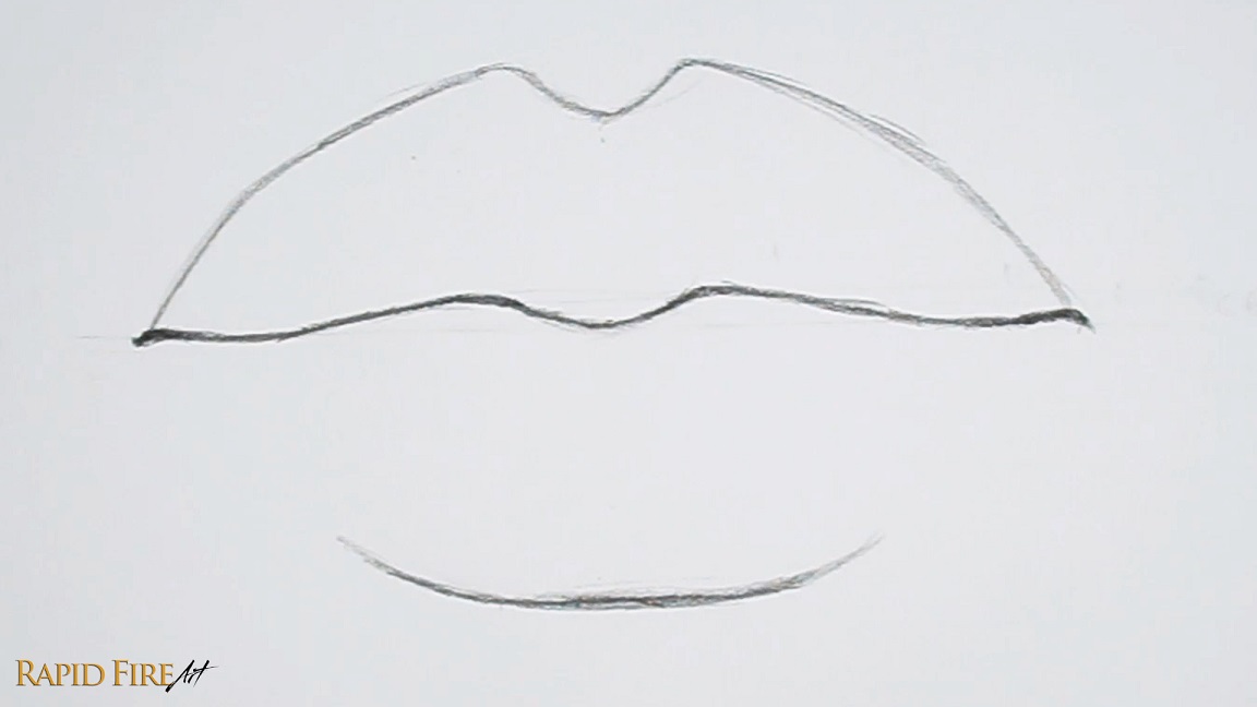
Draw the top and bottom lip. If you want to draw your lips narrower, you can reduce the vertical space.
Step 2: Shade Lip Base Layer
Sharpen your pencil to expose as much graphite as possible. Then use the side of your graphite to shade thick strokes across both lips. Just focus on shading a solid, medium tone. Keep your pencil strokes close together to reduce gaps and achieve a smooth shade.
Tip: Holding your pencil with an overhand grip versus a writing grip will help you achieve thicker strokes. Visit my shading tutorial to learn more.
Then blend using any tool of your choice. I’m using a regular facial tissue wrapped around the padded part of my index finger.
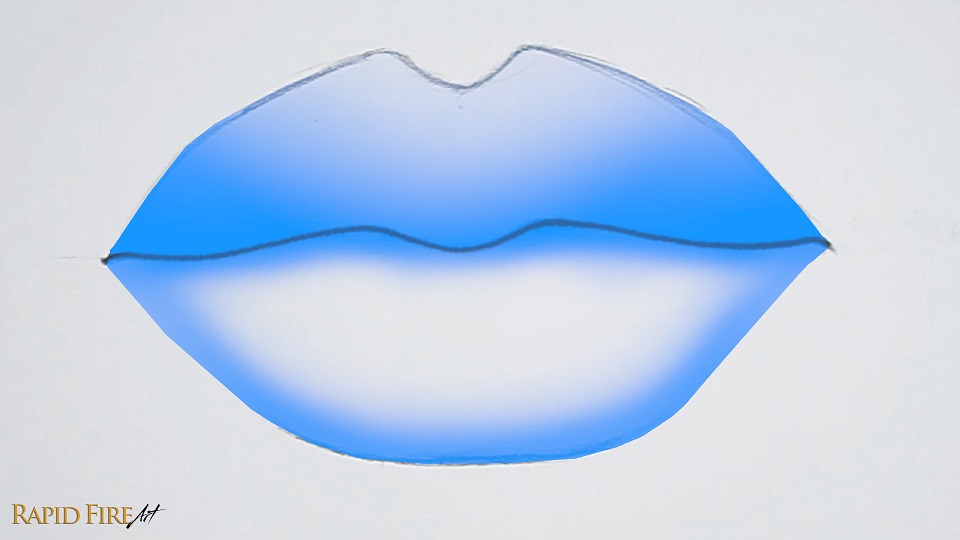
Step 3: Add Shadows
My imaginary light source is shining down from the top left. So I will shade the areas highlighted in blue a little bit darker to give the lips some shape. We will be shading them even more later.
Blend again. Make sure to blend from light to dark to avoid smudging your work.
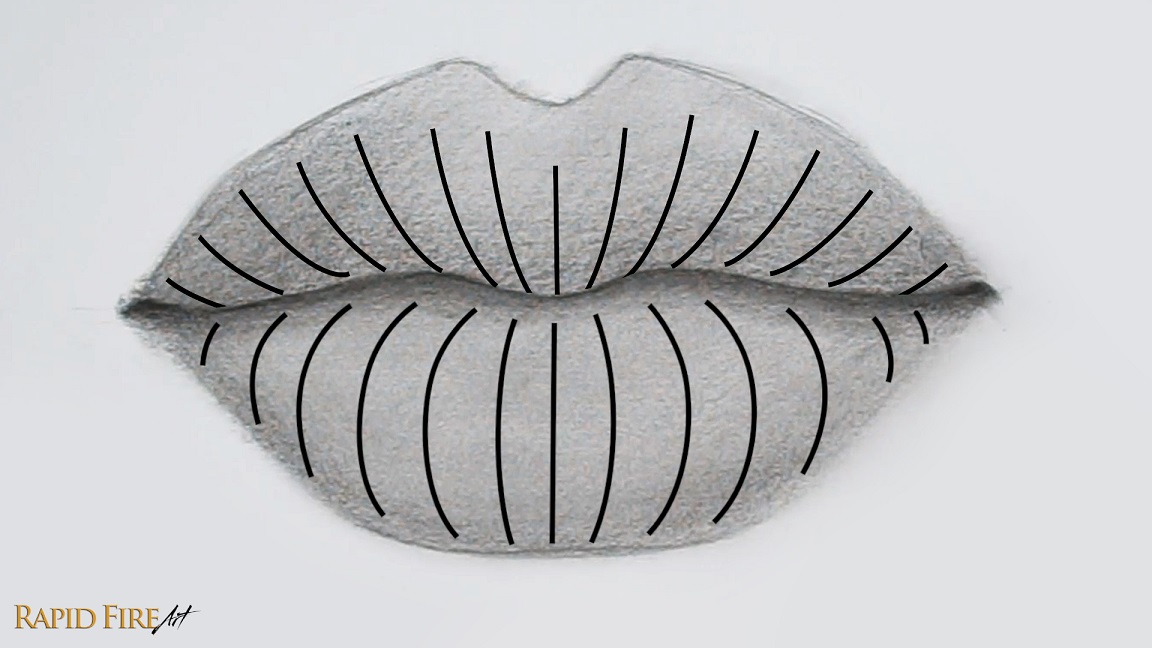
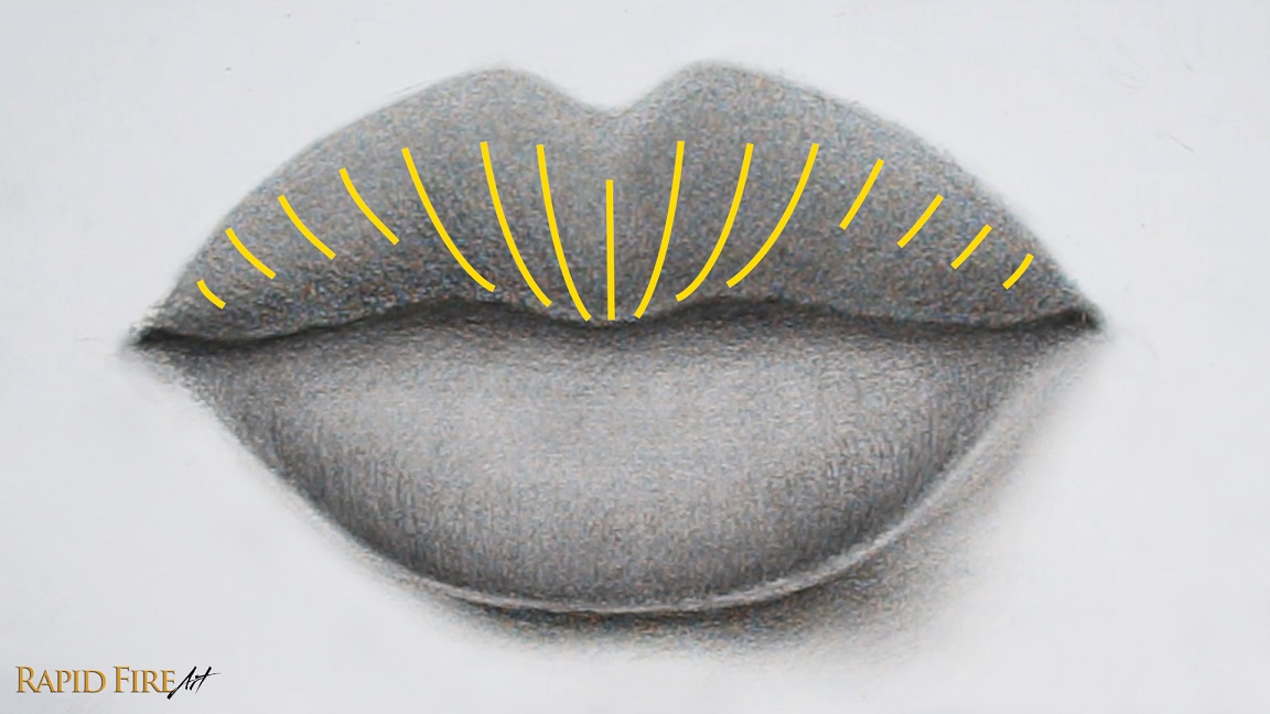
Step 4: Draw Lip Wrinkles
Let’s draw some lip wrinkles along the bottom of each lip to add some realistic texture to our drawing.
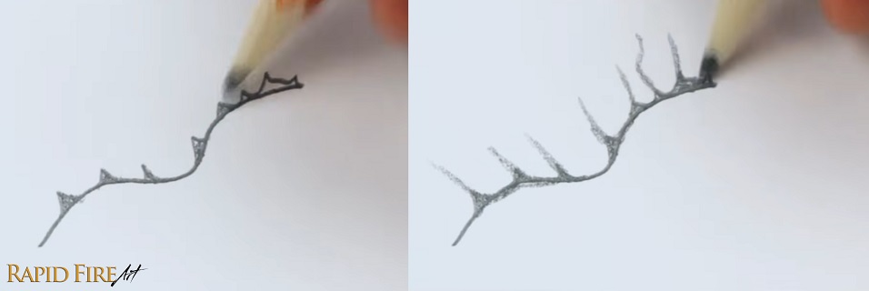
The image above is a reference to help you see the contour of the lips. If you draw wrinkles using curved strokes like this, it will help support the illusion of plump lips. For this drawing, let’s mostly draw wrinkles along the bottom of each lip. Leave a tiny bit of space along the very bottom of each lip to account for reflected light.
To draw wrinkles, use the tip of your pencil to get thin, clean lines. Vary the height and pressure of each line so the wrinkles can stand out and look natural. You can see an example of my strokes right below the drawing. Even though these marks look scribbly, layering several of them together creates surprisingly realistic wrinkles!
These new pencil strokes should double as shading to further shape the lips. So aim to draw these darker than the shadows you did in step 3. Try your best to fade out as you flick your strokes upward so the transition between light and dark is gradual.
If you want to soften up all these wrinkle textures so they are more subtle, blend your work slightly.
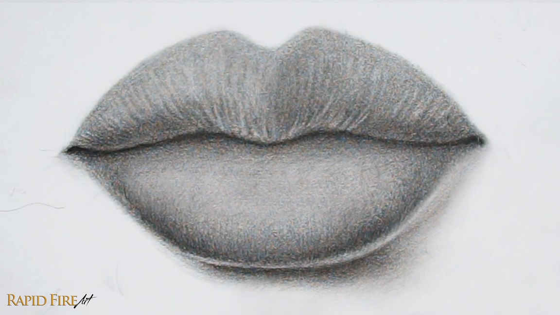
Step 5: Add More Shadows
Add a cast shadow below the bottom lip and blend it very well. Since our light source comes from the top left, the cast shadow will be seen mostly along the bottom right.
Check to see if the outline of your top lip is still visible. If it’s very apparent, lighten it as much as you can and then shade the lip a little darker until it disappears.
Since our light source comes from the top left, the right half of the top lip will be in shadow, so shade it a little darker.
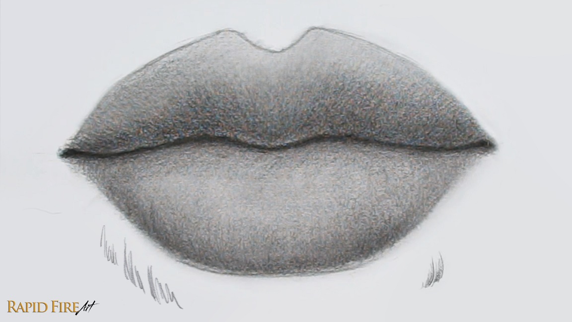
Step 6: Add Lip Wrinkles Using an Eraser
Let’s go along the top lip using our eraser to give it some more shape and texture. I’m going to erase along the areas highlighted in yellow. Curve each stroke to follow the contour of the lip like we did in step 4.
Group your strokes close together and vary the length of each one, trying not to create a noticeable pattern.
Tip: Use your eraser like how you would normally draw, using light pressure to erase subtly and more pressure to erase brighter strokes.
Once done, blend to make the wrinkle lines appear softer and more natural.
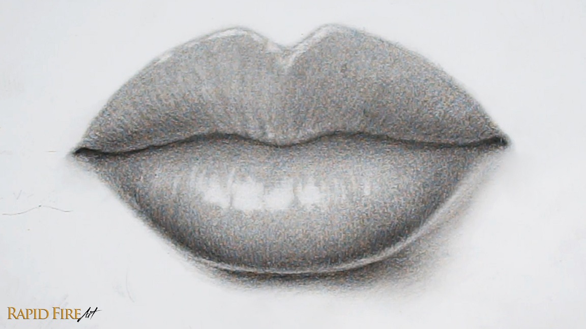
Step 7: Add Highlights
Highlights are the brightest areas of our subject, where the light source hits directly. Since our imaginary light source comes from the top left, we’ll avoid placing highlights along the bottom or right side of the lips.
I’m using an eraser to create these details. Vary your strokes so you have a variety of long, short, wide, and narrow ones. If you want your lips to look glossy, make the highlights more connected.
When making vertical highlights, curve your strokes to follow the contour of the lip (refer to the contour lines from step 4).
Step 8: Additional Details
Optionally, you can make the skin of your top lip appear bunched up.
This can be done by first drawing triangle shapes along the bottom edge, avoiding the sides of the lip. Then, from the top of each triangle, flick your pencil up to create deep wrinkle lines that fade out at the top.
If you already have some prominent wrinkles along your top lip, pick a few and draw your triangles at the base of each.
Between each of these new wrinkles, lighten the skin slightly to make the surface look raised.
A few more tweaks…
If you want to make your drawing pop more, you can increase the contrast by making sure the highlights are as light as you can get them and darken your shadows even more to improve depth.
Around the corners of the lips, shade slightly and then blend well to achieve a very slight dip in the skin. You can blend around the outer edge of both lips to soften them.
I hope this tutorial on how to draw realistic lips using an HB pencil was clear and easy to follow. If you got stuck or need clarification on any steps, please check out the original video tutorial where I walk you through each step and explain things in more detail with additional examples.
Darlene created RFA In 2013 with the goal of sharing simple yet detailed drawing tutorials with other artists on the world wide web. She is a self taught pencil portrait artist and Youtuber.
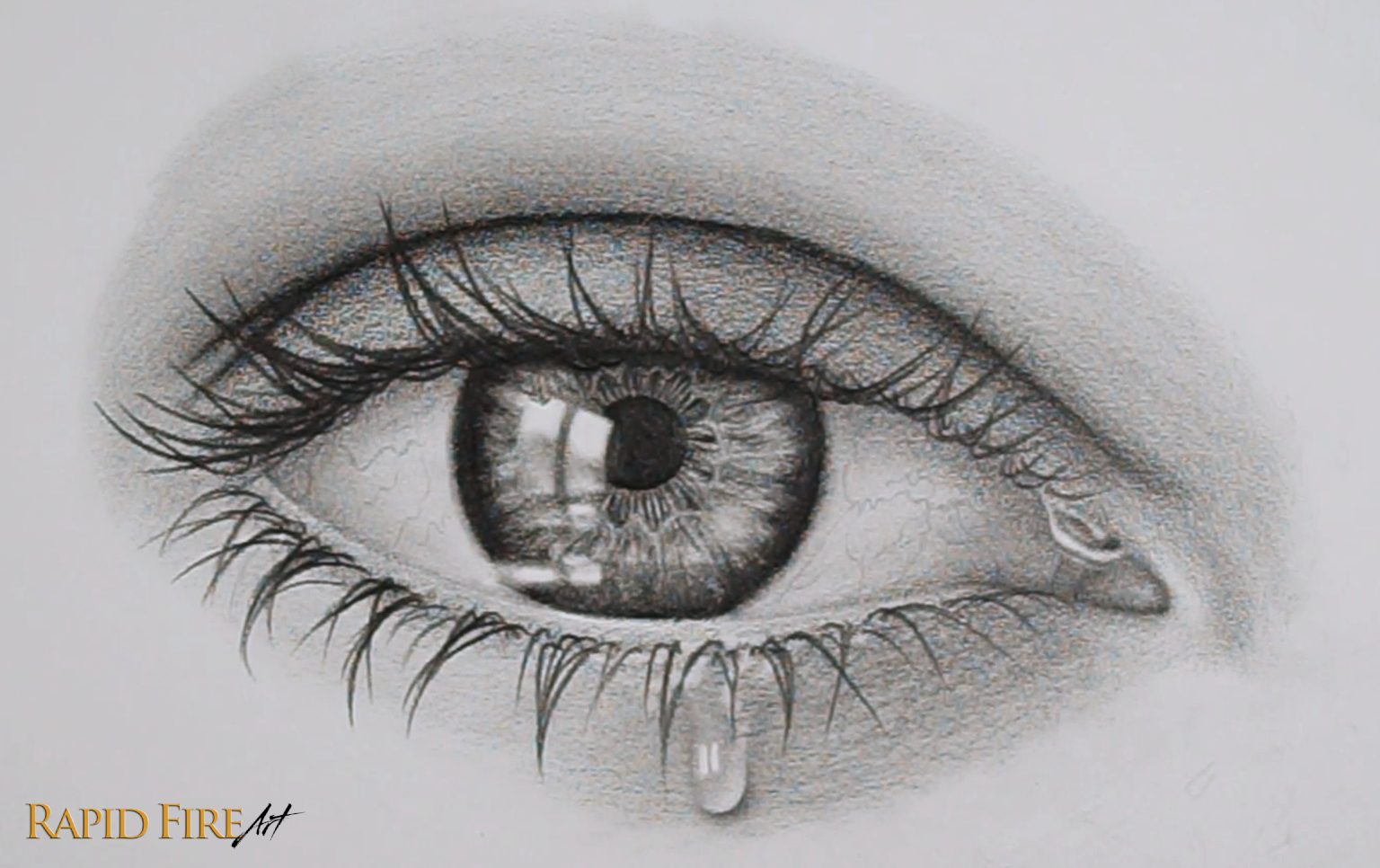
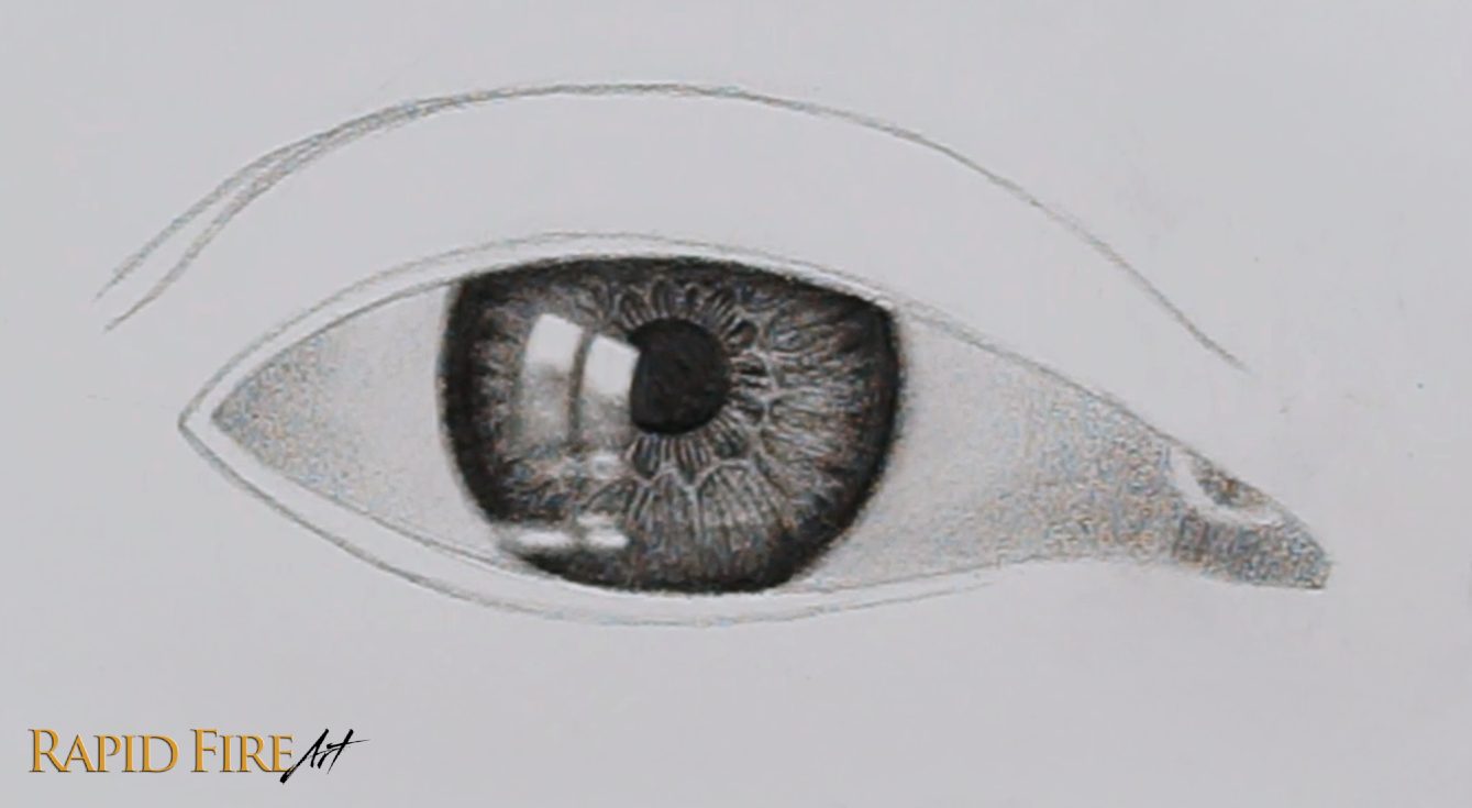
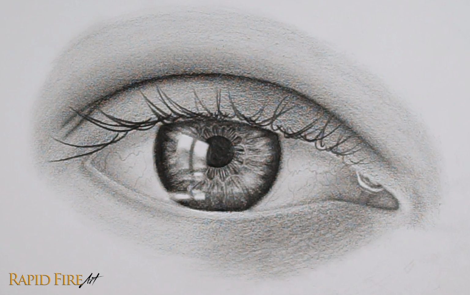
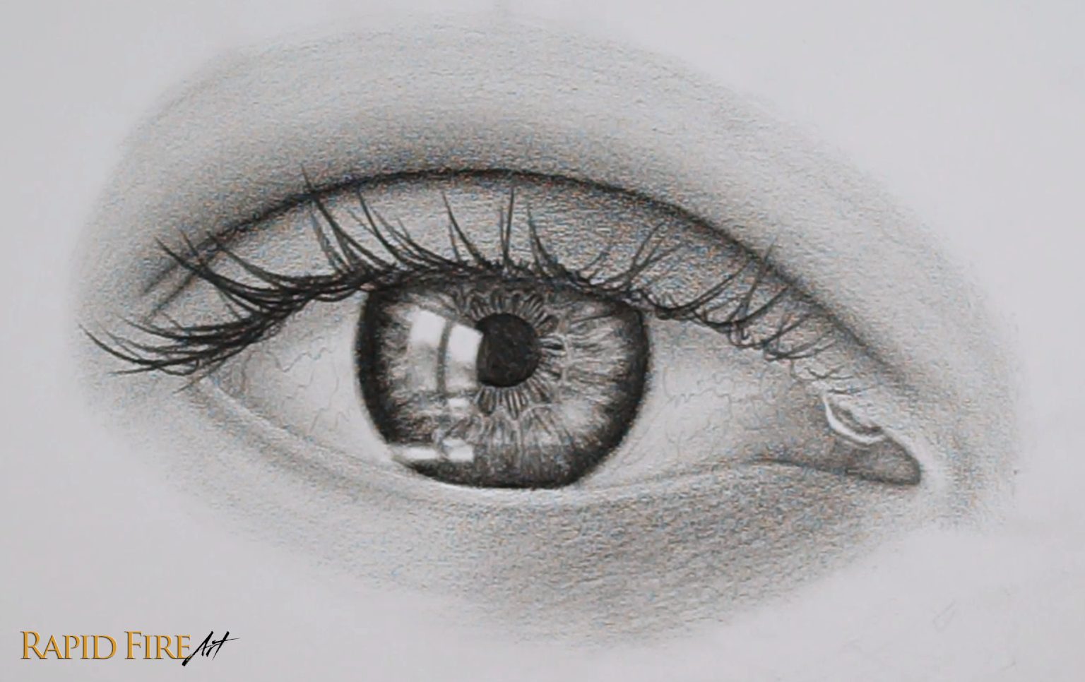
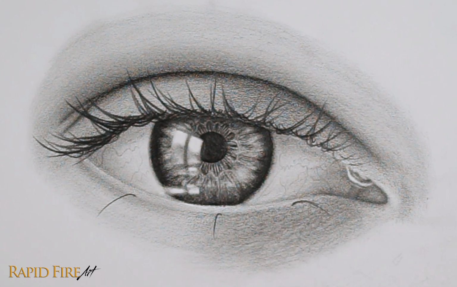
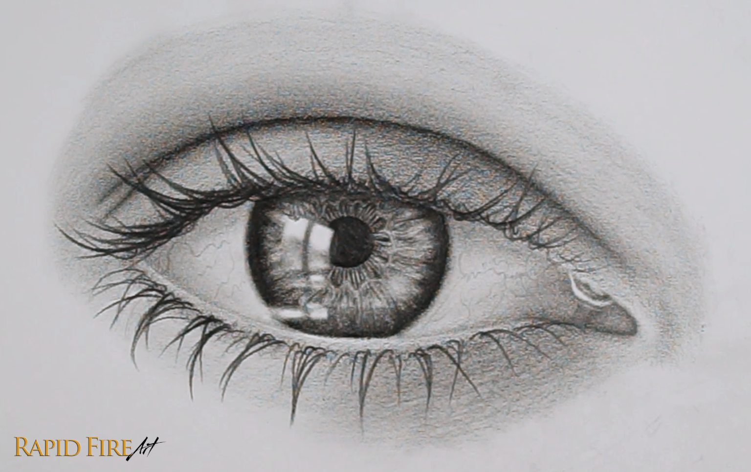
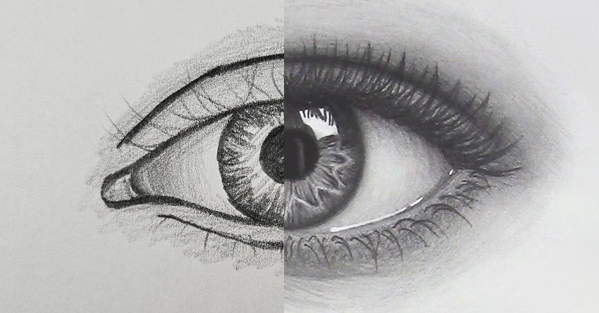
Hey guys! It’s been a while but I’m back with a new tutorial! Learn how to draw this realistic crying eye from scratch in just 12 steps. This condensed tutorial was made using screenshots taken from my hour-long video tutorial on Youtube. Please refer to the teary eye video if you need any extra explanations for any of the steps below 🙂
White Gel Pen: Optional. To make your brightest zones pop!
SmudgeGuard Glove: Drawing glove to prevent smudging and the transfer of oils from your hand.
Note: If you only have a school pencil (HB) and solid eraser, you can still achieve similar results, except your drawing may appear a bit lighter in value.
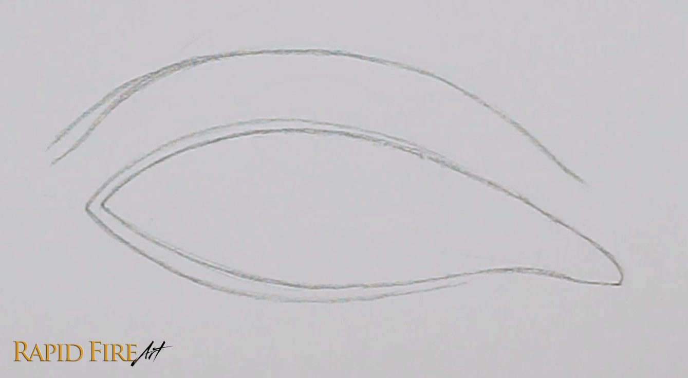
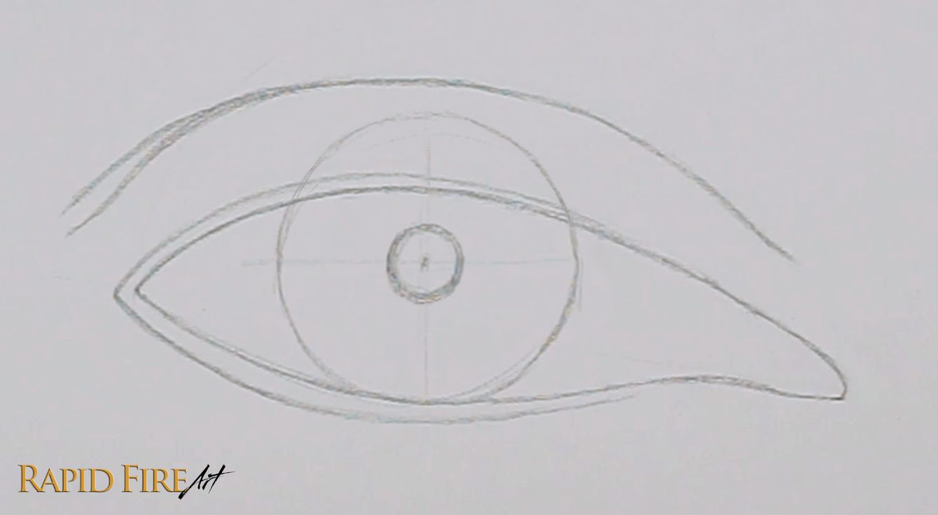
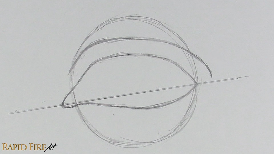
Step 1: Construct the Eye Shape
Lightly draw the shape of an eye using your HB pencil. Draw an eyelid crease above it. If you need help with this step, the video tutorial breaks it down further.
Since we’re going to add a lot of detail to this eye, I would recommend you draw it a similar size as mine, which is about 12-13cm across.
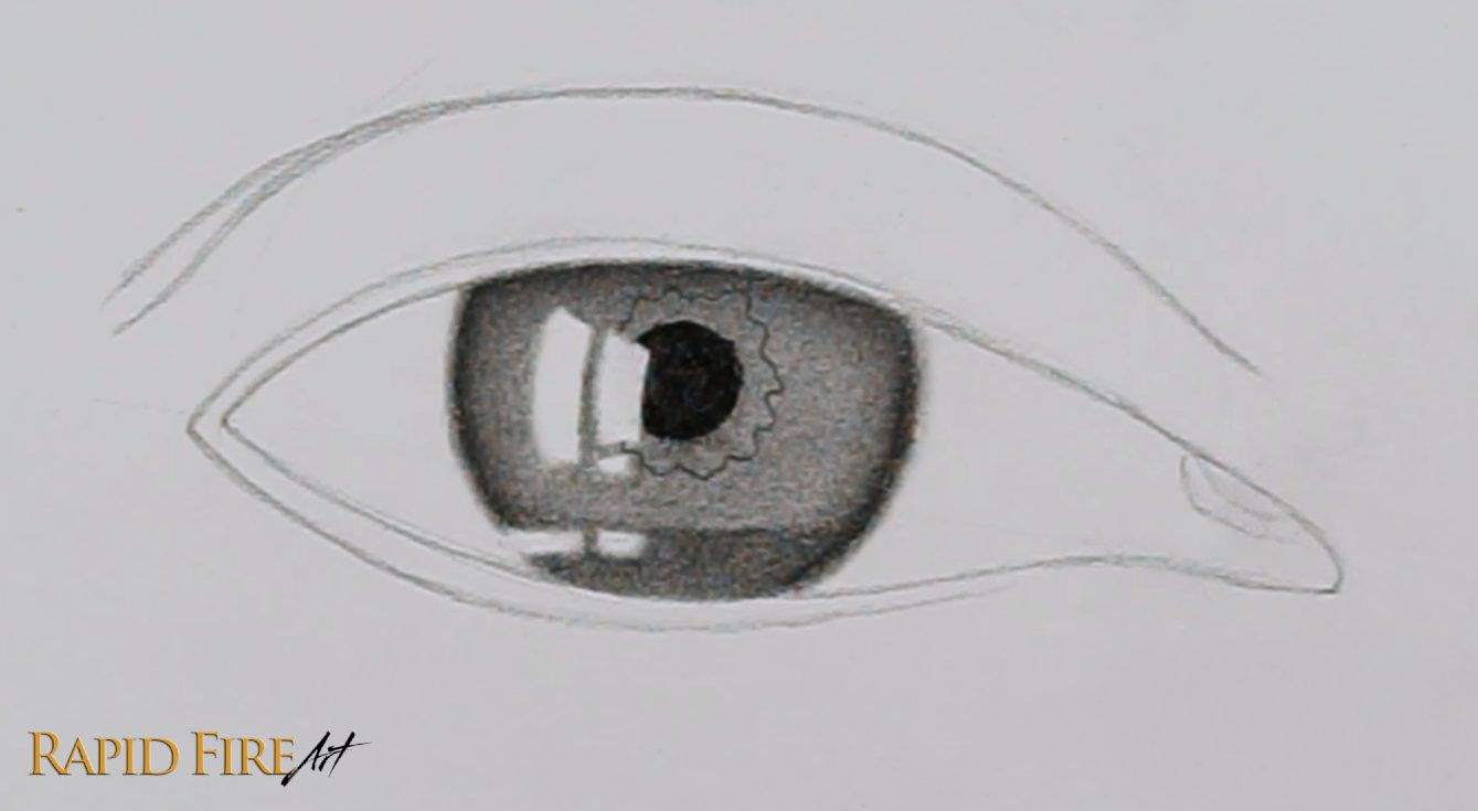
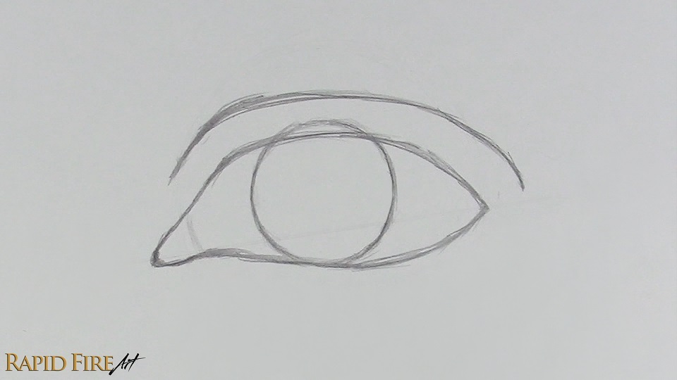
Step 2: Outline the Iris and Pupil
Draw a circle for the iris, making it roughly half the width of the eye. In the center of your iris, add smaller circle for the pupil, but don’t shade it in yet!
If you need help centering your pupil, draw a vertical and horizontal line through your iris. The point where the lines intersect marks where the pupil should go 🙂.
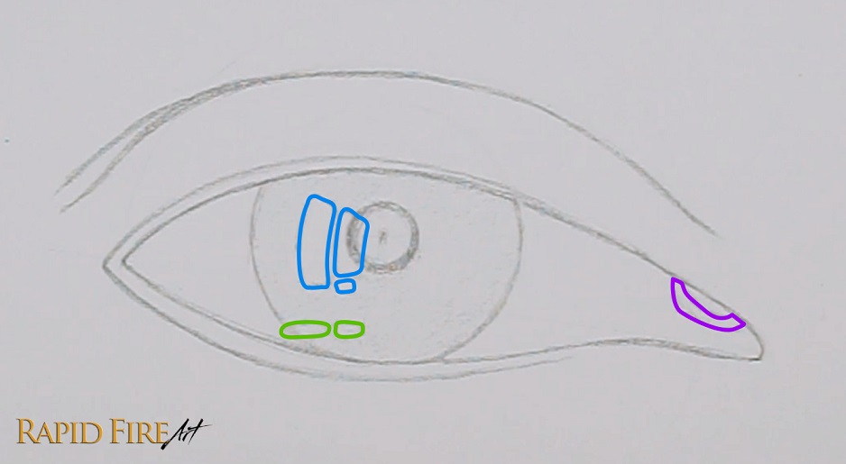
Step 3: Outline the Highlights in Your Eye
The magical part that makes an eye drawing look teary without overdoing the teardrops is the highlights. These are shiny areas that will make the watery parts of our eye glisten.
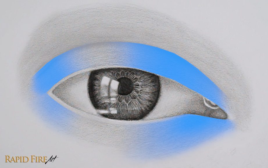
Let’s draw 3 groups of them…
Main Highlights: Outlined in blue for your reference, these rectangle shapes are a reflection of a pair of windows situated to the left side of our imaginary room. It is curved to support the illusion of a curved eyeball. I broke the shapes down from 2 to 3, but you can simplify it more if you want.
Waterline Highlights: Outlined in green, these two shapes are a squished version of the Main Highlights. I’m calling them Waterline Highlights because they are going to sit at the edge of some accumulated tears at the bottom of the eye, and we want these tears to glisten!
Inner Corner of the Eye Highlights: Outlined in purple. When our eyes well up with tears, they always collect at the inner corner of the eye because that’s where the tear duct is located. Let’s outline a big “U” shape to make this area really wet-looking.
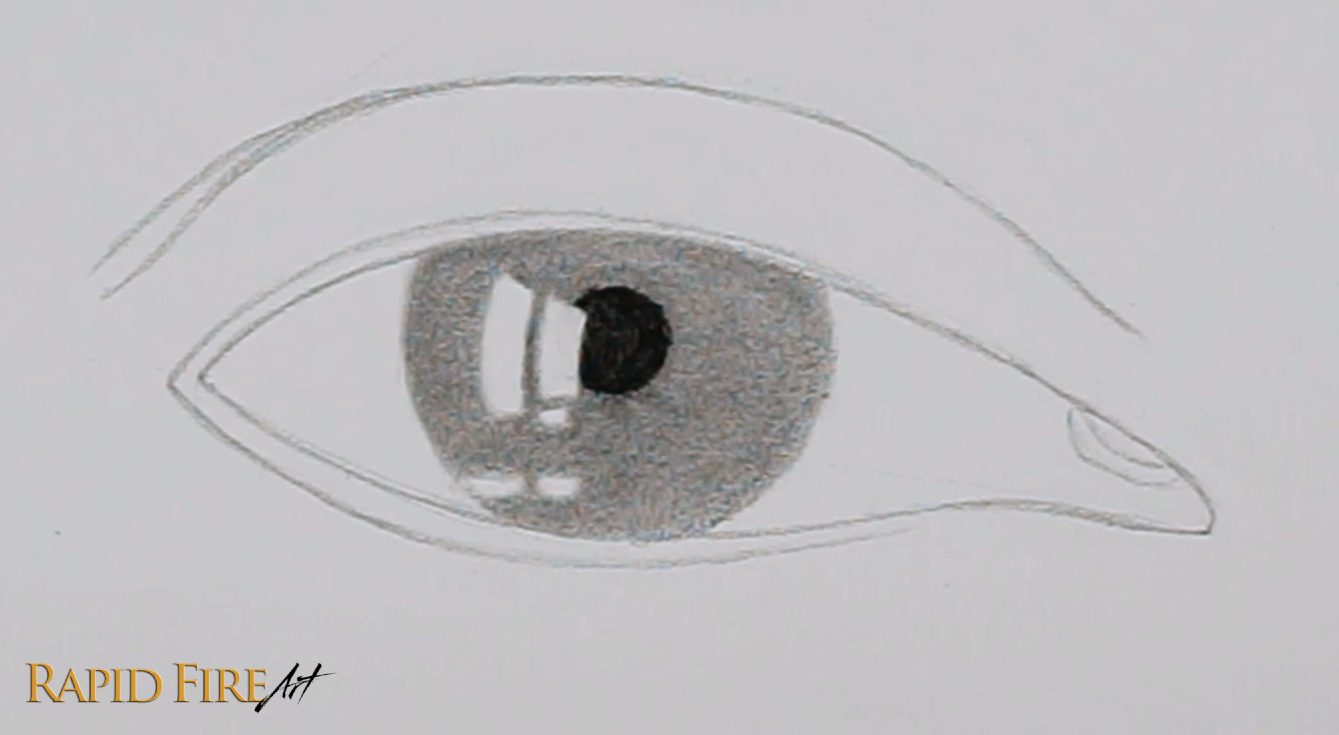
Step 4: Shade the Pupil and Iris
Shade your pupil as dark as you can get it. I used a 6B pencil for this. If you are using a harder pencil like an HB, avoid pressing too hard because it can warp the paper and/or make it overly reflective.
Then shade your iris. Start with an even layer of graphite (4B) and then blend it with a tissue.
Then, using a 6B, shade a dark ring around your iris. Since my imaginary light source is shining down from above, the eyelid will cast a shadow along the very top of the eyeball. So let’s shade along the very top of the iris to account for this cast shadow.
I prefer to blend these dark parts with a blending stump because the tissue tends to lift graphite away, making the area lighter. The advantage with blending using a tissue is that it’s easier to work with if you are a beginner and the result looks smoother.
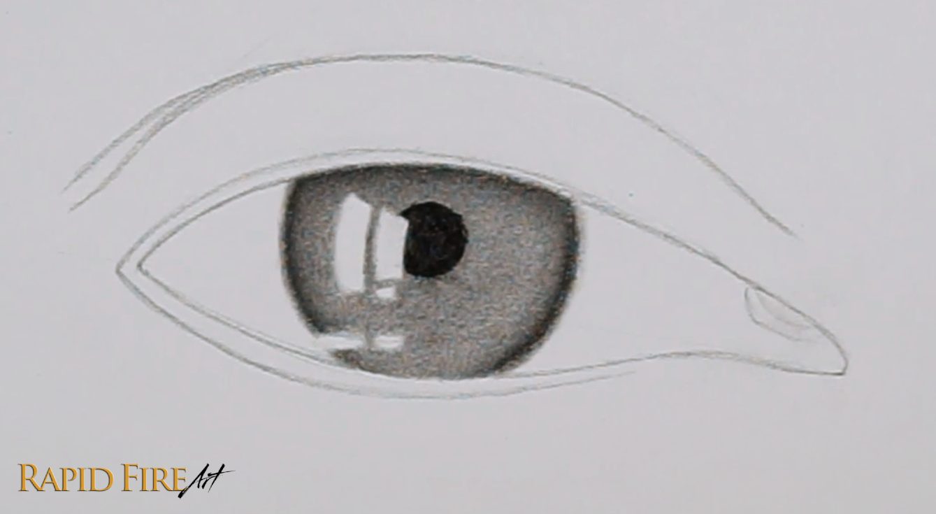
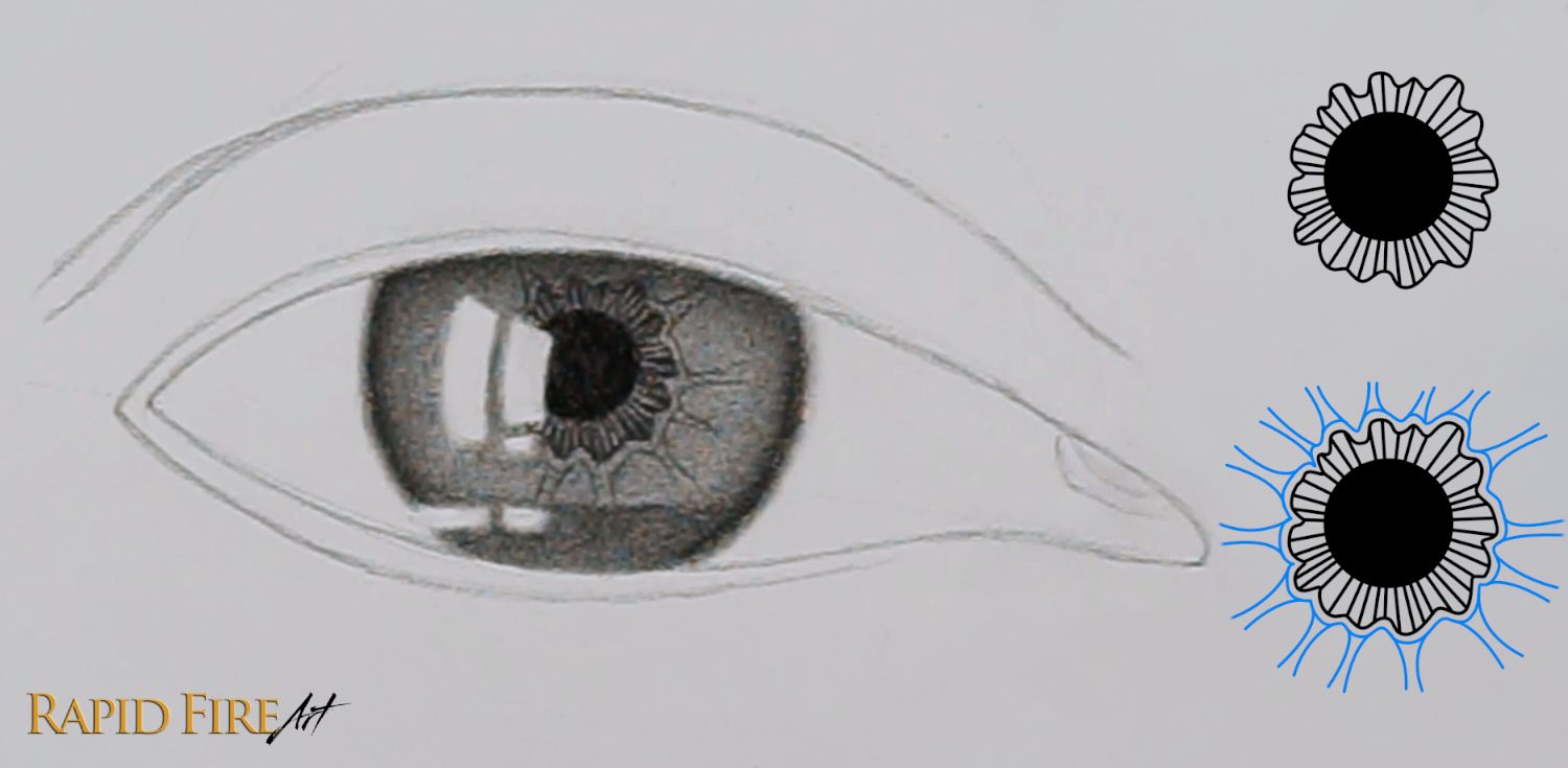
Step 5: Draw Iris Details Part 1
Still using a 6B pencil, shade a dark band along the very bottom of your iris for the accumulated tears. Only shade as high as your Waterline Highlights.
Next, draw a wavy ribbon around your pupil using a 4B pencil.
Step 6: Draw Iris Details Part 2
Within the ribbon that surrounds your pupil, draw a bunch of radiating lines. Then draw another identical ribbon around the first one. Where the ribbon juts out, draw lines that reach outward toward the edge of the iris.
Continue drawing a variety of wavy/squiggly lines radiating towards the edge of the iris. Lighten the spaces in between your pencil marks using your kneaded eraser if you want to make some of the spokes pop out (this increase in contrast can help make your eye look more captivating).
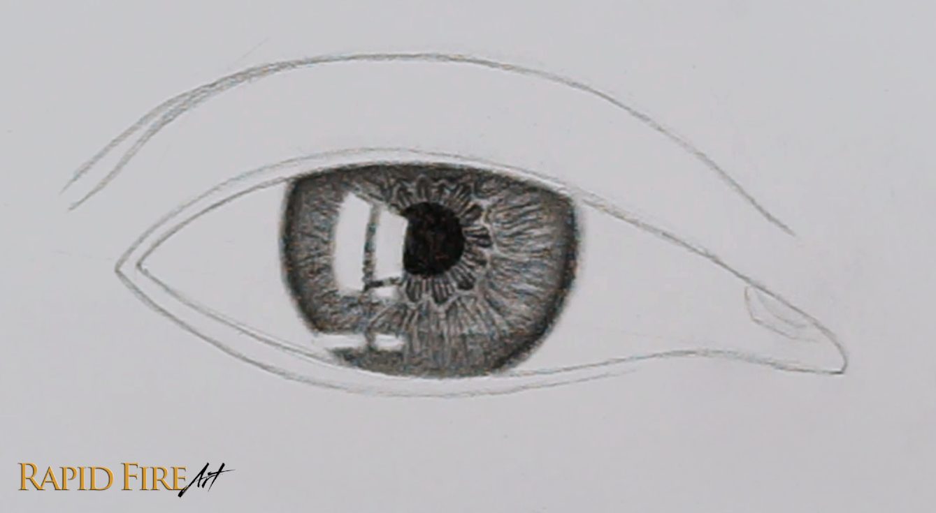
You can increase contrast further by darkening the edge of your iris and the cast shadow along the top using a 6B pencil.
Now let’s draw a reflection in our Main Highlights. In the bottom half of my Main Highlights, I’ve shaded an ambiguous wavy shape and purposefully blended that unevenly to make it look like there are some details reflected back. You’ll notice that I’ve added two extra highlights on the iris. I’ve also used my blending stump to blur the edges of some. I much prefer the softer, more subtle look. Please feel free to blend them however you’d like and add or remove parts based on your personal preference.
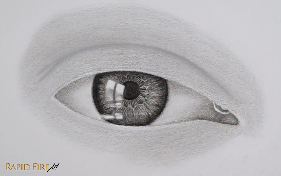
Step 7: Shade the Rest of the Eyeball (Eyewhites)
Make sure the rest of your eyeball is shaded in. We want the lightest areas of this entire drawing to be our highlights.
Shade the far left and far right of your eyeball gradually darker using an HB pencil. Then blend with a tissue.
Shade along the very top of the eyeball to make it look like the eyelid is casting a shadow. Shade lightly along the bottom of your eyeball as well to make it look curved.
Shade the inner corner of the eye pretty dark to convey depth, especially around the edges. Draw some lines/curves in this space and blend them well so they look like bumps and folds.
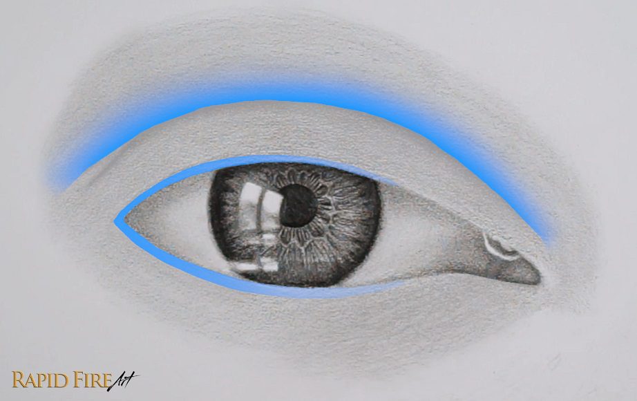
Step 8: Shade the Skin Around the Eyes
Note: This shading instruction is different from the video tutorial to keep things simple.
Using your 4B pencil, shade a light and even layer of graphite across all areas of skin around the eyes. Blend it well using a tissue wrapped around the padded part of your finger. Switch to a clean spot on your tissue often to prevent blotches. Be careful not to smudge the details inside the eye.
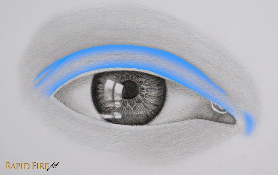
Then, for all the areas highlighted in blue below, shade darker to make the skin appear curved. Lighten your strokes gradually as you approach areas where the skin should be lighter. Shade the eyelid crease the darkest.
My imaginary light source comes from the top left, making the right side of the eye a little darker than the left side.
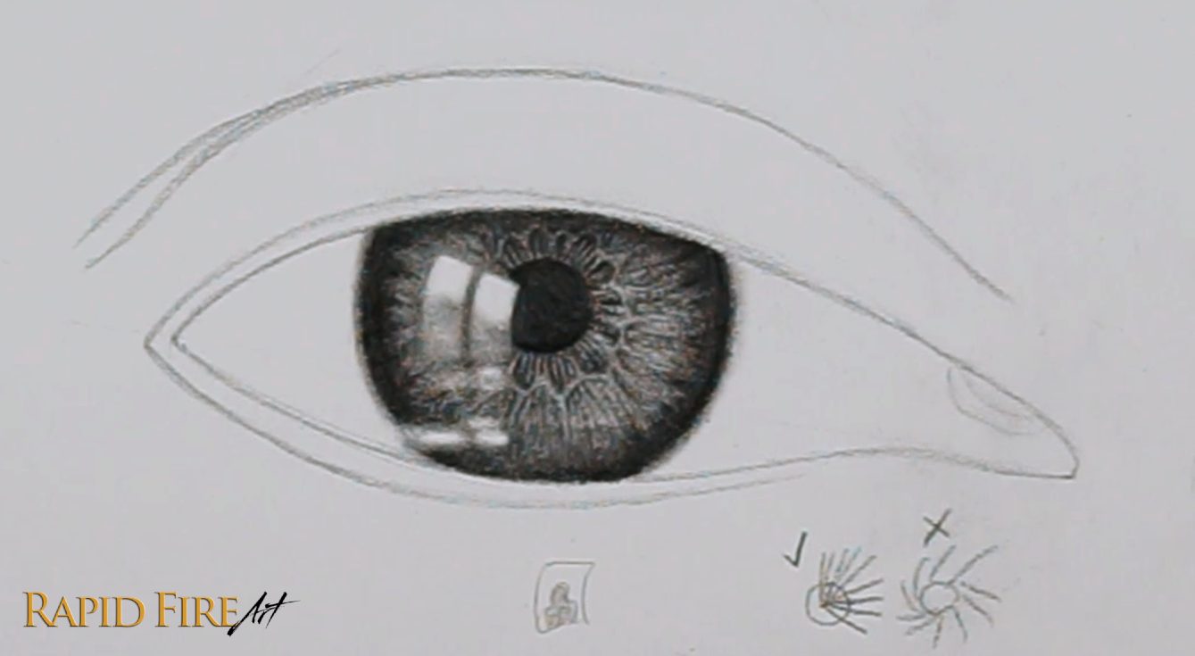
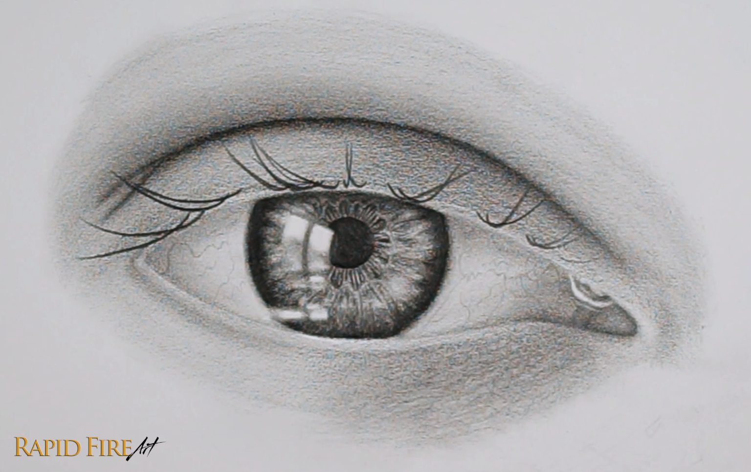
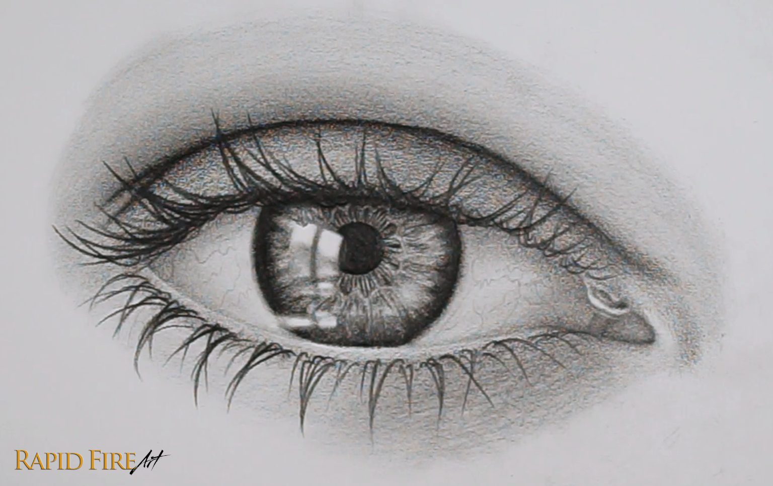
Step 9: Tweaks and Optional Details to Make Your Eye Drawing More Realistic
Before we draw the eyelashes, it’s a good idea to look over your entire drawing to see if you’d like to fix anything as well as try to make your shading smoother. Keep in mind that after you’ve drawn the eyelashes, it will be more difficult to blend the skin because you will need to blend around each lash, or risk smudging them.
If you look closely, you can see I’ve added some subtle squiggly blood vessels along the eyeball using my 2H pencil. This is a totally optional detail to help make the eye more realistic! If you darken the blood vessels, it can help make the eye look more sad, since our eyes do become more red when we cry.
Inside the iris, I used my eraser to lighten more spokes at random. I also added large bright patches using my kneaded eraser rounded to a blunt tip and dragged lightly in the same direction the spokes are pointing.
I also added 3 new subtle highlights surrounding the one at the inner corner of the eye. If you like how yours looks currently, feel free to keep it that way!
Step 10: How to Draw Eyelashes
For my eyelashes, I’m using a 2B pencil. Test your pencils to see which one you prefer. I chose the 2B because it stays sharp for a long time, giving me clean strokes, and the value is dark enough for my preference.
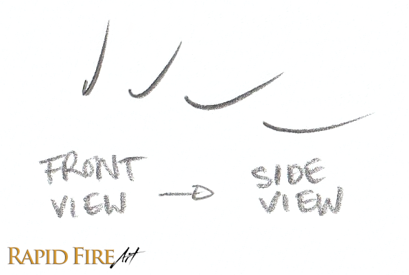
Draw your eyelashes along the eyelid’s ledge. If you struggle with drawing eyelashes, just think of them as “J” shapes. Vary your “J” shapes from narrow to wide and from deep to shallow.
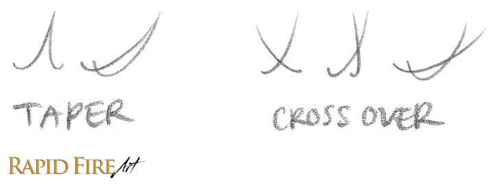
To make your lashes look realistic and natural, try to avoid any repetitive patterns. You can do that by varying the length, the angle, making them cross over each other, or taper them together at the ends for example.
Make sure your lashes are shorter, thinner and lighter the closer they are to the inner corner of the eye.
Layer on more and more eyelashes until you are satisfied.
Do the same for your lower lashes. You might find that spreading your lashes out and jumping back and forth randomly will help you to draw more natural-looking lashes as opposed to drawing them all in order from one side to the other.
I like to keep my lower lashes more sparse. If you are planning to draw lots of teardrops, you can taper many lashes together because hair likes to stick together when wet.
Give your eyelashes some shadows and add texture to the skin around the base of each hair. This subtle detail can be acheived by lightly drawing circular/loopy patterns along the top and bottom eyelid ledges where the eyelash roots are. Make your circles lighter and more subtle where the lashes are few and far between.
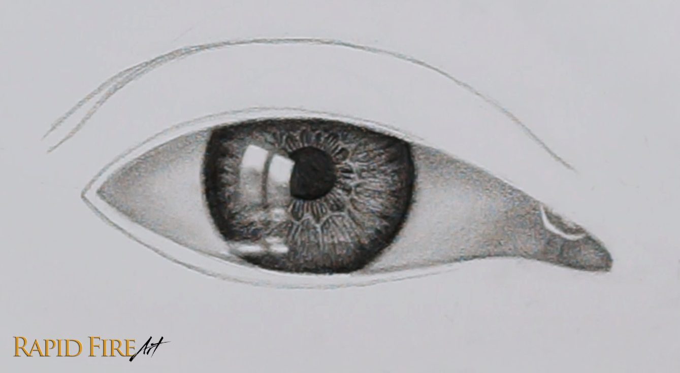
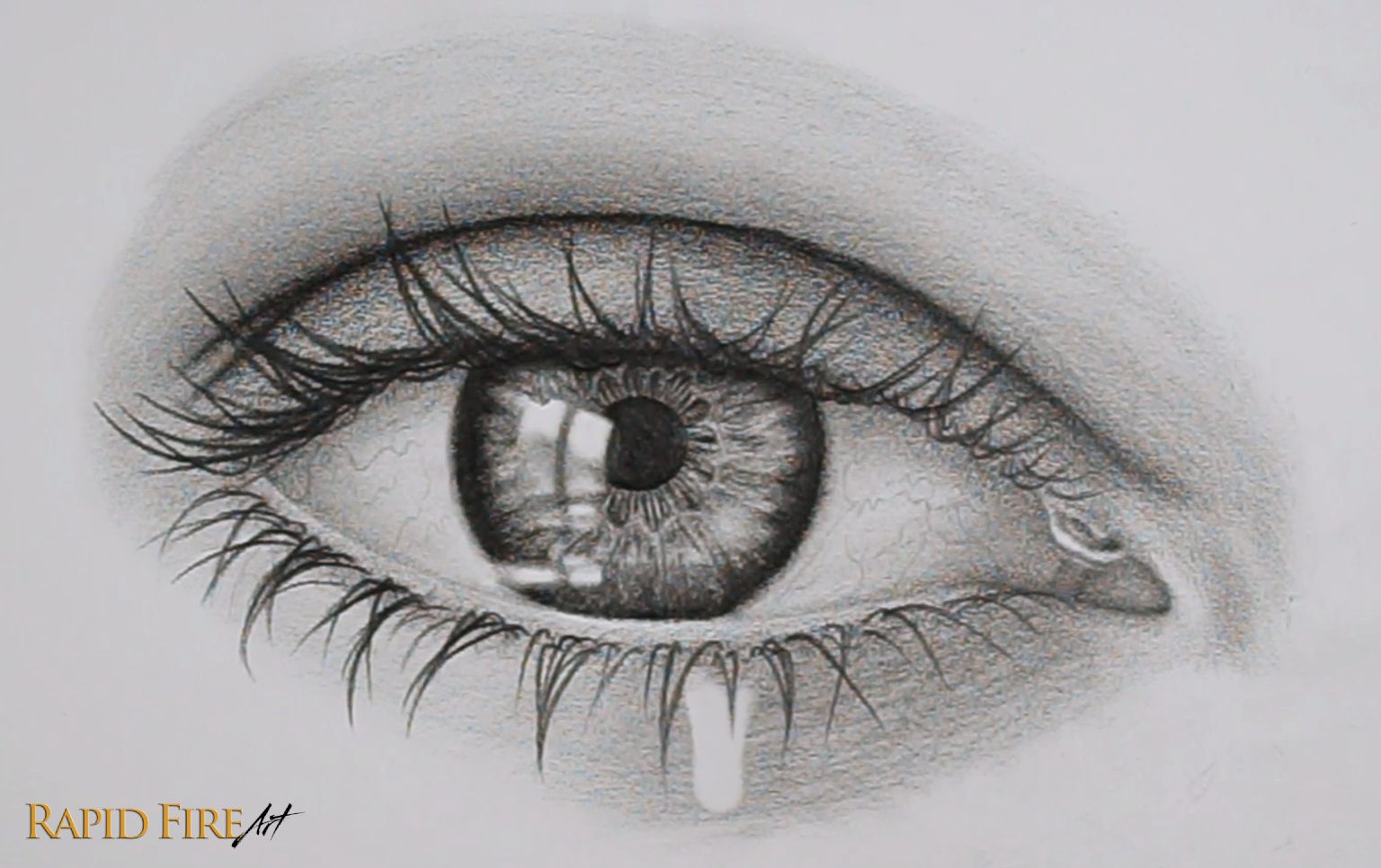
Step 11: Tweak Your Eye Drawing
Take a few steps away from your drawing, or better yet, take a long break to reset your brain. Now look at your entire drawing to see if you want to darken, lighten, add, or fix anything.
I decided to add some more lashes to the top eyelid and make some of them longer. I also darkened the eyelid crease to increase the contrast, as well as darken the eyelid cast shadow along the entire eyeball. Do whatever you feel like to make the eye most appealing to you.
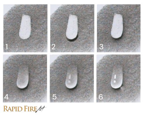
Step 12: How to Draw A Realistic Teardrop on Your Sad Eye
First pick where you’d like the teardrop to fall. Ideally an area in between lashes. Make sure the skin in your chosen area is shaded and blended well. This is to make sure the teardrop shows up well. Keep in mind that the lighter the skin, the less prominent the teardrop will appear because a lack of contrast.
Now erase a teardrop shape. Make the bottom of your teardrop as round as you can.
Consider where the main light source in your drawing is coming from. In this example, it’s coming from the top left, so we’ll draw a shadow on the bottom right, below our teardrop.
When you blend, make your shadow fade out gradually the further it is from the teardrop. I used a tissue to achieve a soft fade. As you shade and blend, try to keep the edges of your teardrop clean and crisp!
Identify the area that will be illuminated inside your teardrop. This area will be right against the cast shadow you just drew. Shade inside your teardrop while avoiding the illuminated zone. You’ll want to shade darkest at the very top of the teardrop and lighter gradually as you move downward. Only shade as dark as the surrounding skin. Blend while making sure the top of our teardrop is blended extra well. Our goal is to make the top of the teardrop blend in with the skin tone to make it look as though the tear is dripping down.
Next, use your eraser to create mini highlights that loosely match your Main Highlights. Since the teardrop is small, you can simplify the shape as much as you need. If the shapes are ambiguous, they may look like blobs.
Optional: You can use a white gel pen to boost the lightest parts of your teardrop. You can also erase a little wedge shape in the cast shadow under the tear to convey light exiting the teardrop.
An optional detail to make the bottom eyelid look more watery is to erase blob-shaped highlights around/above your teardrop.
Now take a step back from your drawing to see it as a whole. Do you want to tweak anything? If you want your eye to pop more, try making the dark areas darker and the light ones even lighter. You can only erase so much, so try using some correction fluid or a white gel pen to really make those highlights really pop!
A Few Last Notes
This tutorial has been more than a year in the making, partly because editing a 10-hour raw recording into something watchable takes a surprising amount of time and energy haha. I wanted this written version to simplify the process even further, giving you enough steps without overwhelm.
But I’m still learning how to balance depth and simplicity, so your feedback would be amazing. If you watched the Teary Eye Youtube video, did this written version support you? Does it make things easier to understand? Your insight will help me improve future tutorials here on my blog so I can support you in the best way possible.
Thank you!
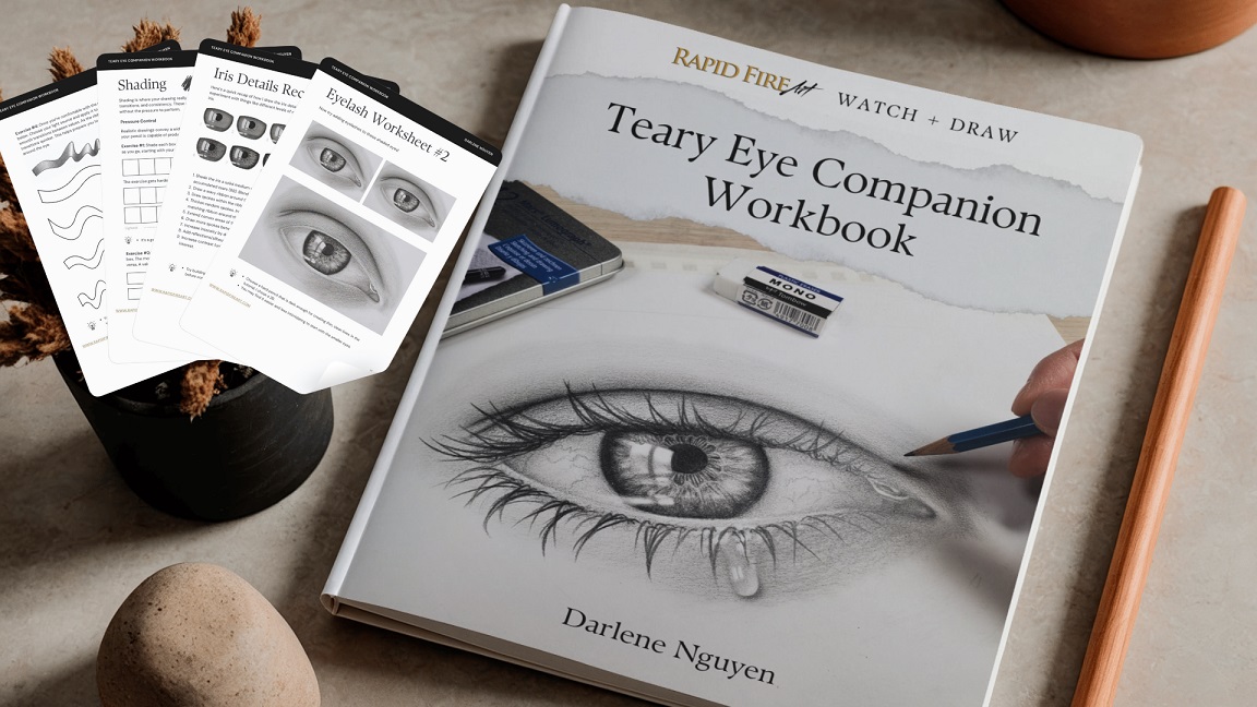
If you want more guided practice, I’ve made a companion workbook (ebook) which includes: printable pages of this exact eye that you can practice on, shading exercises, eyelash exercises, and more to help you build confidence and improve your technique. Click here to learn more!
Darlene created RFA In 2013 with the goal of sharing simple yet detailed drawing tutorials with other artists on the world wide web. She is a self taught pencil portrait artist and Youtuber.
Hey, I’m Darlene, and in this tutorial, I’ll show you my unique method for drawing a hyper-realistic eye from scratch. Follow along with me as I take you through the step-by-step drawing process!
Tools I Used
You don’t need any special tools to draw an eye. A regular school pencil (HB pencil) and a regular solid eraser will work fine. Below are the tools I used:
Start by drawing a faint circle using your HB pencil. It doesn’t need to be perfect. For steps 1-2, keep your pencil marks very light so they’ll be easy to erase later on. In case you’re wondering, my circle has a 7cm diameter.
Step 2: Determine the Eye Angle
Decide on the slope or angle of the eye. Use a ruler to draw a line through your circle, keeping it fairly close to the center.
Want to explore other slope degrees? Check out this eye tutorial to see 3 different examples.
Step 3: Form the Shape of Your Eye
Try to keep your pencil strokes light for this step in case you want to make changes to your eye shape.
Inner Corner: Draw a unique shape for the inner corner of your eye. Position it along the straight line, just outside of the circle.
Experiment with a “V” or “U” shape. See above for examples. You can also experiment with the angle, depth, or width to get wildly different-looking eyes.
Top and Bottom Eyelid: Now let’s draw the eyelids. Start with the top eyelid, extending the line you drew for the inner corner of the eye, arching it across the circle, and ending where the circle and the straight line intersect.
For the bottom lid draw a much shallower curve. You can use the straight line as a reference – the closer your eyelid is to the line, the shallower it is.
Upper Eyelid Crease: Draw a skin crease above your top eyelid while roughly mimicking its curvature. You can adjust its distance from the top eyelid based on your preference. Draw from left to right, starting at the circle’s edge and ending above the straight line.
Step 4: Erase Your Construction Lines
Once you’re happy with the eye shape, erase the circle and the straight line. I’m using an electric eraser to save time.
Divide the inner corner of the eye from the eyeball using a slightly curved line.
Step 5: Draw the Iris
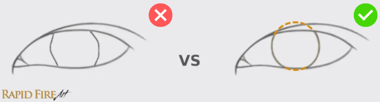
To make an iris, draw a circle about half the eye’s width. When drawing irises, it’s better to draw a FULL circle and then erase parts that extend beyond the visible part of the eyeball rather than simply drawing two bracket shapes. This method helps make sure your iris is as circular as possible.
Here’s an example of drawing an iris using a full circle versus brackets. It’s very difficult to draw a realistic iris using brackets! This is an exaggerated example to get my point across 😛.
Step 6: Outline the Main Highlight
In the eye, draw a reflection of your imaginary light source. This will be one of the lightest areas in our entire drawing, called a highlight. The reflection can be from a window (eg: rectangle or square), a lightbulb (eg: circle), or any other shape you choose.
Make sure the shape is skewed to wrap around the curvature of the eyeball. For example, use curved lines instead of straight lines when drawing a square to help make the eyeball appear round.
You’ll notice that the bottom left corner of my reflection is missing – that’s because I’ve included an obstruction to the light source (explained below). This is optional, but I think it makes the eye look more realistic.
Imagine that the light source is from a rectangular window but with someone standing in front of it. Their body would block the light, altering the reflection in the eye we’re drawing. In the example above, a photographer’s head is obstructing the bottom left corner.
Draw your outline lightly so we won’t see an obvious outline after the iris is fully shaded in. Mine is dark so you can easily see it.
Step 7: Draw the Pupil
Pupil Placement: The pupil is the black circle in the very center of your eye. To draw it in the correct place, find the center of your iris, mark it with a tiny dot, and then draw your pupil around it.
If you have trouble finding the center of your iris, draw a cross through it – the intersection between the vertical and horizontal lines of your cross indicates the center of the iris. Adjust the pupil size based on your preference.
Extra Reflection: An optional detail is adding a reflection inside the pupil like the wavy shape I’ve outlined above.
Shade Pupil: Using a 4B pencil, shade the pupil as dark as you can. Shade the wavy reflection about 80-90% of the way so it’s only somewhat noticeable. Erase the part of your iris outline that extends beyond the visible part of the eyeball.
Step 8: Shade the Iris
Iris Border: Thicken and blend the border of your iris for a softer edge. You can blend using a tool such as a blending stump, tissue, or a cotton swab.
Body of the Iris: Add a solid, light layer of graphite in the rest of the iris while avoiding the highlight. To shade smoothly, keep your pencil strokes close together, minimizing gaps in your shading.
Cast Shadow: Remember when we gave our drawing an imaginary light source? Mine is shining down from the top right, causing the top eyelid to cast a shadow down onto the iris. Let’s shade along the very top of the iris to account for this shadow.
Darken: You can leave your iris as it is or darken it further like I did above. I’ve shaded mostly around the edge and gradually lightened my strokes near the pupil.
Step 9: Draw Iris Details
If you want to keep your iris simple, you can skip this step, but do have a look through it before you decide 😊.
Ribbon: Draw a wavy ribbon around the pupil. Try to make it look random.
Spokes: Within the ribboned area, draw some thin lines radiating outward from the center of the pupil, like bicycle spokes.
Darken Areas within the Ribbon: Thicken random spokes to help the iris look more complex. In areas where the ribbon juts out, shade darker to make these particular spots look deeper.
Outer Spokes: Add spokes along the outside of the ribbon. Keep some distance from the ribbon to give it a bit of thickness. I think these spokes look better if they’re squiggly instead of straight. Also, you can vary the line thickness and/or length to make the eye look more captivating. Try to keep your squiggles subtle and make them fade out as they approach the edge of the iris.
Darken: Once all your iris details are drawn, step back from your drawing to see if you’d like to darken the iris even further (I like to build my shading up in layers as I go along because it’s easier to add graphite to your work rather than erase areas that have been overshaded). I decided to darken the iris’s edge and the shadow cast by the top eyelid. I think the iris looks more striking with the increased contrast.
Inner Corner: Shade the inner corner of your eye, creating little bumps of different sizes. You can draw a bump by shading darker around the base of the bump and lighter at the highest point to make the surface look raised.
Eye whites: To make the eyeball look round, shade the far left and far right. The left side should be darkest because it faces the opposite direction from our imaginary light source. You’ll notice that my eye whites are fully shaded because even though it’s called “eye whites”, it’s not truly white. Keep your pencil strokes thick and close together for smooth shading. For more info on shading eyeballs, click here.
Top Eyelid Cast Shadow: Remember how the top eyelid casts a shadow onto the eyeball? Shade along the top of your eyeball to keep the lighting consistent.
Step 11: Shade the Skin
Before shading the skin around your eye, let’s add a few small details such as some extra creases above the inner corner of the eye and an outline around both the top and bottom eyelids to mark the eyelid ledge.
Top Eyelid: Shade the top eyelid, using pencil strokes that follow the shape of your eyelid. It’s okay if some of your strokes are darker or your shading isn’t very consistent here since these can come across as subtle wrinkles later on. If you want your shading to appear very smooth, eliminate gaps between your pencil strokes.
As you shade closer to the eyelid crease, darken your strokes gradually so that the crease comes across as folded skin instead of just a line drawn on the skin. To see an example of how to shade versus how not to shade a crease, as well as a cross-section view of the skin, visit this tutorial and navigate to tip #4.
Extend your shading above the crease and to either side of the eye. Just like before, darken your pencil strokes the closer you get to the crease so that the skin looks like it curves inward, away from the light source.
Bottom Eyelid: Shade the bottom eyelid leaving the eyelid ledge the lightest.
You can add a few subtle wrinkles under the eye using a sharpened pencil or the sharpest part of your mechanical pencil, drawing disconnected strokes while roughly following the eye’s contours. Around these wrinkles, you can shade using the cross-hatching technique to give the skin more texture, heightening the wrinkle effect.
Step 12: Blend Your Eye Drawing
Once done, use a blending tool of your choice to make your shading look more polished, reducing the amount of white gaps between strokes. I’m using a soft tissue wrapped around my finger, gently blending from light to dark areas to avoid streaks. With each swipe, check how dirty your tissue is and switch to a clean spot often to avoid blemishes.
Avoid smudging detailed areas of your work such as the iris because we want to keep those details looking nice and sharp!
If your drawing isn’t smooth enough after all that blending. use your pencil to lightly fill gaps and a kneaded eraser to remove blemishes by dabbing and lifting them away. Learn how to make a kneaded eraser. Then, blend again until you’re satisfied. It’s important to blend well now because, after the next step, it will be difficult to blend without smudging your eyelashes.
Step 13: Draw Eyelashes
First Three Top and Bottom Lashes: Using a sharpened pencil, draw three initial lashes spaced out across the top and bottom eyelid to act as guidelines for the rest of your lashes. Once you draw these, the rest will be easier to fill in.
Want more guidance on drawing eyelashes? Visit my in-depth eyelash tutorial where I explain how to draw eyelashes down to the individual lash and how/where to place them on the eye. You can also grab some FREE eyelash drawing worksheets while you’re there 😊.
Vary your stroke length and curvature to make the lashes look natural.
Fill in Bottom Lashes: Draw fewer eyelashes along the bottom eyelid and make them shorter and thinner, especially near the inner corner of the eye.
Eyelash Reflections: Within your highlight, draw some eyelash reflections. It’s easy to overcrowd them, so be careful here. Less is more!
Eyelash Base Details: Now we’re going to texturize the skin at the base of our eyelashes. Shade along the base of each eyelash using a squiggly, circular motion (circulism shading) to make the skin look bumpy. You’ll notice the change in skin texture most along the bottom eyelid, where the lashes are less dense.
Along the top of the eyeball, draw subtle shadows that are cast down by the eyelashes.
Step 14: Make Your Eye Drawing POP!
Let’s add some final touches! Take a few steps back from your drawing to see if you’d like to make any improvements. I’ve darkened some areas such as the pupil and iris for higher contrast and depth.
Next, add some highlights along areas of the eye you want to appear wet, such as the inner corner of the eye, and the bottommost visible part of your eyeball where tears would collect. You can make these highlights using a white gel pen or correction fluid. If you don’t have those items, you can make those highlights by removing graphite using a sharpened solid eraser or a pinched kneaded eraser with a dabbing or swiping motion. If your highlights aren’t standing out much, make sure they are the lightest values across your entire drawing.
Your eye should be coming together now, but small mistakes can still make a big difference in how realistic it looks.
If you want to practice without starting over each time, I made a printable workbook based on this exact tutorial.
Practice with my Hyper Realistic Eye Companion Workbook
This 28-page workbook lets you print and practice on the exact same eye, so you can focus on the parts that challenge you most, like shading, iris details, and eyelashes. It includes guided exercises and worksheets based on common challenges from your feedback.
It’s designed to help you build confidence and improve faster with guided repetition.
Darlene created RFA In 2013 with the goal of sharing simple yet detailed drawing tutorials with other artists on the world wide web. She is a self taught pencil portrait artist and Youtuber.
Drawing a nose from the 3/4 angle is a little trickier than from the front or side, but I’ll show you an easy way to do it, plus how to achieve different nose shapes using the same method so you can customize your nose just the way you want it!
Step 1: Use a Wedge to Draw a Nose From the 3/4 View
To draw a nose from the 3/4 view, it will help to first sketch a 3-dimensional wedge to form the basic structure of the nose. We will use this as a guide to draw a more detailed nose, so make sure it’s not too dark, otherwise it will be difficult to erase later. The wedge should have a trapezoid at its base.
Make sure the horizontal lines are all parallel to each other so the nose won’t look wonky.
Step 2: Add Circles for the Nose Tip and Wings
Let’s add three circles to our wedge to make it look more nose-like. Draw one circle where the nose tip will be and one on each side of the wedge for the nose wings.
These circles can be adjusted in size and position to achieve very different-looking noses. Notice how the larger nose also has larger nostrils? Try playing around with nostril sizing too!
Step 3: Start Shaping Your 3/4 Nose
Starting with the middle circle, draw a line that wraps around the left side and continues down toward the bottom of the wedge to create the nose tip and columella. Then draw the wings of your nose by outlining just the outer part of each remaining circle. Use your circles as a rough guideline – you don’t need to stick to them exactly.
Step 4: Draw the Nostrils
Now draw the nostrils. The one closest to us will be more visible than the nostril furthest from us. You can adjust the size and shape based on your preference.
Step 5: Draw the Nose Bridge and Brow
Create the bridge of your nose by loosely following the left edge of your wedge. Avoid drawing a perfectly straight line because the nose bridge is naturally bumpy. At the top, angle your stroke outward to create the brow bone.
You can experiment with many different slope degrees and curves: convex, more concave, wavy, etc!
Step 6: Lighten Your Construction Lines
Lighten your construction lines so they won’t be visible when your drawing is complete. If your construction lines are faint enough, they should blend in once you start shading, making them unnoticeable. I could erase mine even more, but I’ll leave them quite visible for your reference 😊.
Step 7: Shade Your 3/4 Nose
Before shading, we need to decide where we want the light to come from. You can choose how you want to light the scene – I’m choosing to have my main light source shine down from the top right, so my brightest areas will be along the right side of the nose and the darkest areas are along the left side because it’s facing away from the light.
If you’re drawing a bulbous nose or one with flared nostrils, consider the shadow it creates, even on the side of your nose that faces the light most directly. In this example, my right nose wing is somewhat bulbous. Where the skin curves inward and connects to the face, a crevice forms where the light can’t easily reach. So, I’ve given it a dark shadow. The darker you shade around this wing, the more bulbous your nose will appear. If you’d like to draw a narrow nose or one that looks pinched, lighten this shadow significantly.
Let’s shade the darkest areas of the nose first. When shading, keep your pencil strokes close together to minimize gaps. Gaps will make your drawing look less realistic. To learn different ways to shade, visit my Intro to Shading Techniques.
Step 8: Add Mid-Tones
Mid-tones are the shades of gray between the darkest and lightest areas of your drawing hence the word “mid” for middle. They help your shading look more realistic by giving the illusion of depth through the gradual transition from dark to light. Learn more about shading and light.
Currently, there is a very harsh transition from our shadow zones to light zones, so the first thing we want to do is add mid-tones between them. The goal is to get a nice gradual transition.
Next, shade a medium layer of graphite along the entire bottom of the nose, except for the area below the right nostril (highlighted in yellow) – In this area, leave a thin strip of light to make the skin appear raised.
Add mid-tones along the right side of your nose. Avoid the middle part highlighted in yellow to account for the bump partway down the nose. Make your shading lighter gradually as you work towards the lightest areas.
Shade along the very top of the nose to finish off that section.
At this point, the nose doesn’t look very shapely yet. It’s kind of uninteresting to look at. I’m going to shade a few more areas to make the nose stand out more and add some extra details to make the form look more complex. You can pick and choose what you’d like to do to your nose. If you like how it looks right now and prefer to skip to the next step, that’s fine.
I think my nose will stand out more if I darken and develop these areas further:
The very top of the nose. Darkening this area will hint at a stronger brow bone.
The underside of the nose. To avoid a blocky-looking nose, shade the top edge so it’s concave, giving the nose tip a more rounded appearance.
The area above the right circle (the circle isn’t visible anymore, but you can probably visualize where it used to be by following the shape of the wing). This shadow creates what’s called an alar crease.
Step 9: Blend and Highlight
Since this is a quick tutorial, I’m not too concerned about achieving super smooth shading. So if you’d like your drawing to look more polished, make sure you fill in any major gaps between your pencil strokes before blending. Small gaps will likely disappear after being blended.
To blend, use a tissue or blending tool of your choice to smooth out your shading. For this drawing, I’m using a regular facial tissue wrapped around my finger. Working in sections, blend from a light area into a dark area instead of the other way around to avoid dark streaks across your hard work. It’s okay if your light zones become slightly gray (they likely will) – It’s actually a good thing because your highlights will show up better!
Pick areas you want to highlight on the nose to increase your drawing’s contrast, making it pop!
To create highlights, it is best to use a kneaded eraser and a gentle dabbing motion to lift graphite from your drawing. A regular solid eraser can work too, but it will likely result in highlights with harsh edges.
Erase a few sections on the light side of your nose (facing the light source), such as the nose tip, bridge, or ala. These highlights are reflections of your light source. If that’s not enough, you can add some highlights on the underside of the nose, conveying ambient light or light reflected off another surface.
Keep your highlights to a minimum to draw more attention to your drawing. When it comes to highlights, a little goes a long way!
Step 10: Put Finishing Touches on Your 3/4 Nose Drawing
Step back from your drawing to view it at a distance or take a 30 minute break from it, at the least. When you return, you might see it with new eyes, spotting areas you want to fix/tweak. I went back in and darkened the wing outlines. I’m quite happy with how mine turned out and I hope you are happy with yours too!
Bonus Content!
Using Play-Doh or a kneaded eraser, you can make a wedge to use as a crude nose model. With this model, you can see how a nose would look from any angle simply by rotating it in your hands. To learn how to draw a nose from ANY angle, subscribe to my mailing list at the very bottom of this page and I’ll email you when that tutorial is posted!
I hope you enjoyed following along with this step-by-step 3/4 nose drawing tutorial! Happy Drawing!
Darlene created RFA In 2013 with the goal of sharing simple yet detailed drawing tutorials with other artists on the world wide web. She is a self taught pencil portrait artist and Youtuber.
I’m Darlene and in this drawing tutorial, I’ll walk you through how to draw a face from the 3/4 view using Andrew Loomis’ method for drawing heads.
It took me quite a long time to understand and learn how to draw the Loomis heads properly. If you’ve read his book, you’ll notice that I’ve incorporated some of my own methods into this tutorial to enhance clarity in areas where I faced challenges, striving to make each step as easy to understand as possible.
This tutorial is the third installment in a four-part series walking you through the Loomis method for drawing heads.
While it isn’t necessary to go through this series in order, I strongly recommend it. Seeing how the head is drawn from various angles will greatly enhance your understanding of challenging perspectives. This will enable you to draw faces from any angle with confidence over time.
First, I’ll show you how to build the basic structure of the head from the 3/4 angle, then, I’ll explain how and where to draw the facial features, followed by how to draw the final details such as hair.
Drawing Tools
These are the tools I’m going to use. But feel free to use a regular school pencil (HB) for the entire tutorial.
Next, draw a straight vertical line through the center of your circle and call it the Axis. This line determines how straight or how tilted your head will be. We will be using it as a reference for many steps throughout the rest of this tutorial.
Now draw a horizontal line through the center of your circle – This is where the eyebrows will be placed, so we’ll refer to it as the Brow Line. Make sure it’s perpendicular to the Axis.
Now we need to draw a straight line down the middle of the face. When the face is turned, this line curves. Imagine how a ball looks when you turn it slightly (observe how in the example above, the straight vertical line curves when I turn the ball left and right). To draw that curve correctly, we will draw an ellipse.
Make sure your ellipse is balanced evenly along the Axis so the facial features don’t end up looking wonky and lopsided. We’ll call this the Middle Line. The dotted half represents the side of the head facing away from our view. This dotted line helps make our 2D drawing look more 3D and helps us remember which side our head will be facing.
Above is an example of what to do and what not to do when drawing your ellipse. See how tilted the ellipse on the left is? It is not balanced well along the Axis.
It helps tremendously to have a physical model to rotate in your own hands, especially when drawing more difficult angles of the head! If you want to make a drawing reference tool like I’ve made for this tutorial, you can simply draw a vertical and horizontal line across any ball and pierce a stick through the north and south poles.
If you want to create your own drawing model, you’ll need the following materials:
The styrofoam ball represents the cranium and the toothpick is the axis upon which the head rotates. The orientation of the Axis determines whether the head will be straight or tilted and the degree of tilt. You’ll find the axis extremely important when you move on to drawing heads in tilted positions (such as the one in the 4th part of this series) because it will serve as your main reference point for properly aligning important parts of the face and head to prevent your drawing from looking skewed.
Okay, let’s get back to drawing!
So far, we’ve drawn a sphere, but the human head is not that round. The sides of the head should be quite flat, so we’ll need to slice 🔪 the side of our sphere off to reflect that.
Since we’re drawing a head from the 3/4 angle, we’ll only need to cut off one side (the visible side) of the sphere. To make sure we’re cutting off the right amount, split the sphere into 6 even spaces from top to bottom, using small tick marks.
Once you’re done, locate the topmost and bottommost tick, then extend the lines to the edge of your sphere. Make sure the lines are parallel to the Brow Line. With these two new lines, we now have boundaries to help us with the cut 🔪!
Using the boundary lines we just made, draw an ellipse that spans about half the sphere’s width. This ellipse represents the area of the sphere that we’re slicing off. We’ll call this area the Side Plane (side of the head).
Note: If you want to see what the side plane looks like from the front and side view of the head, please visit part 1 and part 2 of this drawing series.
Within the Side Plane, draw a vertical Ear Line. Make sure it’s parallel to the Axis.
Now let’s extend the Middle Line so it falls off the face of the sphere. Imagine a waterfall! Make it parallel to the axis or very slightly tapered.
Locate The Facial Features
Now let’s mark where his facial features will go! We can do this by making tick marks along the Middle Line. We have our Brow Line already, so we just need to find the Hair Line, Nose Line, and Chin Line.
The Hair Line and Nose Line are easy to find because they correspond to the top and bottom of the Side Plane.
You’ll notice that the space between each feature is equal. That means you can find where the Chin Line goes by simply measuring the distance from brow to nose to get the distance from nose to chin.
It’s important that these facial feature lines are parallel to the Brow Line.
Now let’s make this look more like a human head! Draw a curved line all the way from the forehead to the chin, creating the left edge of the face.
The jawline can be drawn by extending the ear line down and then angling your stroke towards the chin. I made my chin quite wide, but you can make it more narrow if you want, by adjusting the length of the Chin Line.
To make drawing the actual facial features less intimidating, section off the side of the face even further. I’ve drawn a curved line that stretches from the chin to the center of the side plane. You can lightly shade this entire right section of the head to clearly differentiate the side of his head from the front of his head.
There are two more facial feature lines to mark down…..the eyes and lips!
The eyes are about 1/3 of the way down from brow to nose.
For his lips, locate the halfway point between the nose and chin and draw a line that is slightly closer to the nose.
Construct the Neck and Base of The Skull
The front of his neck can be drawn right under the chin. Then draw the back of his neck. You’ll notice that I changed the shape of the cranium slightly so that the head looks less spherical.
Okay, we’re done with construction lines for now! Now we can have some fun drawing his actual facial features!
How to Draw Facial Features from the 3/4 View
Now that the structure is in place, it’s time to bring the face to life. In the 3/4 view, each feature sits slightly off-center and follows the curve of the head, so we’ll use our guidelines to position and draw them accurately.
How to Place and Draw the Ear
Now I’m switching to a graphite pencil. Let’s draw his ear in the bottom right quadrant of the side plane, between the brow and nose. The ear should slant back slightly.
You can follow the numbered steps above and use this detailed tutorial if you need more guidance.
Now for the rest of his features…
To make the placement and drawing of facial features easier, you can familiarize yourself with the two things below. They will help you understand the human head and its features, not just from a fixed view like the 3/4 angle, but from any angle.
Human Skull: Understand the bone structure beneath all the skin, muscle, and fat so you know why and where to place bumps, ridges, etc.
Planar Head: A simplified version of the human head represented using flat sides or planes. Simplifying the head and face makes the placement and drawing of facial features easier and faster.
I’ve drawn some planes of the face (above), so you can see how helpful the planar head is. You can probably already visualize more clearly where each facial feature will go. Can you visualize where his eyebrows go? Let’s go ahead and draw those along the browline:
Notice how the tail of the right eyebrow ends roughly where the Side Plane starts.
Shape his forehead however you’d like while loosely following your construction lines. I’ve made his brow bone quite prominent.
How to Place and Draw the Nose and Cheekbone
It’s pretty difficult to draw a nose at this angle without any guidelines, so drawing a simple, planar nose first really helps (like the one I drew a few steps back in red). Try your best to balance your planar nose on the middle line so it sits on the face properly.
To draw the base of his nose, start in the center where the Middle Line and Nose Line intersect and draw towards the tip of the nose.
You can use your planar nose as a rough guide to draw the nose bridge. Extend your stroke to the brow.
Wrap your pencil strokes around the side of your planar guideline to create the nose wing
Then draw the nostril, which sits between the tip and wing of the nose.
When viewing the nose from this angle, the nostril on the far side may not be seen at all.
Tip: If you want to study the nose from different angles, you don’t need any fancy tools, just grab some playdoh or a kneaded eraser. Create a wedge shape and add two round pieces on the side for each nostril. It’s a crude model, but it will give you a better sense of how a nose should look from different angles. Click here to watch my DIY tutorial on making a nose model.
Draw the far side of his face while visualizing the shape of his skull. The area near his eye is concave because of the way the eyesocket looks from this angle.
How prominent/high do you want to draw his cheekbone? You can adjust your stroke based on how you want his cheek to look. I’m not going any further down because I like to draw the lower portion after the mouth has been drawn.
How to Place and Draw the Eyes
To draw the right eye, create a vertical line that runs from the side of his nose wing, up to the Eye Line. The intersection marks where we should draw the inner corner of the right eye.
Tip: If you want to learn how to draw the eye from different angles, it helps to have a physical model to reference. make a simple model using a ball and some playdoh or a kneaded eraser. Flatten the playdoh, cut it in half, and wrap each half around the ball for the eyelids. Watch my DIY video for more details.
To draw the other eye, fit it in the space between the nose and the edge of the face. The inner corner of this eye will be hidden from our point of view behind the bridge of the nose.
How to Place and Draw the Lips
Draw his lips along the Lip Line we created earlier. You can use the numbered steps above for guidance.
Start by drawing the corners of his mouth using ticks. The distance between these ticks will determine the width of his mouth. The size is up to you. I like to draw an imaginary vertical line down from the center of each eye and use that as a boundary line so the mouth doesn’t appear too wide.
To the left of the Middle line, draw a shallow curve.
Connect that curve to the corners of the mouth using wavy lines.
Draw the cupid’s bow (middle part of his top lip), making sure it’s positioned to the left of the Middle Line.
Connect the cupid’s bow to the corners of the mouth to complete the top lip.
Then draw the bottom lip. Position your stroke more to the left of the Middle Line.
How to Draw the Chin, Jaw and Neck
Along the far side of his face, draw a convex curve next to the mouth. I’m still roughly following my construction lines. Outline his chin and jawline. I’ve given him a dimpled chin, but you can do whatever you prefer. For his neck, I’m staying pretty close to my construction lines.
How to Draw Hair From the 3/4 Angle
Let’s draw his hair!
How big do you want his forehead to be? You can use the blue Hair Line we drew during the construction phase as a reference to size his forehead – Draw your stroke below the line for a small forehead, above the line for a large forehead, or even higher for a receding hairline.
Work from the Middle Line and extend your strokes to either side of his head. As you work your way to the right, stop near the Side Plane, then bring your stroke down towards the end of his eyebrow. Before reaching the eyebrow, angle your stroke down to create his sideburn near the ear. Wrap the stroke around the top of his ear and continue down to the nape of his neck.
For the rest of his hair, try not to follow the sphere too closely, otherwise, the head will look too round and unnatural. At the very back of the head, angle your stroke inward so his head doesn’t look like a ball. If you want his hair to have lots of volume, put more space between the hair outline and the skull. You’ll notice that I’ve given him longer hair at the top/front of his head by adding more space between the hair outline and the skull.
Clean Up and Final Touches
Once you’re satisfied with how your 3/4 face drawing looks, feel free to erase your construction lines and shade the face!
You’ve now drawn a face using the Loomis method in the 3/4 view – one of the most important angles to learn. Now let’s build on that!
If your drawing didn’t turn out exactly how you wanted, don’t worry, this is where repetition makes a huge difference. Each new angle that you draw will help everything click into place.
Practice Other Angles
Whether you’re starting here or continuing the series, practicing multiple angles will strengthen your understanding and help you draw faces more confidently from any perspective.
Try another angle below to reinforce what you’ve learned:
Darlene created RFA In 2013 with the goal of sharing simple yet detailed drawing tutorials with other artists on the world wide web. She is a self taught pencil portrait artist and Youtuber.
Canson Drawing Paper (If you want smooth drawings, look for paper labeled as “fine tooth” or smooth, but make sure it’s thick so you can work it)
Step 1: Draw Boundary Lines For Your Curls
Start by drawing a pair of vertical lines that taper at the bottom. These will serve as boundary lines for the hair. The tightness of each curl ring depends on how far apart these two lines are. You can experiment with that.
Step 2: Draw the Front Sections of Your Curl
Let’s shape the curl while keeping our strokes within the boundary lines. Draw thick sections of hair that are spaced well apart. Slant them all in one direction. At the bottom, draw the end of your lock of hair by tapering the hair to a point.
Step 3: Draw the Back Sections of Your Curl
To draw the back part of your curl, draw similar-looking sections of hair that are connected to the ends of the ones you just drew. The dotted lines in my example above show you the part where the hair is hidden from view (erase these before you shade).
Before we move on to the shading portion, make sure your curl has rounded corners instead of sharp corners like the example below:
Drawing your curl like this will make it look flat instead of spirally
Also, make sure to lighten your construction lines before shading so they don’t show through in the end.
Step 4: Add a Light Layer of Shading
You can erase the two vertical boundary lines before shading.
Grab your pencil and lightly shade one section of hair at a time, working from the outside in. Use the flat side of your pencil to avoid scratchy shading. We want to make the area going down the center of the curl appear lighter in value so it will look 3D. When you approach this lighter area of hair, flick your pencil up quickly to create a gradual change in value.
Once you’re done, you can blend your shading so it’s smooth, using any blending tool of your choice, such as a soft tissue or blending stump. Blend in the same direction you shaded.
Step 5: Add Strands of Hair to the Front Sections of Your Curl
Now we’re going to draw individual strands of hair over the top of our shading. Sharpen your pencil, using the tip to draw this time, and use more pressure to create darker lines. In each section of hair, start your stroke along the outside and flick your pencil in toward the middle.
Now that my drawing is darker, you can more clearly see the pattern of light and shadow – each section of hair is lightest down the center. The transition between light and dark values should be gradual unless you’re drawing wet or extremely shiny hair.
Step 6: Add Strands of Hair to the Back Sections of Your Curl
Let’s work on the back sections of our curl in the same way we did in step 5, using the tip of our pencil to create many individual strands of hair. To make our drawing look 3D, try to darken this section more than the front section.
Step 7: Add Final Details to Your Curl!
Once you’re done, check to see if you’d like to make any tweaks to your drawing. I added some stray hairs so my drawing looks more natural instead of rigid and predictable.
If you’d like to learn more about how to draw long curls, such as how to draw loose curls, changing the curl direction, or how to layer many curls on a head of hair for your character drawings, plus many more tips, please refer to my video tutorial below!
Video Tutorial: How to Draw Curls
Thanks for drawing with me! I hope you enjoyed this tutorial on drawing realistic curly hair and hope you share it with your friends :)
Leave a comment down below if you have any questions!
Darlene created RFA In 2013 with the goal of sharing simple yet detailed drawing tutorials with other artists on the world wide web. She is a self taught pencil portrait artist and Youtuber.
Hey, I’m Darlene and in this tutorial, I’m going to explain the Loomis method for drawing the face/head from the side view. It took me a long time to understand and be able to draw the Loomis heads properly, so my goal with this tutorial is to make each step as easy to understand as possible and bridge any gaps. I also added some methods of my own.
This is part 2 in a 4 part series on drawing the Loomis heads. ** You do NOT need to go through the series in order**, but doing so will help you understand how to draw a face from any angle that you want. It’s a very useful skill to have for portrait artists! Additionally, once you learn one angle, the others will be easier, since you’re just translating one method to another angle.
Part 1 covered the head from the front and can be viewed via this link.
Drawing Tools
These are the tools I’m going to use. But feel free to use just a regular school pencil and eraser.
If you already went through Part 1 of the series, these steps will look quite familiar to you. If not, don’t worry, you can still draw a face from the side view using these detailed steps.
Important Note: Some text will be marked with an asterisk “*”, meant for those of you who are going through this series in order. The text here may not make sense for people following this series out of order.
Draw Construction Lines for a Head in the Side View
Start with a circle. Then draw a straight vertical and horizontal line through the very center. I’m using a colored pencil so the instructions don’t get too confusing, but pencil crayon isn’t easy to erase, so I would recommend you use your graphite pencil and sketch very lightly so you can erase the construction lines easily once you’re done.
* Since we’re drawing a head from the side now (facing to the left), the middle line that runs down the middle of the face is going to be located on the left side of our circle. The vertical line is now called the ear line.
Extend your middle line straight down, creating the front of the face.
Find Where the Facial Features Go
The horizontal line is called the brow line, since that is where the eyebrows will be drawn (but more on that later). To find where the rest of his facial features need to go, we’re going to split the ear line into 6 equal spaces. Use small tick marks.
The topmost tick will mark the hairline. The bottommost tick will mark the nose line.
The space between each facial feature should be equal. So to figure out where the chin line goes, take a measurement from brow to nose and add it below for the chin line. You should now have 4 facial feature lines that are spaced evenly apart.
The eyes are going to be located about 1/3 of the way down from the brow to nose. For the lips, make a line a little higher than the midway point between the nose and chin lines.
Draw the Final Construction Lines
Draw a circle that spans from the hair line to nose line to represent the flat side of his head (aka the side plane).
* Remember when we chopped off the sides of his head in the front view? This is what it looks like from the side.
To complete the head shape, draw the jawline which runs from the bottom of the side plane to the chin.
To draw his neck, let’s first make the head shape less circular, as I’ve done above.
To draw the back of his neck, align your pencil with the nose line and base of his cranium. Halfway between the front of his face to the ear line, draw the front part of his neck.
Draw the Facial Features (Side View)
Now that we’ve constructed the head shape and know where his facial features should go, let’s use these as guidelines to draw our details on top!
How to Place and Draw the Ears
Let’s draw the ear between the brow line and nose line, placing it in the bottom right quadrant of the head. It’s actually slanted back instead of perfectly vertical, so draw a slant that looks like a forward slash “/” before we actually draw the ear.
I think the ear shape is kind of similar to an oval, so if you want to have a rough guideline to draw within, create a faint oval.
Using the slanted line and oval as loose guidelines, you can more easily draw an ear. You can follow the steps as pictured above to draw the ear. You can see that I’ve now switched to drawing with a graphite pencil. At this point, I usually draw darker to differentiate the drawing from my construction lines.
Struggling with drawing the ears? Follow this step-by-step tutorial → How to draw ears.
How to Place and Draw the Forehead and Nose (Side View)
To draw the brow bone and forehead, start your pencil stroke just below the brow line, creating a deep convex curve. Extend your pencil stroke upward to create the forehead. I gave him a forehead that slants inward, but you can make it steeper or have it jut outward if you prefer. Try not to follow the circle shape, otherwise, his head will look too round. Stop when you reach the hair line.
Below the brow, you can draw a light triangle (the simplified version of a nose to use as a guideline to draw a more detailed one). Experiment with different shapes to get the nose shape you prefer. The base of the triangle should rest along the nose line.
Use the triangle as a rough guide to draw a more detailed nose shape. I’ve provided some examples above. You can manipulate the triangle to get some very interesting nose shapes.
After you’ve drawn the nose bridge, tip, and septum, add the wing of his nose to the right side of the middle line (the vertical line that marks the front of his face). For the nostril, draw a slight curve between the tip and wing of his nose.
To learn how to shade a nose, check out this tutorial.
How to Place and Draw the Mouth (Side View)
Time to draw his mouth. I’ve included some steps above, showing the order I recommend for drawing the mouth. On the lip line, without going too far past the wing of his nose, draw a small tick to mark the corner of his lips. Define the opening of the mouth by drawing a wavy line. Then draw the top and bottom lip, making sure they are drawn on the left side of the middle line (the vertical line that marks the front of his face).
To learn how to draw an underbite, overbite, or normal bite, visit this tutorial.
How to Draw the Chin, Neck, Jaw and Head Shape
Below the lip, bring your pencil stroke out to create a round, full chin, instead of following the construction lines too closely.
Then use the construction lines to draw the neck, jawline, and the rest of his head shape in more detail. Don’t forget the adam’s apple along the front of his neck :) For his head shape, try to deviate slightly from the circular construction line. I’ve made it so the back of his head is a little pointy.
How to Draw the Eye and Eyebrow
Let’s draw his eyebrow along the brow line. I like to align the eyebrow arch with the side plane (the small circle we drew within the largest circle)
To draw the eye, first, draw an imaginary line going up from the wing of his nose. We’ll draw his eye to the right of that.
When referencing the numbered steps in the image above, the red line marks the imaginary line drawn from the wing of his nose and the blue line marks the eye line.
Draw the eyelids using a shape similar to a rotated “V”, but more curved.
Then add the eyeball using a curved line.
The eyelid crease can be drawn using a curve that is similar to the shape of the top eyelid.
Add eyelashes if you would like.
How to Draw Hair from the Side View
Time to draw his hair! Start along the hair line and draw hair-like strokes toward the right to frame his forehead until you reach the side plane. If you want to draw a large forehead, draw above the hair line. For a small forehead, draw below the hair line. Follow the side plane down toward the eyebrow, but don’t get too close! Angle your stroke down toward the ear. When you get to the brow line, create his sideburn, and then end your stroke near the top of the ear.
Continue your stroke on the right side of his ear, working down the nape of his neck.
Looking at the head on the right in the image above, you’ll notice how the hair highlighted in red is close to his head in certain areas and further away in other areas. The closer the hair is to the head shape, the shorter the hair is and vice versa. Use this knowledge to design his hairstyle the way you want. I made his hair mostly short but gave it much volume at the top.
Clean Up and Final Touches
Once you’re happy with how the face/head looks, erase your faint construction lines (what I’ve drawn in blue pencil crayon). And that’s how you draw a head from the side view using the Loomis method. If you want to learn how to draw 3 more head positions, please navigate to those tutorials using the links below.
Other Tutorials in this Series
Continue the Loomis Method (All Angles)
Continue through the series to practice drawing the head from any angle using the Loomis method:
Darlene created RFA In 2013 with the goal of sharing simple yet detailed drawing tutorials with other artists on the world wide web. She is a self taught pencil portrait artist and Youtuber.
Hey, I’m Darlene and in this tutorial, I’m going to explain the Loomis method for drawing a face from the front view. It took me a long time to understand and be able to draw the Loomis heads properly, so my goal with this tutorial is to make each step as easy to understand as possible and bridge any gaps. I also added some methods of my own.
This method allows you to not only draw faces from the front view but also from ANY view that you want.
This is PART 1 in a 4 part series where I’ll show you step-by-step how to draw 4 different head positions (side view, 3/4 view, tilted 3/4).
Drawing Tools
These are the tools I’m going to use. Feel free to use a regular school pencil and eraser though.
How to Draw a Face from the Front View (Loomis Method)
Let’s start with the easiest angle. The front view. I’m using a colored pencil crayon for all the construction lines so you can still see the construction of the head after the drawing is complete. Keep in mind that pencil crayon cannot be erased easily, so if you’re following along, you might want to use just a regular graphite pencil for this construction process.
Draw Construction Lines for a Head in the Front View
The first step is to draw a circle. To do so, limit the movement in your fingers and wrist and instead, move your elbow and shoulder. Just hover over your sketchbook, creating circular motions. When the movement looks and feels right, lower your pencil to create a faint circle. It may take a few tries and that’s perfectly normal!
I’ve gone over my circle to make it dark so the instructions are more clear. But try to keep your construction lines very light.
The next step is to create a vertical line (called the middle line) and a horizontal line (called the brow line) that runs through the very center of your circle.
Since the side of the human head is more flat, let’s cut off the sides of our circle. To cut off just the right amount, split the vertical line (aka middle Line) into 6 equal spaces.
Draw a straight horizontal line through the top and bottom-most tick.
Where each horizontal line intersects with the circle, draw a straight vertical line:
You should now have a square within your circle.
I can’t easily erase pencil crayon, so for now, just imagine that the left and right sides of the circle are gone.
Determine Where each Facial Feature Goes
Extend the middle line down so we can mark where all his facial features go.
We already know where the eyebrows are going to go, so next, we’ll need to figure out the placement of the hairline, nose, and chin. In the process of cutting off the sides of our circle, we’ve actually created the hair line and nose line already.
For an average male face, all of these features will be spaced evenly apart, so to find the boundary of the chin, take a measurement from hair to brow OR brow to nose to find the distance between the nose and chin. Make a small tick to mark the spot:
Now we have 4 horizontal feature lines that are spaced evenly apart.
To complete our head shape, we’ll need to draw the jawline. Extend the sides of the head down a little and then taper your pencil stroke in toward the chin. You can adjust the chin width based on your preference. For older males, I like to make the chin very wide with sharper angles. For a younger male with softer features, I like to draw the chin more narrow and smooth out the corners.
Now we have a complete head shape!
But there are two more feature lines to draw – the eye line and lip line!
The eye line is located about 1/3 of the way down from brow to nose.
And then between the nose and chin, there’s the lip line. It looks like it’s halfway between the nose and chin, but it’s actually just a little closer to the nose.
Draw the Facial Features (Front View)
Let’s start adding his features now! Now that we’ve constructed the head shape and know where each facial feature should go, let’s use these as guidelines to draw our details on top!
How to Place and Draw the Ears
Draw his ears along the side of the head, positioned between the brow and nose.
It may help to think of the ear as a shape that resembles half of a heart ❤️.
Drawing the rest of his facial features can be very intimidating. So before we actually draw any of them, it’s good to learn where each feature fits on the face, then we can worry about how to draw each one.
A good way to approach this is to first practice drawing the human skull because it helps us understand the structure beneath all that skin.
Study and draw the skull from all sorts of angles. There are many apps and online references you can use to study from.
You can also learn how to draw muscles of the face, which is covered in Andrew Loomis’ book.
Learning how to draw a planar head will also come in handy. It’s basically a blocky, simplified version of the head. When you practice drawing this, it helps you better visualize where the facial features go. And it will give you a better grasp of the subject in a 3-dimensional space, giving you an understanding of how to draw the subject from different angles, which will help you as you move on in this drawing series.
It takes some time to learn this, but if you put in the time, your drawing skills will level up dramatically.
You can go right ahead and actually draw the planar head over your drawing very lightly to block out the different sections from one another. There are many ways to draw a planar head, as you can tell from a quick Google search. The Loomis one is a little different from what I’m doing now.
I like to lightly sketch just the face section and ignore the rest of the head, but when you’re practicing it’s probably a good idea to draw the whole planar head.
Please refer to the book for more info on this.
I’ll walk you through the specific placement of each facial feature as I draw them. With the skull and planar head references, you can probably already vividly picture where the features go.
How to Place and Draw the Eyebrows (Front View)
Along the brow line, let’s draw his eyebrows. Slant them up at the ends. Leave a little space between the tail of each eyebrow and the side of the head.
How to Place and Draw the Nose (Front View)
Use your planar head sketch as guidelines to help with drawing the nose. The nose should sit on the nose line and be balanced along the middle line that runs vertically down the face.
I won’t go into much detail on how to draw each individual facial feature because I have separate tutorials for each one already. Click here to find all my free facial feature tutorials.
How to Place and Draw the Eyes (Front View)
To place the eyes, draw a vertical line from the wing of the nose all the way up to the eyeline. That marks the inner corner of each eye.
The width of each eye should be about the same width as the nose.
For each eye, you can draw a trapezoid-like shape, then round off the corners to create something that looks more like an eye.
Position his eyes right above the eyeline.
Add an eyelid crease above each eye – It’s just a line that roughly follows the eye shape.
To draw the lips, I’m going to use a different method from Andrew Loomis.
Where your lip line intersects with the middle line, draw a U-shaped curve. It can be pointy, shallow, wide, or long. To either side, draw the corners of the mouth using small ticks, then connect the dots creating a wavy line in the shape of your choice.
Draw the outline for his top lip, creating an M-like shape. The bottom lip is like a very wide and shallow U shape.
How wide should the mouth be? It’s up to you, but I like to draw it a little wider than the nose.
Finish the Head and Face Structure
Let’s draw his cheeks next.
If you want to really define his cheeks but don’t know where to start, it helps to visualize his skull. Also, knowing where the cheekbones end will help you understand which areas you can hollow out.
For his jaw, use your construction lines as a rough guide, softening the harsh angles. I’m giving him a dimpled chin.
For his neck, draw it as thick as you’d like.
I’m using red here so you can clearly see what I’ve added since the last step
Let’s draw the outline for the top and sides of his head. Round off the sharp corners and make the sides of his head come out a little more than the blue construction lines.
How to Draw Hair in the Front View
To draw his hair, you can use the hair line as a reference point, which will give him a medium-sized forehead. Draw above or below the hair line to give him a larger or smaller forehead.
Where the hair line intersects with the vertical middle line, I’ve drawn a dip to give him what’s called a cowlick. The boundary of his hair along the two sides of his forehead angle in slightly toward his eyebrows and then out toward each ear.
You can leave it like this so he has a buzz cut (head pictured on the left) or give his hair some length and volume (head pictured on the right). To do that, first select where you want his hair parting line to be (where he parts his hair). The parting line is the transition point between where his hair sweeps left and right. Start drawing his hair from that point and give him any hairstyle you want. To give his hair more volume, draw it further away from his head.
Clean Up and Final Touches
Once you’re happy with how your drawing looks, erase the faint construction lines to clean everything up. You’ve now completed the front view! Next, let’s build on this by drawing the head from different angles and adding more detail.
We’ll be using this same process in the next tutorials, so you’ll start to recognize the same patterns as you draw the head from different angles.
If your drawing didn’t turn out the way you wanted the first time, don’t worry. This method takes practice, and each attempt will get easier.
Next Steps
Continue the Loomis Method (All Angles)
Continue through the series to practice drawing the head from any angle using the Loomis method:
Darlene created RFA In 2013 with the goal of sharing simple yet detailed drawing tutorials with other artists on the world wide web. She is a self taught pencil portrait artist and Youtuber.
Hey, I’m Darlene and in this tutorial, I’ll break down how to draw a realistic male eyebrow into simple steps.
Tools I Used
I’m going to use a cheap 2B dollar store pencil, but you can use an HB pencil if you prefer, I’m also using a kneaded eraser, which you can learn how to make here and I’ll use a regular, soft facial tissue for blending.
0.5mm 2B Lead Dollarstore Mechanical Pencil (Studio brand)
We first need to figure out where to draw the eyebrow above our eye. I’m going to place mine close to the eye, but you can play around with the height to see what you prefer.
For males, I like to draw the eyebrow closer to the eye. Above is an example of a masculine and feminine eye with different eyebrow heights for reference.
Outline the Eyebrow
Once you’ve decided on the eyebrow height, let’s create a few rough guidelines to help us construct the eyebrow outline. These don’t need to be exact.
Navigate a small distance outside the left of the eye, move your pencil straight up and draw a very light tick to mark the spot. This is roughly where your eyebrow will begin.
Navigate to the right corner of the eye, go straight up, add a light tick mark. That will be the point where the eyebrow arches.
Angle outward from the right corner of the eye for the tail of your eyebrow.
Okay, now that we have some guidelines in place, we can outline the shape of our eyebrow:
You can create a number of shapes using the guidelines that we just drew to help you. I’m going to go with something quite angular, not too curvy to make the eye look more masculine (Example C).
Instead of drawing a solid outline, use tiny pencil strokes that flow in the same direction that our eyebrow hairs point, that way, they’ll blend in and just disappear as we continue to draw.
Use small, light strokes. Don’t worry too much about how they look, we mainly want to focus on the eyebrow shape that we’re making.
Tweak the shape however you’d like before moving on to the next step.
Understanding Eyebrow Hair Direction
To simplify the rest of the eyebrow drawing process, I’m dividing the eyebrow into two zones. Let’s call the bottom half zone 1 and the top half, zone 2.
In zone 1, the hair mostly points up and toward the tail of the eyebrow. At the beginning of the eyebrow, they can even point the opposite way.
Zone 2 is simple, they mostly point down toward the tail of the eyebrow.
In the middle section (between the two zones), they’ll point toward the tail of the eyebrow while following the same path as the boundary line.
Let’s keep that in mind as we draw.
You can draw a boundary line between zone 1 and 2 using hair-like strokes starting from the top left to the bottom right. Since everyone’s eyebrow is different, your boundary line can look way different from mine:
Search up some eyebrow pictures on Google and you might find a distinct line that runs through the eyebrow, separating it into two zones like example A which I find quite common, like example B where zone 1 is most prominent, or even one like example C where zone 2 is most prominent.
ZONE 1: Draw the Bottom Half of the Eyebrow
Here are some tips before we start actually drawing the eyebrow.
To make the eyebrow look as natural as possible, make sure not to draw the hair in a perfectly straight path and instead stagger them, creating a more random pattern.
Another thing to remember is to avoid drawing them all straight and parallel to each other, and instead, slightly change the angle or the curve. The example above is a little exaggerated.
The last thing to remember is to keep your pencil sharp at all times to make sure each hair is thin. Flick your pencil up at the end of each stroke to feather it out.
Let’s start drawing the hair in zone 1, creating a row along the very bottom. If you make a mistake, just pinch your kneaded eraser to a fine point and dab the mistake away gently.
Once you finish the first row of hair, move up slightly and add a second row, then a third, and so on.
Keep doing this until you reach the boundary line. As you get closer to the boundary line, you’ll want to start angling your hairs or curving them until they’re pointing in the same direction as the hairs we drew along the boundary of zone 1 and 2.
Draw more or less hair depending on how full or sparse you want your eyebrow to appear. Fill any areas that look too bare.
Try to avoid drawing stray hair unruly hair for now because we’re going to blend our drawing slightly later on.
ZONE 2: Draw the Top Half of the Eyebrow
Now that you have some experience drawing the bottom hairs, it’ll be easier to do the ones up top.
Again, you can cross some hairs over each other to make them look natural instead of drawing them parallel to each other.
So for zone 2, we’re going to draw the first row of hair very lightly using very thin strokes.
Then for the next row down, we can darken our strokes some more. Keep going row by row until the full eyebrow is drawn in.
Along the boundary line between our two eyebrow zones, I want the hair to look like they’re affected by each other like they’re interacting with each other.
I can do that by tapering some of the top and bottom hairs together like in example G. You can also draw them like example H where they cross over each other, but I think too much of that can create a very unnatural-looking crisscross pattern as shown in example I. So it’s up to you and your creative decision and how you want to go about it.
Experiment with tapering or crisscrossing hair to see what you prefer.
If your eyebrow is looking too patterned or stiff, make sure your strokes are slightly curved and relaxed instead of straight and stiff, and remember to flick your pencil up at the end of each stroke.
Blend Your Eyebrow
Next, I’m going to slightly blend the eyebrow to make it look more full and give it some shadow.
If you’re unsure about this step, you can test it on a separate sheet of paper before applying it to your drawing and do it as lightly as you can.
If you’re still unsure, you can instead just lightly shade over your eyebrow, making sure the edges are the lightest and make sure the smoothness of your shading matches the rest of your drawing.
To blend, I’m just using a regular, soft facial tissue wrapped around my finger. Try to avoid the outer edges of your eyebrow and any stray hairs that you’ve drawn. Very gently smudge your eyebrow following the direction of the hair, using a swift motion, lifting your finger up at the end of each swipe.
The lighter you press, the less you’ll smudge and vice versa, so do what feels comfortable to you. If you need to do it a few times to blend the entire eyebrow, use a clean spot on the tissue each time.
Here’s a before and after so you can see how much I blended mine. You absolutely don’t have to blend yours as much!
It doesn’t look pretty right now and it’s not supposed to because we’re going to work the drawing even more. The smudges act as cast shadows and it makes the eyebrow look bushier without having to draw an overwhelming amount of hair.
Let’s take a break from the main body of our eyebrow for now and finally draw some stray hair. The reason I’m drawing the stray hair now is that I want these pencil strokes to appear as sharp/clean as possible.
Draw Stray Eyebrow Hair
You can skip this section if you want your eyebrow to look well-groomed and plucked.
I’m just sort of expanding the eyebrow in a very subtle way, drawing very light hairs that are shorter than the others that we’ve drawn so far. I like to draw them even lighter the further they are from the main part of the eyebrow.
Try to spread them out, so they’re not too close to each other.
Along the top of your eyebrow, draw your pencil strokes especially thin.
Add more stray hair if you want your eyebrow drawing to appear bushy.
By now, you can probably tell that I’ve expanded my eyebrow past the original outline that I made, and that’s completely fine. Because it was meant to be a rough outline – something to help us during the initial drawing phase. So don’t feel like you need to strictly stick to that original shape!
Darken and Sharpen Your Eyebrow Drawing
If you think your eyebrow lacks that 3D feeling, you can darken hairs that face away from the light.
Here’s an example of what I mean using a diagram of the eyebrow from the profile view:
My imaginary light source comes from the top, so the lightest hair will be the ones along the top (zone 2), because those hairs face the light more directly, while the hair along the bottom (zone 1) are facing away from the light, making them appear darker.
So simply darkening the hair along the shadowy side of your eyebrow, can make it look more 3D.
Okay, so earlier we used a tissue to smudge our eyebrow in order to give it cast shadows and make it look more filled in.
This process made it a little blurry.
We want to give it back some definition. In other words, I’m redrawing some of the hair so that they are more apparent and appear sharper.
You don’t have to redraw every hair, just pick a select few and try not to favor one section of the eyebrow over another. I’m just redrawing every other one or so, allowing the others to act as fillers.
Try to keep your pencil very sharp throughout the process.
If you like the hair color/shade of your eyebrow currently, just focus on making the hair look sharper, but if you’re like me and want to darken your eyebrow more to make the drawing POP, you can go ahead and darken them at the same time by pressing harder with your pencil as you draw each stroke.
As I’m doing this, I find myself doing some touch-ups like elongating some hair or even adding some new ones where there appears to be an odd gap. Just do what you think looks good for your specific drawing.
As you go along, step back from your drawing every so often to make sure you like how it’s coming along.
If you need to remove some hair, pinch your kneaded eraser to a fine tip and dab the hair away gently instead of rubbing out an entire area of your drawing.
And that’s how I draw a bushy, male eyebrow from scratch!
Note: If you’re stuck on any of the steps, you can refer to the video version of this tutorial which contains more detail on each step.
I hope you enjoyed this tutorial! Happy drawing :)
Darlene created RFA In 2013 with the goal of sharing simple yet detailed drawing tutorials with other artists on the world wide web. She is a self taught pencil portrait artist and Youtuber.
Hey, you’re reading a detailed step by step tutorial on how to draw a realistic eye from the side, QUARANTINE EDITION!
✏️ TOOLS I USED:
Since art supplies may be hard to come by during this time, use whatever tools you have or you can even make your own. I’m using a dollar store pencil, a tissue, a homemade blending stump and a kneadable eraser, which you can learn how to make in my other post: How to Make a Kneaded Eraser Putty!
Cheap Dollarstore Mechanical Pencil (Studio brand) that comes with 0.5mm 2B Lead
Lightly draw or trace a circle for the eyeball. It doesn’t have to be perfect because we’re only going to use it minimally during the construction process of our eye and then we’ll erase it completely.
Just in case you’re wondering, my circle is 6cm in diameter.
Draw the Cornea
Draw a small bump or cornea in the direction you want the eye to face. I want mine to face the right, so I’ll draw my cornea on the right side.
In terms of sizing, the cornea’s length is roughly half of the eyeball’s diameter (or the length of the radius).
Draw the Iris and Pupil
Now draw the iris by creating a curve that touches the top and bottom of the cornea. Make sure your linework is very light, so you can make changes easily.
Erase part of the eyeball that crosses through the iris/cornea. Then inside the iris, draw a narrow oval for the pupil.
Draw the Eyelids
Now let’s draw the eyelids.
Starting roughly from the center of the eyeball, lightly draw a curved line for the top eyelid. It can cover part of your iris or expose it completely, then wrap the eyelid around the other side of your eyeball.
To draw the bottom lid, create a curve where the two eyelids meet and then continue your stroke toward the bottom of your iris.
Example of a narrow eye (the iris is more exposed at the bottom, rather than the top.
Usually, when our eyes are open, the iris is most exposed at the bottom rather than the top. So if you want to draw narrow eyes, keep that in mind:
Alright, moving on! Right above the top eyelid, draw the eyelid crease. You can use the eyelid shape as a reference or draw a more uniquely shaped crease. Connect that pencil stroke to the top eyelid using a slight curve.
To complete the bottom lid, I’m drawing a stroke that goes almost straight down, but you can angle it out or in if you want.
You can add wrinkles at the corner of the eye or at the end of the eyelid crease if you want.
Bulging eye example
Tip:If you wrap the eyelid skin very close to the eyeball, you can get a bulging eye effect:
Once you’re done, erase the circle guideline and parts of the iris that fall outside the eye-opening.
Eyebrow Placement
Now let’s figure out where to place the eyebrow.
Lines from left to right: Tail, arch, and beginning of eyebrow.
Draw a very faint line at the end of your eye, another line from the cornea’s edge, and then a line that angles out from the eye, similar to the picture above. These are for the tail, arch, and beginning of the eyebrow.
Eyebrows come in all shapes and sizes, so don’t worry too much about this part. They’re just rough guidelines.
Now that we have 3 guidelines in place, we can draw our eyebrow more easily – using them as rough guidelines/boundaries.
You can draw your eyebrow lower or higher than mine if you like, and you can draw it as thick as you want.
Keep your pencil strokes extremely light so that your outline won’t show through later – That would take away from the realistic effect that we’re going for.
Once you’re happy with the shape of your eyebrow, erase the 3 guidelines. We’ll add the eyebrow hairs later!
Draw the Highlight/Reflection
Let’s add some highlights in the eye. Highlights are the brightest area of a drawing.
A highlight can be from a nearby window or any light source. Here are a few example shapes:
These shapes are all curved because the eyeball is curved, so a rectangular window, for example, might take on more of a C-shape.
You can come up with your own shapes and stretch them across the eyeball, covering as much or as little space as you like.
If you want, you can add obstructions in the highlight like the silhouette of a person standing in front of the window or some curtains. You can even create a gradient across your highlight to indicate a difference in light intensity.
Anyway, once your highlights are drawn, erase any lines that cross through them, cleaning them up.
I like to use my kneaded eraser for this, by rolling the end till it’s pointy and then dabbing the graphite away. Here’s a closeup:
You can even flatten your eraser to work along an edge:
Throughout the drawing process, try to keep your highlights as clean as possible so that they can stand out.
Shade the Pupil
Time for some shading!
Let’s start with the pupil, shading it really dark, because it’s actually a hole in the iris.
Shade the Iris
Next, we’ll shade the iris. Remember to be very careful around the highlights because we want to keep their edges crisp. You can shade as light or as dark as you want, without going darker than the pupil.
I recommend blending the iris now, using a tissue or blending stump for example, so it looks more smooth before moving on to the next step, or you can skip the blending process if you want.
In the video for this tutorial, I blended my entire drawing at the very end to keep the video short. But I highly recommend blending as you go because it’s a lot easier that way and you can avoid smearing your work during the process.
Here’s the shading/blending process that I like to follow:
I shade the light values, blend it, then add shadows, I try to blend just the shadows so I don’t smear the darker graphite into the lighter areas. Then finally I add details. If I need to do any blending after the details are added, I blend around them, being very careful not to blur or smudge my detail work.
Once detail work is smudged, it may be difficult to recover:
Okay, moving on!
Exaggerated example
My imaginary light source comes from the top right, so I’m shading the top of my iris darker because the iris shape is concave, so the top of the iris is actually facing away from the light, whereas the bottom of the iris, faces toward the light.
As I work my way down, I apply less and less pressure to get a gradient, as the concave iris shape starts curving/facing toward the light.
Also, you can shade the very top of the iris even darker to account for cast shadows from the eyelid.
Something I like to do is shade the rim of my iris darker than the iris body to give it more contrast, but that’s completely up to you.
The large highlight is too overpowering for my liking, so I’m going to make it more subtle by shading a gradient across it, making it dark at the bottom and gradually lighter toward the top, just like the example I showed you earlier:
When you finish shading the iris, make sure that the outline of each highlight is no longer visible. If it still is, you may need to erase it slightly or shade the surrounding area a little darker so it blends in/disappears.
Okay, so that was the simple and quick version for shading an iris. If you want to add more detail, you can apply the following steps…
More Detailed Version of an Iris
This section is optional, but to make the iris look more interesting, you can add some fine detail such as lines that stretch outward from the center.
Use your pencil and eraser to render these lines. If you want to draw straight lines, you can flatten your kneaded eraser, and then just press and lift the graphite away or rub gently. If you curve your lines close to the pupil (the hole inside of the iris), you can make the iris look more 3d.
Try to angle or space out some of your lines randomly and vary the thickness to make them look more natural.
Squiggly lines example. You can use a kneaded eraser or solid eraser for this.
As an alternative, you can draw squiggly shapes if you prefer. I’m drawing this example on the same iris, but I recommend you select only one style or somehow merge the two.
A solid eraser will work too, just make sure that it’s pointy enough. You can cut the eraser to make it as pointy as you require. It’s good to overlap the squiggles too.
After that, use your pencil to darken some of the spaces in between your squiggles to add some depth and contrast.
These lines and squiggles are all part of the iris, so we’ll need to shade them similarly to how the iris was shaded before they were added. Remember we shaded the top of the iris? I’m doing that again, except this time, lighter.
Oh, and shade around the outside your pupil if you want the area to appear deeper.
Anyways, that’s the detailed version of an iris. You can of course stick with the simple version.
Shade the Eye Whites
Let’s shade the eye whites now.
They’re called eye whites, but they’re not exactly white, so don’t be afraid to shade them.
Refer to your light source again (mine’s in the top right) – Subtly shade the eyeball lightest where it faces the light and darker where it faces away from the light.
To shade very smoothly, try to keep pencil strokes close together to eliminate gaps.
Shade the top and bottom of your eye whites.
Now we’re going to shade the top and bottom of the eye whites. We’re shading the top because the eyelid sticks out and creates a cast shadow directly below it, and the bottom because the round eyeball curves away from the light source, putting it in shadow.
While we’re here, I’m just going to shade the iris rim to soften the edge.
You might wanna blend your eyeball before moving on to the next step…
You can add veins in the eyeball by sharpening your pencil and drawing them in very very faintly. Try to make your veins even lighter as they reach toward the iris.
Shade the Skin
Let’s shade the skin, starting with the top eyelid.
Right where the eyelid crease is, create a gradual value change from dark to light as we shade our way down. This will make the skin actually look as though it’s creased.
After that, let’s shade the lower section of the eyelid because the skin curves away from the main light source.
Now let’s shade the rest of the top eyelid, leaving the right side the lightest because it faces the imaginary light source directly.
Where the skin starts to curve away from the light, I’ll shade it the darkest.
If you want to learn more about shading and how light works, please refer to my shading tutorial.
I’m using strokes that follow the contour of the skin. This is called contour shading. If you vary your stroke pressure, making some strokes darker, you can give the skin a more realistic texture. You can even throw in a few subtle strokes that go in random directions to mimic the fine lines and wrinkles of the skin.
For the bottom eyelid, I’m shading along the top edge, while leaving a narrow space for the eyelid’s ledge.
To draw an eye pouch or bag under the eye, shade along the bottom of the eye bag to make it look as though the skin above it puffs outward.
For a subtle eye bag, make your shadows light.
Shade the Rest of the Skin
Let’s shade the rest of the skin and then we’ll move onto the eyelashes.
Starting at the eyelid crease, I’m going to shade lighter as I work away from it (as the skin curves and turns toward the light).
Tip:If your outlines are still visible after shading around the eye, try to lighten them up or darken your shading until the outlines disappear.
To shade the brow area, I’m going to again consider the light source in the top right and work out which areas of skin face the light directly and which areas face away. I’m shading the right side of the brow lighter than the left side because it faces the light directly.
You can shade the brow area however you want to define a brow shape that you prefer.
Draw the Eyelashes
Alright, it’s eyelash time. But before we draw any hair, I’d suggest that you blend your shading now because it’ll be quite difficult to blend around all the individual lashes.
To draw eyelashes, we’ll need to sharpen our pencil first. I’m working with a mechanical pencil, so It’s already quite sharp.
Practice drawing eyelash shapes until your strokes become pretty consistent. Your eyelashes can curve more or less. Just make sure the end of the eyelash is tapered. You can use flicking motions to achieve that effect. If you’re struggling with drawing smooth curves, it may help to rotate your sketchbook.
Let’s start at the top eyelid, creating lashes that grow out from the bottom edge.
Tip: Avoid drawing too many lashes that run parallel to each other. If you taper them together, you can create more natural-looking lashes that are less patterned:
There are a few things you can do to make your lashes look more unique and random. Such as vary the length, spacing, or amount they curve.
Continue along until you reach the corner of the eye. Lashes located near the corner of the eye are usually shorter, thinner, and therefore appear lighter. Don’t forget to add some lashes along the other side (far side) of the eyelid too.
Let’s move onto the bottom lid, sprinkling lashes along the ridgeline that we created earlier (Stagger them in a sort of random zig-zag pattern).
I like to draw these lashes much shorter and more spread out than compared to the top set of lashes. You can draw lighter than mine if you want a more subtle appearance.
Again, avoid obvious patterns. You can draw the lashes on their own, join them at the ends or cross them over one another.
You can also vary the hair spacing, length, and thickness.
Don’t forget to draw lashes along the other side (far side) of the eyelid too :)
Draw the Eyebrow
Once you’re satisfied, it’s time to work on the eyebrow. The hair growth pattern might seem confusing, but let’s break it down.
We can draw a line through the eyebrow to separate it into two zones. I’ve drawn a line from the top right to the far left. This boundary line is different for everyone because there are so many different types of eyebrows.
In zone 1 (the bottom portion), we’re going to draw hairs that point up, and then as we work toward the left, they’ll point more toward the tail end of the eyebrow.
In zone 2 (the top portion), the hairs mostly point in a downward direction toward the tail of the eyebrow.
Where the hairs from both zones meet, I like to taper them together instead of cross them over one another, but you can do whatever you prefer.
Draw a boundary line through the eyebrow to separate it into 2 zones.
Okay, let’s draw a faint boundary line for our eyebrow to separate the 2 zones, using short, disconnected pencil strokes because we don’t want this line to show through in the end.
Then, using light strokes, roughly draw hairs in zone 1 while staying within the boundaries. As you work toward the left, curve, and angle the hairs so they point more toward the tail of your eyebrow. We’re going to blend this out in a second, so it doesn’t have to be perfect.
Then draw a few faint hairs in zone 2 without crossing over into zone 1.
I’m going to lightly blend the eyebrow out using a regular facial tissue wrapped around my finger. Blend from right to left, basically, in the general direction, all the hairs are pointing. After blending, we now have a base layer of cast shadows / subtle hair that we’ll draw on top of.
Now we’re going to draw the final hair which we won’t blend. I’m going to draw them dark, but you can adjust the pressure based on your preference.
As I draw, I’m tapering 2 or more hairs together so they don’t look bushy.
If you find these strokes difficult to draw, try rotating your sketchbook.
You can add some unruly hairs on the far right. I like to draw these ones lightly.
Once you’re done with zone 1, move up to zone 2, drawing hair that points down, toward the left.
Again, where the hair from both zones meet, I like to taper them instead of crossing them over each other because I think when they cross over each other, it looks messy but feel free to experiment with both.
Try to avoid drawing straight lines and instead curve your strokes even just slightly. Also, try to feather out your pencil strokes along the top of the eyebrow.
Okay, next, we can actually get the eyebrow to look 3D by making specific hairs darker. This could be a whole topic of its own, so let’s keep it simple.
The hair right below zone 2 are covered in shadow because when they meet with the hair above, they curve outward and are therefore facing away from my light source.
Make the eyebrow more 3D by darkening the hairs right below zone 2.
If we shade them darker, we can give the eyebrow more dimension (depth). I’m just going along each and every hair and making them a bit darker.
Now there’s a clear difference in value between the two zones, making the hairs point out toward the viewer instead of appearing flat on the page.
By now, our faint eyebrow outline should no longer be visible. If it is, erase the outline carefully or draw additional hair until the outline disappears.
Let’s go around the edges and add some lighter hair and/or unruly hair. You can draw them all over and spread them out pretty far if you want the eyebrow to look unplucked.
I’m just gonna shade a slight cast shadow right below the eyebrow.
Okay, I think that’s enough for the eyebrow!
Make the Eye Look Wet
To make the eye look wet, we can add water along the bottom of our eyeball.
Grab your pointy solid eraser or kneaded eraser, flatten it, and erase a thin space along the eyeball, where it meets with the bottom eyelid.
If the line of water doesn’t show up well, shade around it slightly. The (increased) contrast will bring it out. Or you can use a white gel pen or correction fluid to introduce a bright white value.
Blend your Eye Drawing
If you’ve already blended your drawing throughout the tutorial or you’re not interested in blending, please skip to the section on how to make the drawing pop.
Check that your shading is as smooth as possible.
Alright, before blending, we need to make sure our shading is as smooth as possible, so that means making sure there are no gaps between our strokes and that any blotchy areas are reduced to the best of our ability.
Before and after blending with a tissue and blending stump.
Blend one section of your eye at a time, using a clean blending stump, tissue paper, q-tip, or fine-haired paintbrush (whatever your preference is).
I like to blend from a light area into a dark area so I can avoid unwanted smear marks.
In large areas of my drawing, I wrapped a tissue around my finger and swiped gently from the lightest to the darkest area. Blend as much as you need to until the drawing becomes nice and smooth.
Be very careful when you blend around detail work like the eyelashes and eyebrows, making sure not to blur/smudge them. A pointy blending tool like a blending stump will work well for getting into tight spaces, blending precisely where you want it to. But you can also use a folded tissue paper:
Carefully blend around eyelashes with a pointy blending tool (I used a folded facial tissue).
As you blend, follow the direction of each eyelash, being careful not to smudge them.
If you’re using a tissue and there’s a tight spot you need to get into, fold your tissue paper using fewer layers, making it tighter, or you can blend the area with your sharpened pencil, basically filling in any white dots or valleys on the paper’s surface.
When the tissue becomes too dirty, fold your tissue again using a clean spot or just rotate it to a cleaner spot.
Tip: You can remove excess graphite by dabbing it with your kneaded putty eraser gently (learn how to make one here). This is how I get rid of blotchy areas to make the drawing look even smoother. Areas that don’t have enough graphite can be filled in using a dirty blending tool (this also blends the drawing at the same time).
Alright, side note! So we covered this earlier, but if you still have a visible outline around your cornea, and you can’t just erase it because it looks weird without the outline, you can make it blend in by shading the skin beyond it just enough to make the outline disappear.
Now the cornea’s outline is no longer visible since it has blended into the background.
Make the Drawing Pop
If your drawing doesn’t pop enough, try cleaning up the brightest parts of each highlight or using a white gel pen/correction fluid to make the highlight a bright white.
You can also shade the darkest areas of your drawing even darker.
Or you can add more detail to the iris to make it stand out more, like the example I showed earlier (In the section called “More Detailed Version of an Iris”).
I’ve also gone along and did more blending to make the drawing even smoother.
Extra Tip
If you want to draw fine wrinkles across the skin like I did here along the top eyelid, pinch your kneaded eraser flat and then press it gently along the eyelid, lifting very tiny amounts of graphite. Space them out somewhat randomly and change the angle.
If you find yourself stuck on any of the steps in this tutorial, please refer to the video tutorial that goes along with this blog because it goes into way more detail. The video is very long (40 minutes), so feel free to forward it to the spot you need instead of watching from the beginning. I’ve provided you with timestamps below so you can easily and quickly find the section you need 😊.
⏰ Video Timestamps:
00:11 – Tools
00:29 – How to draw an eye from the side CONSTRUCTION
00:57 – Cornea
01:14 – Iris
01:26 – Pupil
01:39 – Eyelids
02:21 – Eyelid Crease
02:52 – Bulging Eye Example
03:23 – Eyebrow Placement
04:48 – Highlights
20:05 – Eyelashes
22:29 – Lower Lashes
24:27 – Eyebrows
29:24 – Make the Eyebrows 3D
31:08 – Wet Eye Effect
31:59 – Blend
38:54 – Make the Drawing POP!
39:19 – Extra Tip (how to draw fine wrinkles)
39:41 – Slideshow of the ENTIRE Process
I hope this tutorial was helpful! If you have any questions, leave them down below. I hope you guys stay safe and are doing well. Thanks for stopping by!
Darlene created RFA In 2013 with the goal of sharing simple yet detailed drawing tutorials with other artists on the world wide web. She is a self taught pencil portrait artist and Youtuber.
RFA uses cookies to offer you a better browsing experience, analyze site traffic, personalize content, and serve targeted ads. By clicking accept, you are helping to support my site and keep drawing tutorials free 🙂. Not a fan of cookies? No worries! Adjust your preferences in the settings! Not consenting may affect some features and functions such as embedded video tutorials.
Functional
Always active
The technical storage or access is strictly necessary for the legitimate purpose of enabling the use of a specific service explicitly requested by the subscriber or user, or for the sole purpose of carrying out the transmission of a communication over an electronic communications network.
Preferences
The technical storage or access is necessary for the legitimate purpose of storing preferences that are not requested by the subscriber or user.
Statistics
The technical storage or access that is used exclusively for statistical purposes.The technical storage or access that is used exclusively for anonymous statistical purposes. Without a subpoena, voluntary compliance on the part of your Internet Service Provider, or additional records from a third party, information stored or retrieved for this purpose alone cannot usually be used to identify you.
Marketing (Activating this supports my website via ads, keeping tutorials free)
The technical storage or access is required to create user profiles to send advertising, or to track the user on a website or across several websites for similar marketing purposes.