Darlene created RFA In 2013 with the goal of sharing simple yet detailed drawing tutorials with other artists on the world wide web. She is a self taught pencil portrait artist and Youtuber.
Hey, I’m Darlene, a self-taught portrait artist and here’s my list of recommended drawing tools for beginner artists. You don’t need anything fancy to start drawing. The tools below range from things you probably already have or can make at home to simple supplies you can pick up at a store. While a basic school pencil and any piece of paper will absolutely get you started, having a few reliable tools in your kit can make the drawing process smoother and more enjoyable while also helping you achieve better results.
These are the tools I use for most of my drawing tutorials, and I don’t feel limited by them. I know a lot of artists use a wide variety of specialized tools, but I prefer to keep things simple.
#1: Durable Sketching Paper
You can absolutely use matte printer paper to get started, but I recommend picking up an affordable sketchbook when you can.
The first thing you’ll want is an affordable sketchbook that you don’t mind scribbling in or even tearing a few pages out of. This is where most of your practice work will happen, so you need to feel comfortable experimenting and making mistakes without worrying about “wasting” paper.
I recommend choosing a sketchbook with thicker pages, especially if you tend to erase a lot. Thicker paper generally holds up better to repeated corrections and feels more durable overall. If you’re shopping in stores, try to look at and feel the paper in person. I’d stay away from sketching paper that feels even slightly fuzzy – based on my experience, it breaks down quickly when erasing and doesn’t erase cleanly, which can make drawing frustrating.
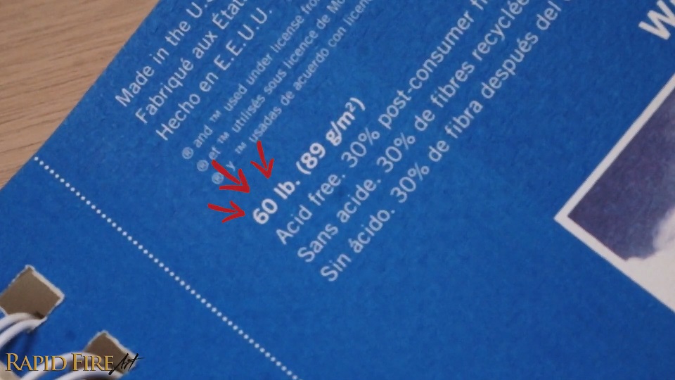
Aim for a smooth-feeling paper that still has enough thickness so your pages don’t warp or tear easily. If you’re shopping online, you can usually get a sense of the paper weight from the listing – something in the 50 to 60 lb range is a good starting point.
If you plan on keeping your sketchbook long-term so you can track your progress, make sure it’s acid-free so your drawings don’t fade or yellow over time. The Strathmore 300 Series is a good choice.
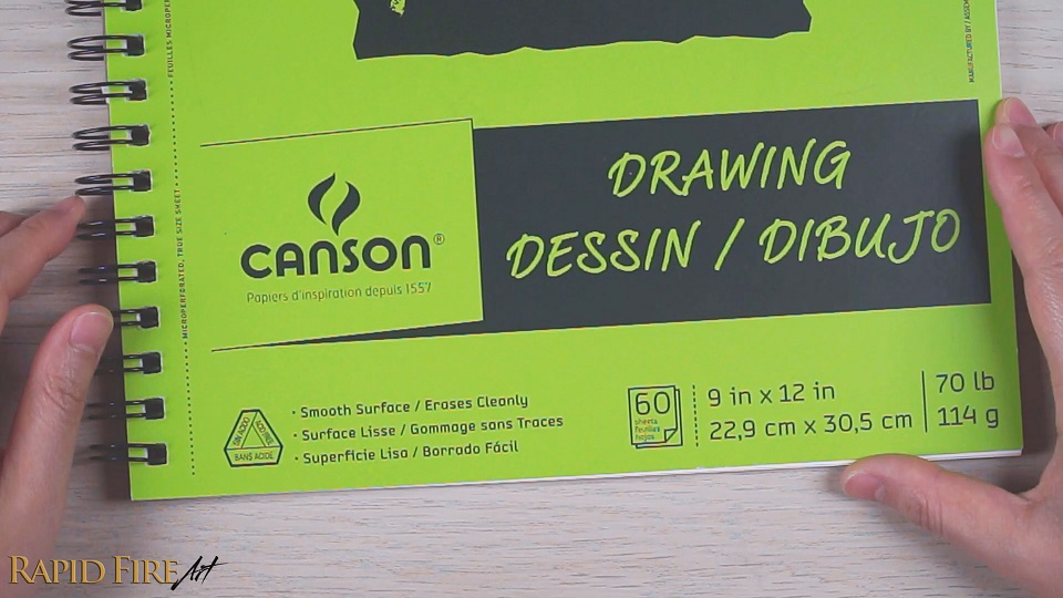
#2: Quality Drawing Paper
While a sketchbook is perfect for everyday practice, I also like keeping a pad of higher-quality drawing paper on hand for more finished work. Drawing paper is usually better at handling heavier graphite, more layering, and more detailed shading without breaking down as quickly. For reference, one of the longer drawing sessions I’ve done on this paper was 10 hours, and it held up without any issues or noticeable wear, even with heavy shading.
Because of that, you can achieve drawings with greater detail and depth. They also come in a wider range of textures, so you can choose a surface that better fits the kind of look you’re going for, the types of medium you use, and your personal drawing style.
10-hour drawing using Canson XL Drawing Paper
6-hour drawing using Canson XL Drawing Paper
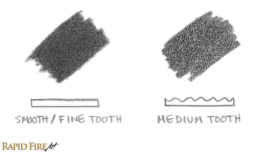
When choosing paper, pay attention to the texture, often labeled as the “tooth.”
A smooth or fine tooth is great for detailed drawings and clean shading transitions, making details like hair/fur show up cleanly, while a medium tooth has more texture and can hold additional layers of graphite or colored pencil, making it better for building depth. My go-to paper is Canson XL Series Smooth Drawing Paper. This is the paper I use for most of my drawing tutorials. I usually stock up whenever I find it on sale because I go through quite a bit of it.
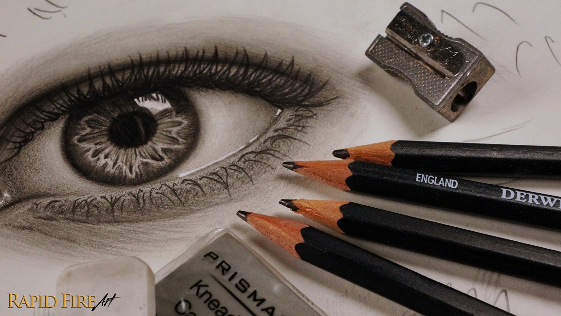
#3: Drawing Pencils
You can clearly tell which pencils I use the most!
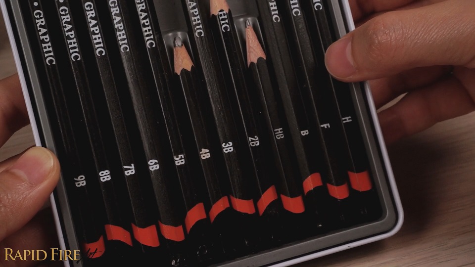
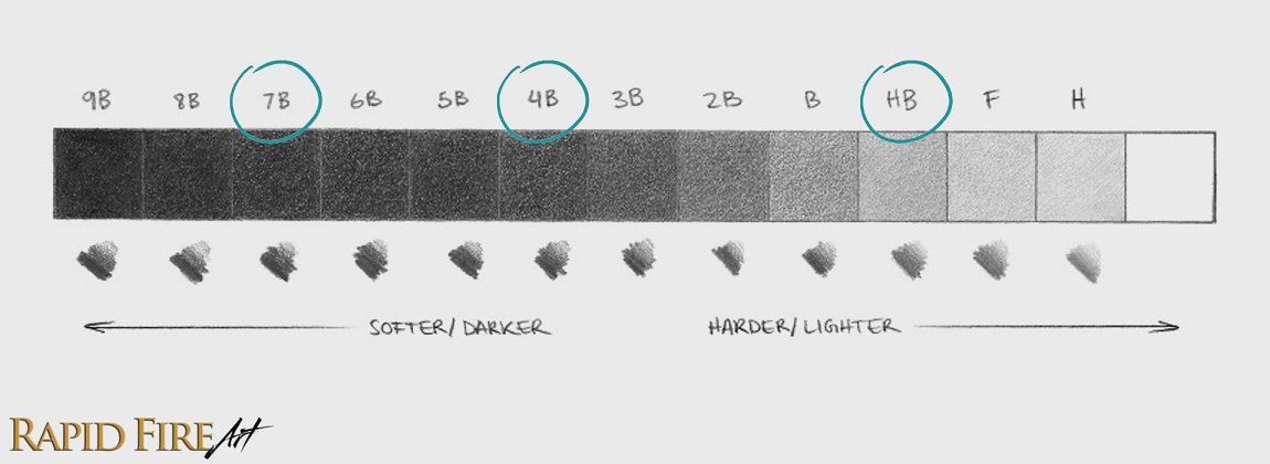
Now let’s talk pencils. Most people are familiar with the HB or number 2 pencil from school, and it’s actually great for sketching and practicing. But when you want more contrast, depth, and darker values in your drawings, softer pencils become incredibly useful. Softer pencils are also much easier to blend. They also tend to blend more easily than harder grades.
A drawing pencil set typically includes a range of grades from soft to hard, giving you access to both dark and light values. You definitely don’t need every single grade (just like you don’t need every sandpaper grit for a carpentry project), but having a variety of pencils makes shading smoother, more efficient, and easier on your hand because you don’t have to work as hard to achieve the values you want.
If you’re on a budget, you don’t need a full pencil set. You can get by with just two or three pencils. One harder pencil is perfect for sketching, construction lines, and light shading, and then one or two softer pencils will handle your mid-tones and darker values. If you prefer to keep things simple and only want a single pencil, I’d recommend a 4B. It’s dark enough for shading deep values while still being versatile enough for sketching and general drawing.
I used Derwent Graphic Pencils for many years before switching to Staedtler Lumograph Pencils. While both are great options, I prefer the Staedtlers because I find their texture more consistent and I haven’t experienced any lead breakage while sharpening them.
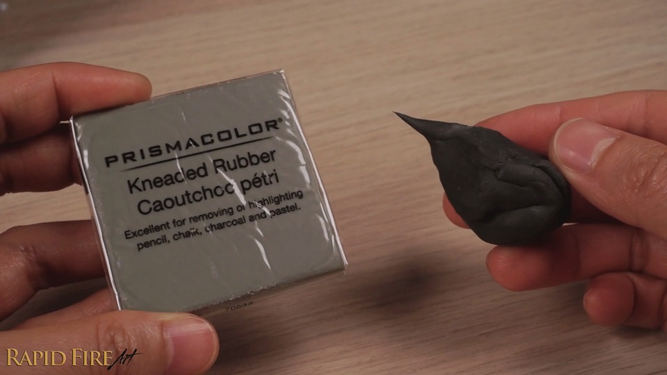
#4: Erasers
I also recommend having two types of erasers. A solid plastic eraser, like the Tombow Mono eraser, is great for removing larger areas or cleaning up parts of your drawing where precision doesn’t matter as much.
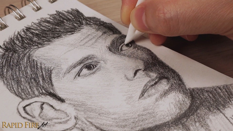
Then, for fine detail work, a kneaded eraser is incredibly useful. You can shape it however you want, and it lets you lift graphite gently without rubbing or damaging the paper. You can buy one or make one using my DIY tutorial!
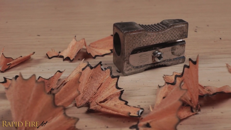
#5: Reliable Pencil Sharpener
A good sharpener also makes a big difference. I personally like all-metal sharpeners because they feel more stable and give you a consistent, sharp point every time. If you tend to use softer pencils or draw with a heavier hand and need to sharpen often, an electric sharpener can save a lot of time.
#6: Transparent Ruler
A ruler is another simple but important tool, especially for perspective drawings and construction lines. A transparent ruler is especially helpful because you can see your drawing underneath it instead of blocking your view while you measure or align things. There’s no need to spend a lot of money here. Any transparent ruler from the dollar store will do the job. Just make sure the edge is smooth and free of rough spots so it doesn’t wear down your pencil tip as you draw against it.
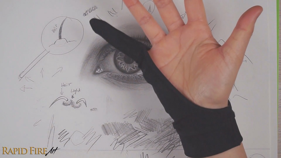
#7: Drawing Glove
To avoid smudging your work, place a clean scrap piece of paper under your drawing hand as you work. This prevents your skin from smearing graphite across the page or leaving skin oils behind, which can stain and ruin your drawing.
If you don’t want to keep shifting a sheet of paper around, a drawing glove is an even better option since it moves with your hand and protects the surface as you draw. Smudging isn’t just an aesthetic issue, it’s also just annoying to constantly erase marks from your hand or stop to wash up mid-drawing. I also avoid drawing immediately after washing my hands, since any leftover moisture can slightly wrinkle the paper. I usually wait a few minutes before getting back to work.
I have several drawing gloves, including one that’s made specifically for traditional drawing. But honestly, the gloves that came with my digital drawing tablets work just as well. Traditional drawing gloves can also be surprisingly hard to find on their own and are often more expensive than they need to be, so there’s no need to hunt down a glove specifically marketed for graphite or pencil drawing. In my experience, a standard digital drawing tablet glove can work just fine.
Just make sure it fits your hand properly so you don’t have excess fabric dragging across the page. While a glove does help reduce smudging and the transfer of oils, it doesn’t completely prevent it. You still need to be mindful not to drag your hand forcefully over your drawing.
#8: Blending Tools
For blending, you don’t need anything fancy. A simple facial tissue, Q-tip, or even toilet paper works really well.
Blending with a folded facial tissue
If you need a finer point for detailed areas, you can fold a tissue over a couple of times and then into a triangle shape until you get a sharp edge. As it gets dirty, just switch to a clean section and refold it.
Those are all my essential drawing tools for beginners. If you have any tools you personally rely on, feel free to share them in the comments to help other beginner artists out. Thank you!
Darlene created RFA In 2013 with the goal of sharing simple yet detailed drawing tutorials with other artists on the world wide web. She is a self taught pencil portrait artist and Youtuber.
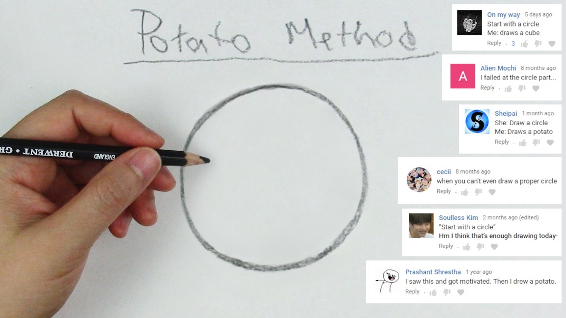
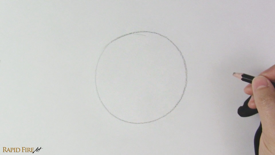
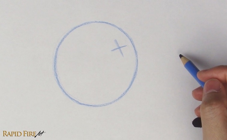
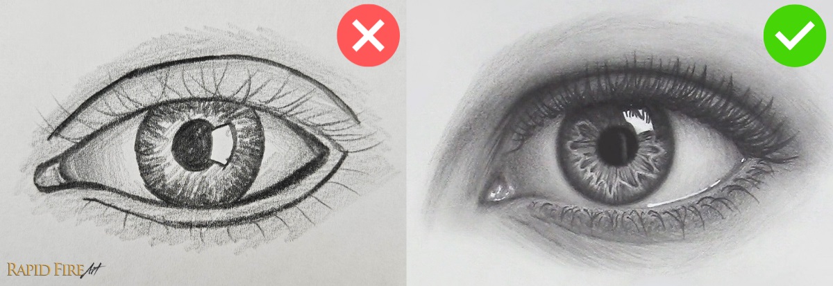
I get a lot of comments from people saying they can’t draw circles, or that their circles look more like potatoes or ovals. If that sounds familiar, this tutorial is for you.
We’re going to work completely freehand, so all you’ll need is a pencil, eraser, and sketchbook. If you’ve been wondering how to draw a circle without a compass, I’ve got three methods you can try below. To prove that these methods actually work, I’ll use my non-dominant hand. As long as you know what a circle should look like, you should be able to draw one, even if you’re picking up a pencil for the first time.
Here are three different methods for drawing circles.
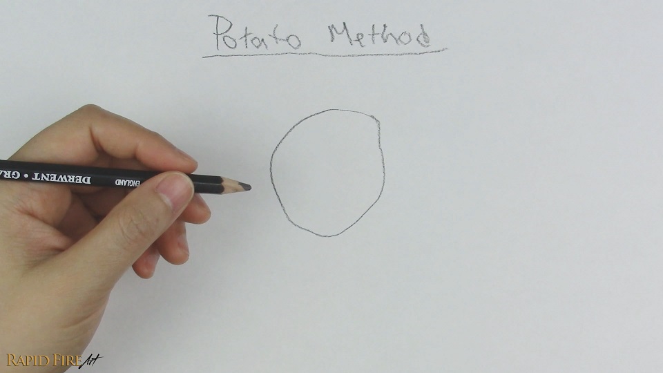
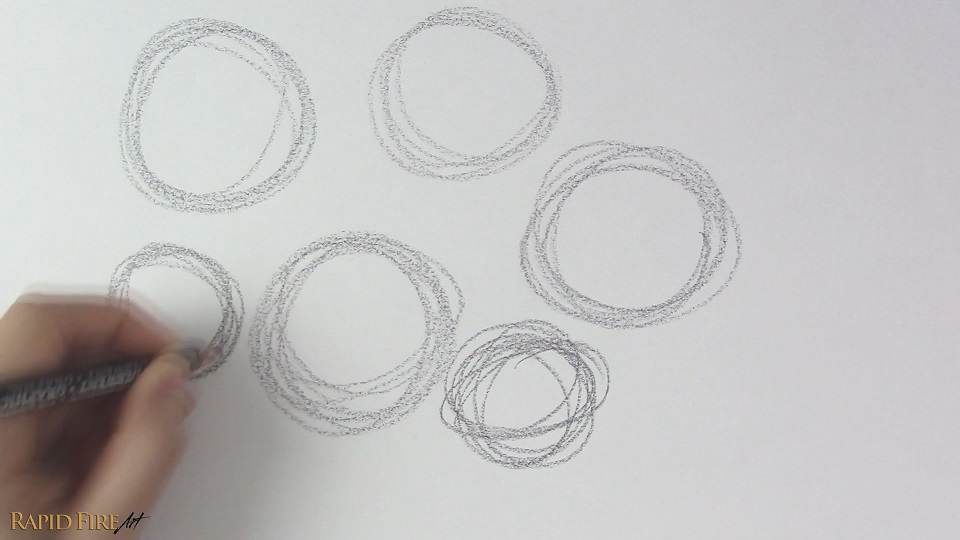
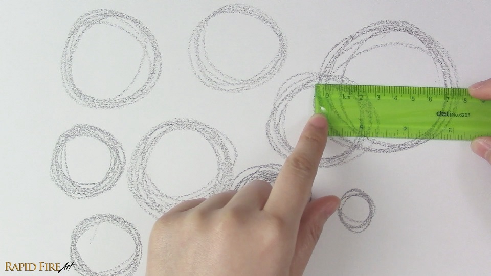
Method 1: The Potato Method
I’m calling this the Potato Method because our first attempt at a circle can sometimes end up looking a little more like a potato.
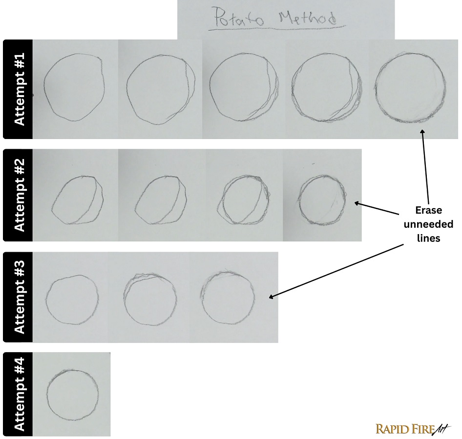
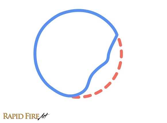
The first step is to draw your potato… I mean, just draw the best circle you can, even if it looks rough or uneven. Then reshape it using additional lines until it looks more circular. There’s no rule saying circles have to be drawn in one perfect motion, so take your time.
Once your shape is as close to a circle as possible, erase any unneeded lines. Don’t be afraid to use your eraser – It’s not cheating!
The more you practice this method, the fewer corrections you’ll need to make and the smoother your circles will become naturally. After 4 attempts, using my non-dominant (left) hand, my circle is already looking pretty good! No additional lines were needed to fix the shape, and I’m happy with it even without erasing anything.
If you’ve been avoiding circles because they seem too difficult, hopefully this method gets you to at least try drawing one. Don’t worry about getting it perfect on the first attempt. The whole point of this exercise is to make adjustments as you go.
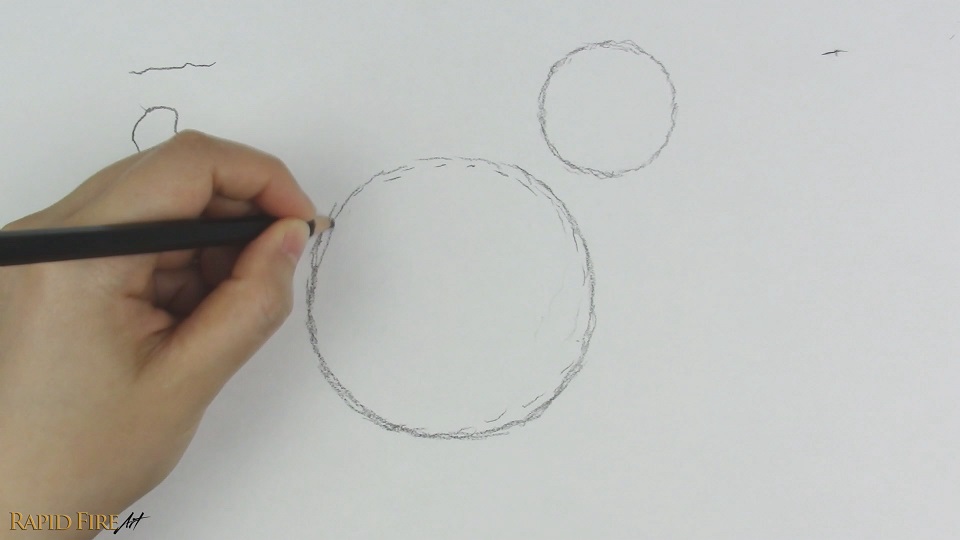
Method 2: Using Short Strokes
This method is great if your lines come out shaky or are hard to control.
Instead of trying to draw one smooth circular line, use a series of short strokes and slowly shape them into a circle. Small circles are usually easier to draw than large ones, so start small if needed.
If your hand blocks your view, try drawing in the opposite direction. The difficult part is visualizing the circle in your mind and then tracing it with your hand, so don’t expect perfection right away. If you make a mistake, don’t restart from the beginning. Just adjust your path where the mistake happened and continue from there.
Over time, you’ll start noticing patterns in your mistakes, which makes them easier to correct before they happen. For example, when drawing with my left hand, I noticed my circles tend to get dented in the bottom-right area, so that’s the part I pay extra attention to whenever I draw one. Since I already know where the mistake is likely to happen, I can correct my path ahead of time, and with practice, the dent becomes less and less noticeable.
As your hand gets more comfortable with these motions, gradually practice using longer, smoother strokes to build your muscle memory. Over time, you’ll gain better control over your hand and get it to do what you want it to.
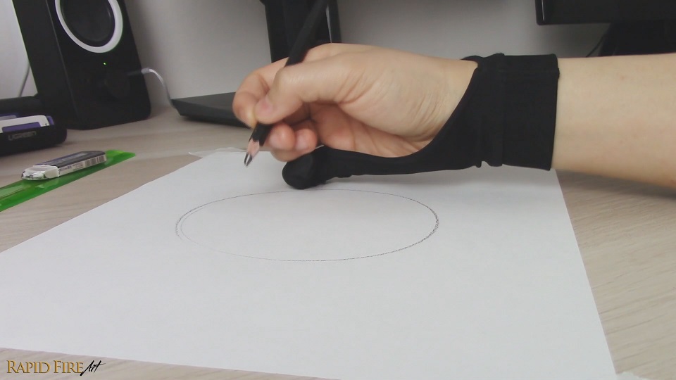
Method 3: How to Draw Circles Smoothly
This method takes more practice, but it’s useful for drawing large circles quickly and cleanly. It’s best explained in video format, so please refer to the video below for a thorough explanation:
Instead of drawing mostly with your fingers and wrist, try using your elbow and shoulder instead. The fewer joints you need to control, the easier it is to create a smooth circle. Hover your pencil slightly above the paper while making circular motions in the air. Once the motion feels smooth and looks circular, lower the pencil and draw the circle.
You can lightly rest the side of your hand or pinky on the page to help stabilize your motion.
If the movement feels awkward, try reversing the direction you’re rotating. Sometimes one direction feels much smoother than the other.
A great way to practice this method and clearly see the output of your arm movement is to keep your pencil connected to the page from the very start and draw continuous circles over and over again instead of hovering first and drawing a single circle. This helps cement the circular motion into your muscle memory much faster while also making it easier to quickly catch mistakes and adjust your arm movement accordingly. Filling a few pages with spirals like this is actually really good practice and will help the motion start to feel more natural over time.
You can use this technique to draw both small and large circles, but you’ll probably notice that larger circles feel easier because your elbow and shoulder naturally work better across larger movements.
Circle Drawing Exercises
If you’d like some guided practice, here are a few simple exercises you can follow:
Potato Method Exercise: Fill a page with circles using the potato method. For each new circle, challenge yourself to use fewer corrective strokes than the last. As you work, pay attention to any patterns in your mistakes so you can adjust your hand movement with each new potato.
Short Stroke Exercise: Draw a row of very small circles using only short pencil strokes. For each new row, make the circles slightly bigger while trying to keep them as round as possible. As your control improves, challenge yourself to use longer/fewer strokes to complete each circle. You may be surprised at how quickly your hand starts building muscle memory for smooth lines.
Spiral Exercise: Keep your pencil on the page and draw continuous circles over and over again, creating a spiral pattern. This is a great way to build muscle memory and improve your circular arm movements. Try to fill about 3 pages with this exercise – it goes by quickly, and the repetition really helps lock in the motion.
Size Variation Exercise: Set a 3 minute timer, anchor your hand on the page, and hover your pencil a few millimeters above your sketchbook. For the full 3 minutes, make circular motions with your pencil in the air, focusing on creating a consistent circular shape. It may help to sit directly over your sketchbook so you can observe the motion of your hand and pencil from above. Try to minimize movement in your fingers and wrist while maintaining a consistent hover height. You may find it helpful to focus on just one aspect at a time, such as hover height, circularity, or reducing finger movement.
Once your motions feel smooth and consistent, begin drawing a series of circles, starting very small and gradually increasing their size until they fill most of the page. Then work your way back down to small circles again. Pay attention to which sizes feel the most difficult and spend extra time practicing those.
Try spending just a few minutes on these exercises whenever you sit down to draw. Consistent practice will improve your hand control and make drawing circles feel much more natural over time.
Final Thoughts
The potato method helps you build circles through correction and reshaping.
The short-stroke method improves your hand control if you’re new to drawing and struggling to draw smooth, continuous strokes.
The third method trains your arm to draw smooth circles using broader movements, making it suitable for a wide range of circle sizes, especially larger ones.
Whichever method you use, the key is consistent practice. The more often you draw circles, the more natural the motion will feel as you build up your muscle memory over time. I hope you give these three methods a try and let me know how it goes!
Does shading feel intimidating? Here’s a shading guide and tutorial that breaks everything down – from elements of good shading, to how to hold your pencil, and how light works to create the illusion of form and depth.
Darlene created RFA In 2013 with the goal of sharing simple yet detailed drawing tutorials with other artists on the world wide web. She is a self taught pencil portrait artist and Youtuber.
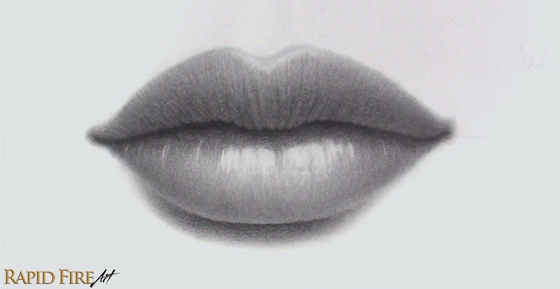
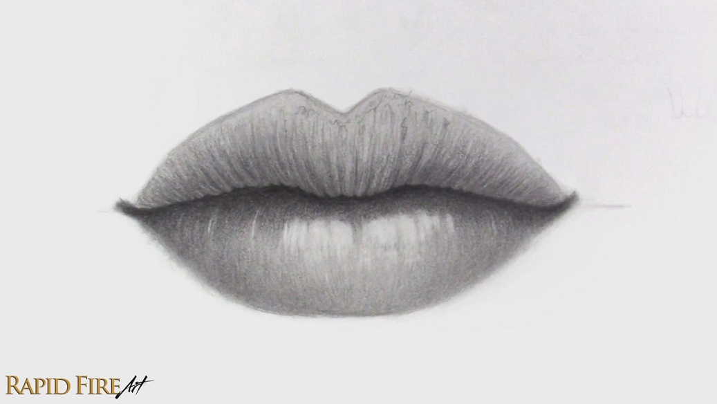
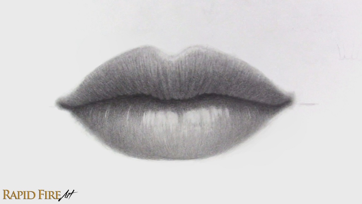
Hey, I’m Darlene and in this tutorial, I’m going to walk you step-by-step through my process of drawing a pair of thin lips, from the initial construction lines to shading, highlights, and final details.
Before starting this tutorial, it helps to already understand basic lighting and how it wraps around forms. If you’re not familiar with that yet, I’d recommend reading my shading tutorial first, since it will make the shading process much easier to understand.
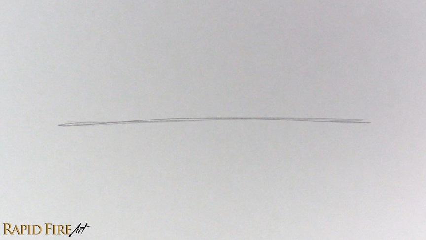
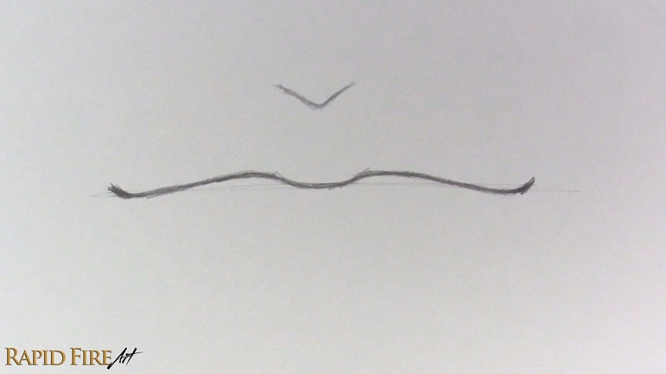
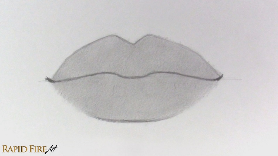
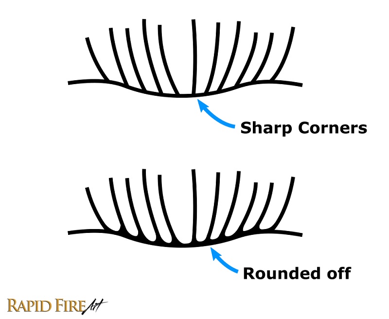
Step 1: Draw a Line
Begin by lightly drawing a curved line using an HB pencil. This line doesn’t need to be perfect since it’s only there to guide the direction of the lips. The curve can tilt upward, downward, or sit flat depending on the expression you want. Just keep it very light because this will eventually be erased.
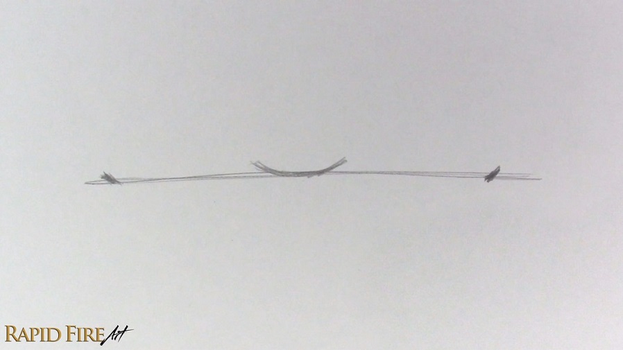
Step 2: Draw the Center and Corners of the Lips
Along the line you just drew, draw a shallow “U” shape for the center point of the mouth. From there, draw small ticks on each side for the corners of the mouth. Make sure they are evenly spaced. The further apart the ticks are, the wider the mouth will appear. You can adjust this based on your preference. If you’re going to add this onto an entire face, I like to vertically align the corners of the lips with the middle of the eyes. To learn how and where to draw lips on a face, please refer to my face drawing tutorials based on the Loomis method.
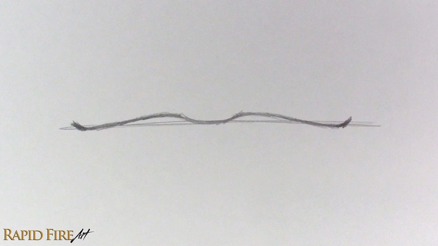
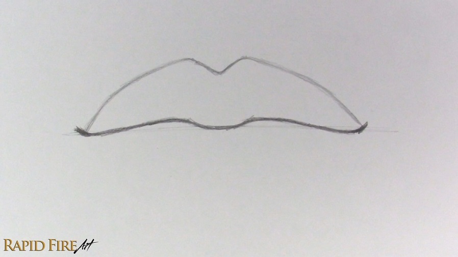
Step 3: Complete the Opening of the Mouth
Now we’re going to play connect-the-dots! Using a wavy line, connect the corners of the mouth to the center. I’ve drawn a very stretched out “W” shape. Try to keep both sides symmetrical. You can use your construction line from step 1 as a reference for symmetry. Once you’re happy with the shape, erase that first construction line since we won’t need it anymore.
Step 4: Draw a Thin Top Lip
Start building the upper lip from the center and work outward toward the corners. We’ll start by drawing a big “V” shape above the mouth’s opening. You can draw different shapes depending on the look you want, such as a smooth, shallow curve or almost a straight line. Adjust the height of this “V” based on how thick or thin you want the top lip to be.
As you connect the cupid’s bow to the corners, make sure both sides feel level and symmetrical.
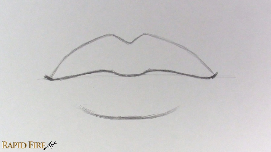
Step 5: Draw the Bottom Lip
Again, start from the center and work outward.
The distance between the mouth’s opening and the bottom lip edge will determine how thin the lips appear, so keep that spacing small. As you approach the corners, allow your strokes to fade out. We are going to avoid connecting the bottom lip outline to the corners of the mouth, unless you want to draw a mouth with dark lipstick or full lips that curve out to a great extent.
If you are interested in drawing very plump lips, check out this tutorial.
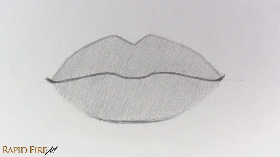
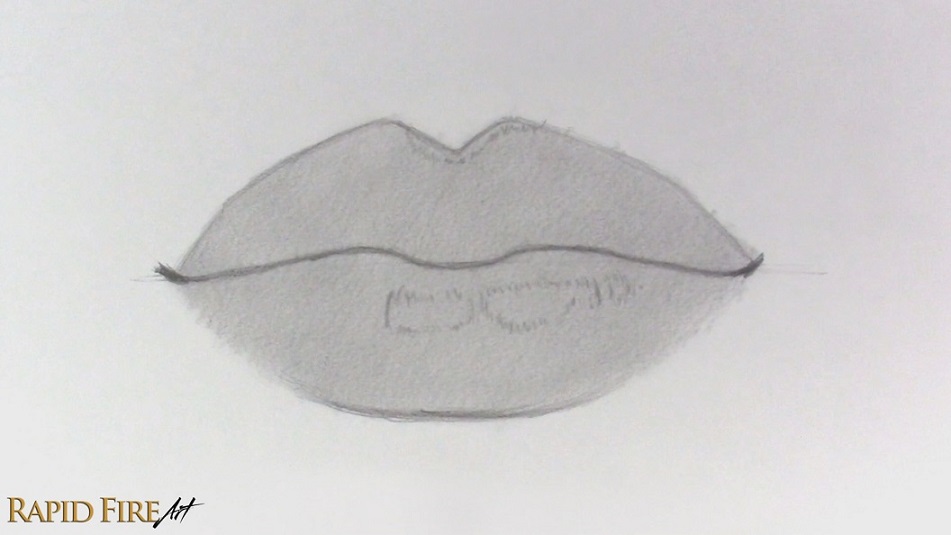
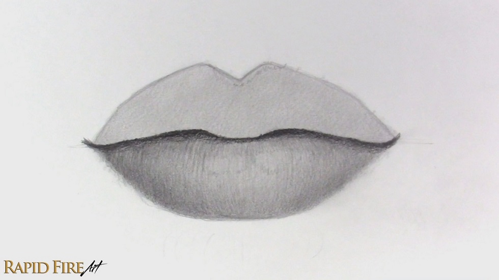
Step 6: Shade a Light Base Layer Across Both Lips
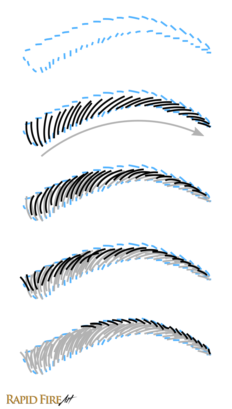
Before adding any detail, start by applying a light and even layer of graphite across both lips. This helps separate the lips from the white of the paper and gives you a mid-tone to build on. I used a hatching technique here, keeping all my strokes going in one direction so the texture stays consistent. Using an overhand grip on your pencil can help you produce smoother and thicker strokes, which makes blending easier later on. Try to reduce any gaps between your strokes so the shading looks as smooth as possible.
Once the graphite is down, use a soft facial tissue wrapped around your finger to gently blend everything. We are going to be layering on a lot more graphite later, so don’t worry if it doesn’t look perfectly smooth. If the tissue becomes too dark or starts creating blotches, switch to a cleaner section and continue.
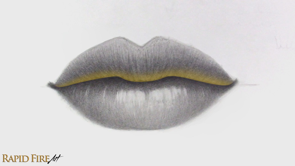
Step 7: Decide on Your Lighting and Mark Highlights
Before adding any darker shading, decide where your imaginary light source is coming from. In this case, the light is coming from the top right, so the upper planes of the lips will be lighter while the lower areas will naturally fall into shadow.
Think of the lips as a curved surface rather than a flat shape. Areas facing the light will always appear brighter, while areas turning away will gradually darken.
Once you’ve decided on your lighting, lightly mark out the highlight zones so you don’t accidentally shade over them later. These areas will be the lightest areas of the entire drawing and will help with conveying the curvature of the lips. You can see that my highlights are positioned more toward the right side where the light is coming from. I’m outlining the highlights using short strokes that follow the contour of the lip’s surface so when the drawing is completely shaded in, these outlines will naturally blend right in instead of having to be erased.
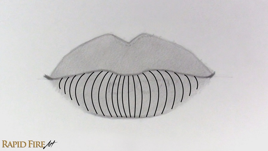
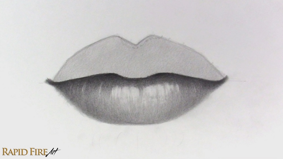
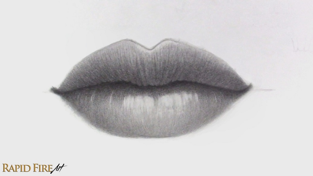
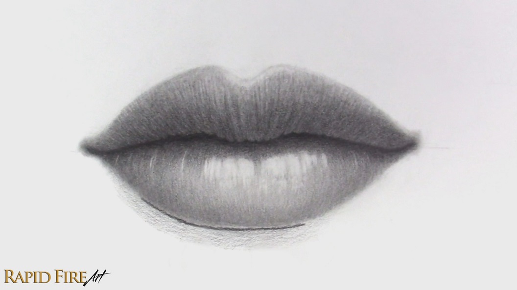
Step 8: Shade the Bottom Lip
Now begin shading the bottom lip (still using an HB pencil). Instead of hatching, I’m switching to contour shading – This is where my strokes follow the curvature of the lips. These lines should wrap around the form rather than sit flat, because that helps the lips feel more three-dimensional. They also double as lip wrinkles!
I used the pointy part of my pencil to draw these lines, but you can use a dull tip if you want the wrinkles to appear more subtle so the skin is less textured. As you build up your contour lines, aim for a uniform value. Once you’re happy with the lip shape, make the bottom of the lip darker since it curves away from the light source. You can flick your pencil upward for each stroke to make the value transition between dark and light more gradual.
Add a cast shadow along the very top of the bottom lip using a softer pencil like a 5B. Using a softer pencil helps avoid hand strain and makes it easier to achieve darker values with less effort. If you don’t want your drawing to be too dark, using an HB pencil will help prevent that. This cast shadow is caused by the top lip blocking light from reaching the bottom lip. The darker you shade this, the deeper the separation between the lips will appear and the more curved the bottom lip may come across.
Use your pencil to blend those new values into the lip area below, creating a gradual value transition. Avoid shading into the highlight outlines we created earlier. Blend all your shading along the bottom lip, going from light to dark to avoid smudging your work.
Use your kneaded eraser to remove graphite from the areas we marked out for the highlights. I used a downward swiping motion to get the bottom section of the highlight to fade out. You can add thin highlights following the contour of the lips in random areas.
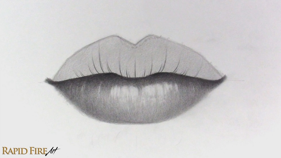
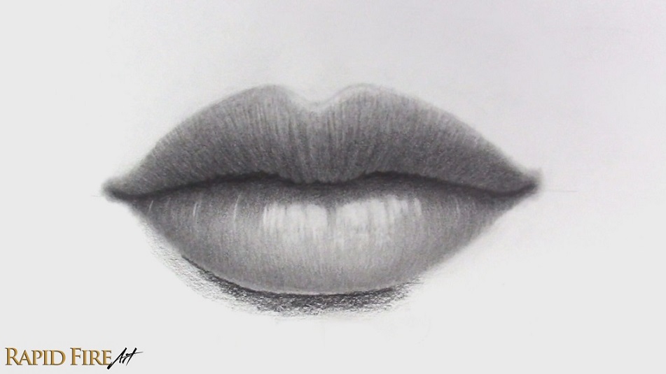
Step 9: Shade the Top Lip
We’re going to follow a similar process for the top lip, except this time I want the lip to appear flatter, so I’ll use contour lines with less curvature (the contour lines above are just an example – I won’t actually draw them this dark). Since the top lip tends to have a more bunched-up skin texture, I’m also going to make the contour lines more noticeable than the ones on the bottom lip.
After drawing your contour lines using an HB pencil, identify the most prominent ones and then go along the bottom edge of the lip to bunch up the skin using your 5B pencil. Do this mostly near the center and less near the corners of the lip.
Below is an example of how I did this:
If there aren’t many prominent contour lines, you can bunch the skin first and then extend a dark contour line from each concave section. Lighten your strokes as you work your way up, so the top of the lip looks smoother.
With your HB pencil, darken contour lines that are most prominent so they come across more like wrinkles.
If they just look like lines instead of wrinkles, shade along each one slightly while lightening your pressure as you reach the mid-point between the next wrinkle. Now the skin should look bumpy.
Shade the bottom of the lip darkest, while using contour shading, but keep the very bottom a bit lighter to account for reflections that hit the bottom lip and bounce back up. This is a small detail that may not feel like it makes a difference, but it absolutely does 🙂
Continue shading upward to make the top of the lip gradually lighter. Use your eraser to lighten the highlight zone that we sectioned off in step 7 along the top of the lip. After shading the top lip, you may notice that your lip outline has blended in. If it hasn’t, lighten or erase it so there isn’t an unnatural outline around your drawing. My cupid’s bow outline is still very apparent…
We need to make the outline disappear to improve the realism of our drawing. You can do that in a few ways:
Lighten the outline with an eraser and then blend to soften it out.
Or shade the skin above the lips to make the outline blend in/disappear
Then blend your work. Make sure to blend the corners of the mouth too.
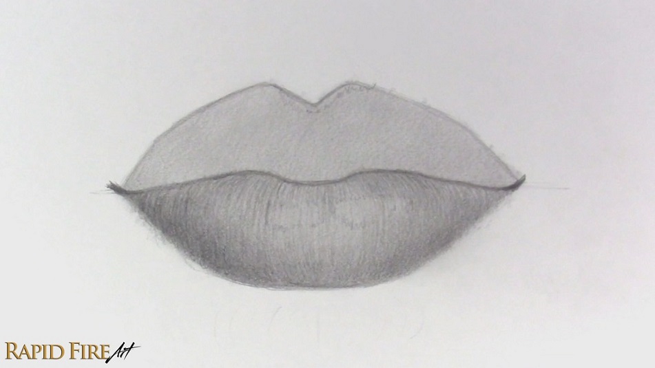
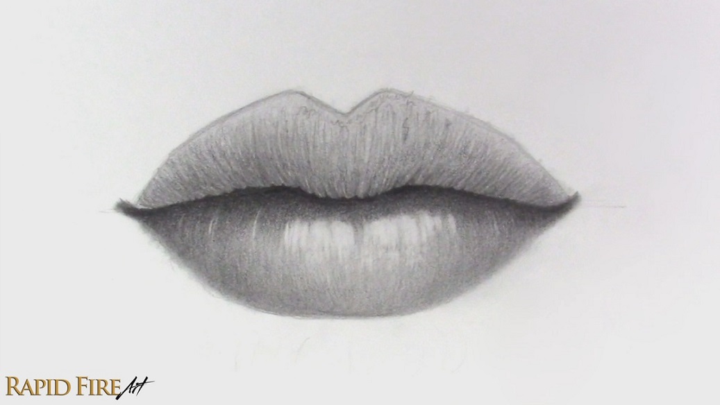
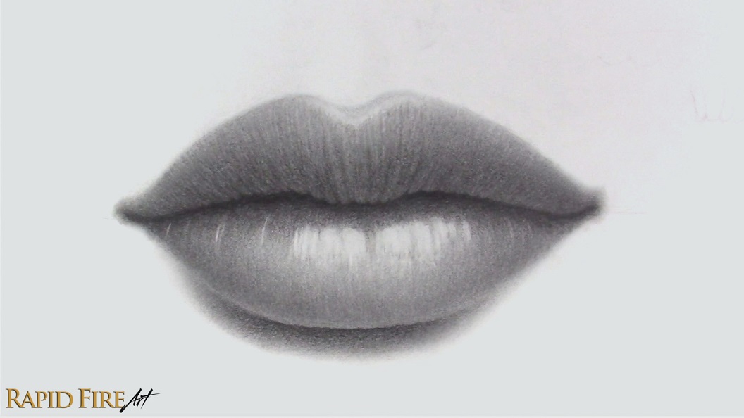
Step 10: Add a Cast Shadow Below the Bottom Lip and Apply Final Touches
Let’s draw a cast shadow under the bottom lip to help lift the lips off the page a little more. Switch back to the 5B pencil or stick to an HB if you want a more subtle cast shadow. Start by drawing a clean line along the bottom left edge of the lip (opposite the light source). This line acts as a boundary so the edge of the lip stays crisp instead of looking muddy or roughly shaded.
Shade as dark as you want directly underneath this new line, fading out as you work your way down.
Blend this cast shadow very well, making sure the bottom edges are soft. Avoid blending too close to the bottom lip so the boundary stays clean and defined. Now take a step back and look over your drawing. This is a good time to polish up any areas that feel inconsistent or flat. I like to check my shading for uneven values and see where I can increase contrast to make the drawing stand out more.
I used my kneaded eraser to brighten a few highlights and my 5B pencil to deepen the cast shadow beneath the top lip.
I also added a subtle value above the cupid’s bow and blended it out very softly. I like how this makes the highlight stand out more without looking too harsh.
Once you get comfortable with the construction and lighting process, you can use the same method to draw many different types of lips.
Darlene created RFA In 2013 with the goal of sharing simple yet detailed drawing tutorials with other artists on the world wide web. She is a self taught pencil portrait artist and Youtuber.
A while back, I went through a pretty frustrating artist block. For those of you who’ve followed my work for a while, you know I mostly draw realistic portraits. I find them really rewarding, but whenever I go from a finished piece to the next blank page, there’s this huge psychological hurdle.
I knew I needed to keep drawing so I wouldn’t get rusty, so I started filling my sketchbook with anything and everything. What helped most was removing the pressure of creating something impressive or perfect and relearning how to just enjoy drawing again.
If you’re bored, stuck in an art block, or just looking for fun things to fill your sketchbook with, here are some creative drawing ideas that helped me get excited about drawing again!
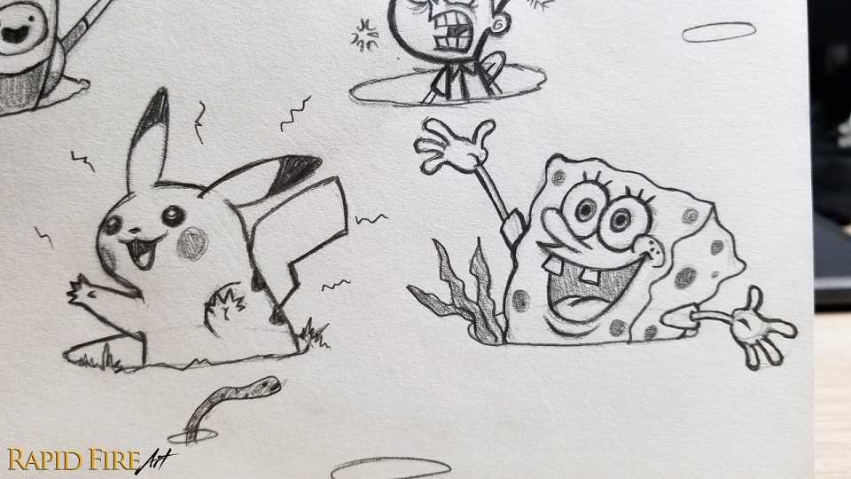
1. Draw Characters Peeking Through Holes
Draw a bunch of oval shapes with some space in between, then pick your favorite cartoon characters, animals, or people and make them peek through or jump through each hole in the ground.
You can decorate the area around each character to match their environment – grass, seaweed, rocks, clouds, whatever fits. I pretty much spent a whole hour on this page because it was so much fun and honestly nostalgic. I’m a 90s kid, so I filled mine with mostly characters from cartoons I grew up watching.
Add as many ovals as you want and try filling the whole page. You can even flip characters upside down so only their legs are sticking out.
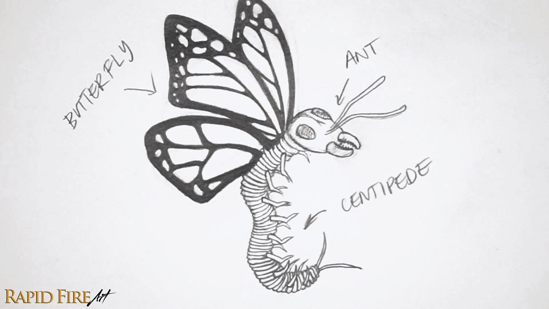
2. Mash Different Animals Together
This one is weird in the best way.
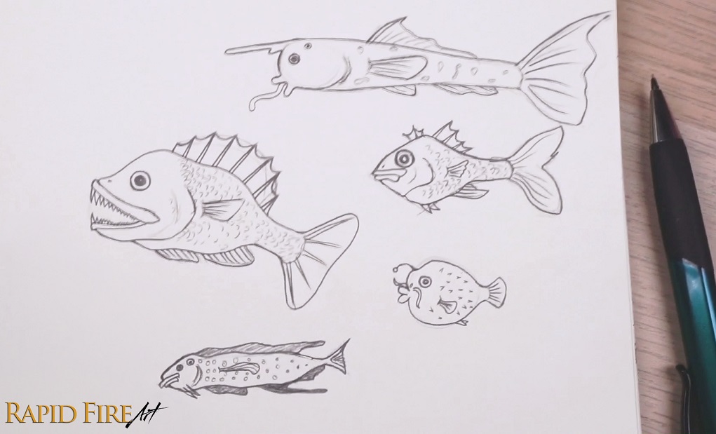
Look up pictures of insects, fish, reptiles, or any animals you want, then combine parts from different species to create something completely unique. I chose three very different bugs and smashed them together into one terrifying creature. I’m not really into drawing butterflies and flowers, but a butterfly-centipede-ant hybrid? Way cooler!
You can also mash together animals from the same category. For example, look up different types of fish and interchange their heads, eyes, fins, bodies, and tails. Or just completely invent something from your imagination.
3. Play With Size
Pick something tiny and make it enormous or vice versa. Maybe you draw a giant grasshopper terrorizing New York City, or a tiny elephant standing on the tip of a pencil. Draw a background that emphasizes just how huge or small your subject really is.
It’s a simple idea, but it instantly makes a drawing more interesting.
4. Fun Panels
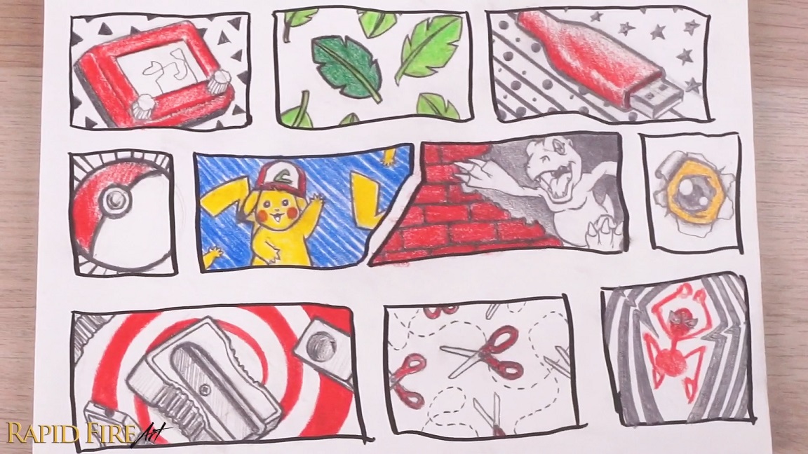
Divide your page into small sections using a grid or random boxy shapes, then fill each section with tiny sketches.
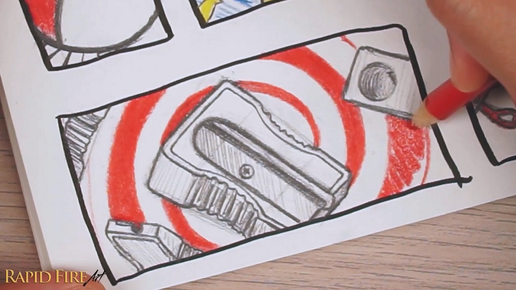
The cool thing is the drawings don’t need to relate to each other at all. Just draw whatever pops into your head. I like adding some color afterward so the page feels more lively. If one box looks bland, try adding patterns in the background. Even boring objects like a USB cable or pencil sharpener start looking interesting when they’re part of a full page of random little drawings.
The completed page almost reminds me of a sticker sheet or comic page, and the randomness makes it really fun to explore. Also, if you draw something you don’t like, don’t immediately erase it. Try transforming it or working with it instead.
5. Draw One Mundane Object From Multiple Angles
Pick any random object and draw it from as many angles as you can. I drew a pencil sharpener from four different viewpoints and then added a dramatic background to make the image more interesting. You can draw swirls so the objects look like they’re getting sucked into the abyss, or explosions so they appear to be flying toward the viewer.
It’s a surprisingly fun way to study forms while still keeping things creative.
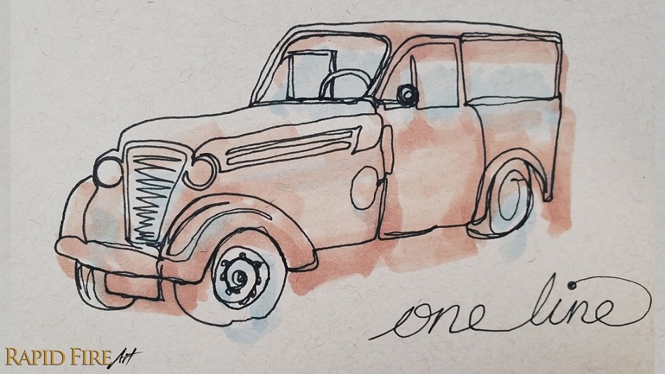
6. Try Continuous Line Drawings
A continuous line drawing is exactly what it sounds like: you create the whole drawing using one unbroken line without lifting your pen.
This exercise is amazing for overcoming perfectionism because you’re forced to keep moving forward instead of obsessing over every mark. I used a marker instead of pencil, which made it even more challenging because if I paused too long, the ink would bleed. It forced me to stop overthinking and just play.
As I kept doing more of these drawings, I found myself embracing mistakes instead of fighting them.
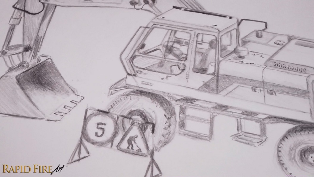
7. Draw Rusty Machinery or Old Equipment
Construction machinery, old farm equipment, exposed wires, hydraulic components. These can all be incredibly fun to draw, especially when they’re rusty, grimy, or falling apart. The intricate details are what make these sketches interesting. Scratches, dents, bolts, dirt, peeling paint… all of that texture gives you a lot to explore on the page.
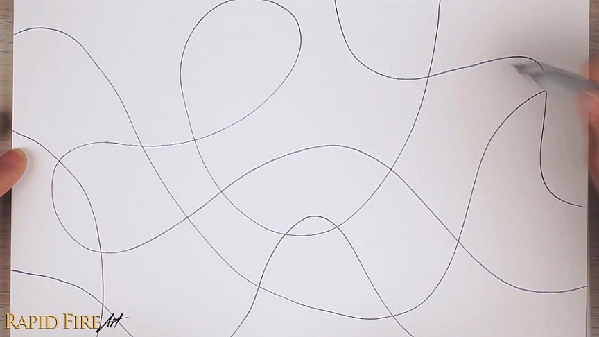
8. Try a Zentangle or Zen Doodle
If you ever feel frustrated or stuck, scribble all over the page and start filling the spaces with patterns.
Use lines, dots, zigzags, circles, waves – whatever abstract patterns you want. My first example is kind of a mix between a zentangle and a doodle drawing. I didn’t even realize official zentangles had specific rules when I made it, so I just experimented freely and mixed in some recognizable shapes too.
One thing I love about it is there’s basically zero pressure. You’re not trying to create a masterpiece. You’re just keeping your pencil moving and letting your brain loosen up creatively.
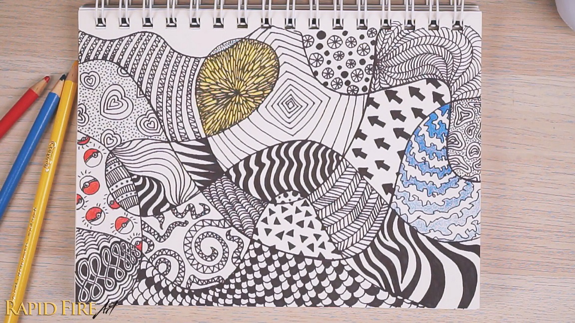
A zendoodle is a little more open and playful. Instead of focusing mostly on abstract patterns, you can mix in doodles, characters, objects, and random little details. You can start by drawing the outline of something simple, like a cat or mushroom, then fill the shape with doodles and patterns. Try squishing the shapes close together so the drawing feels packed with detail.
As I kept going, I started adding little faces and characters into the patterns, and eventually the whole drawing started coming to life. Coloring afterward is optional, but for me it was the most satisfying part because that’s when the page really started to pop.
Also, you absolutely do not need to finish these in one sitting. I have several unfinished doodle pages that I slowly add to whenever I need a quick warmup. It’s actually hard to stop once I start, so beware! Set a timer haha!
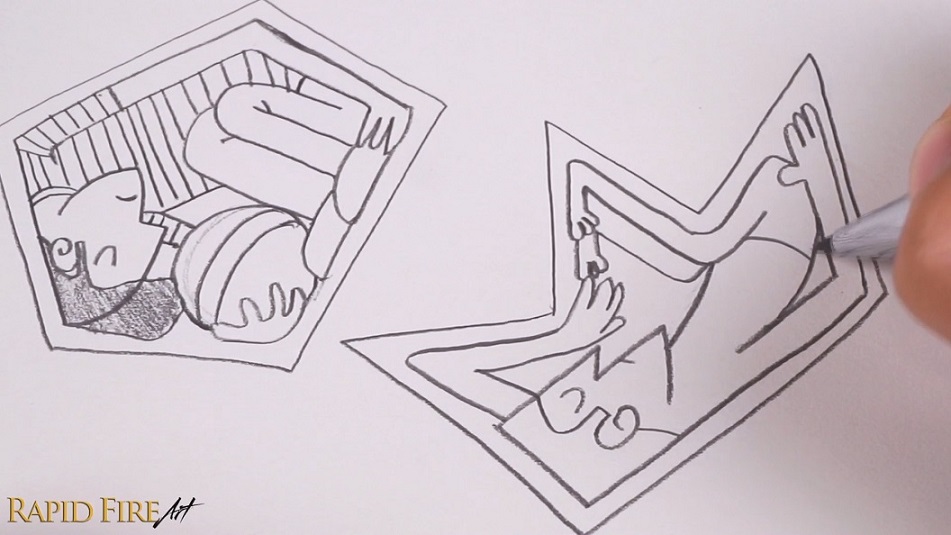
9. Create Random Shapes and Fit Characters Inside Them
This exercise is one I discovered through a class on Skillshare by Tom Froese called ODD BODIES, and it ended up being one of the most fun sketchbook exercises I’ve tried! Draw a random shape with fewer than ten sides, then try fitting a person or character inside it. Every shape creates a brand-new challenge, and you’re forced to figure things out as you go.
What I love about this exercise is how freeing it feels. You can bend limbs in impossible ways, stretch proportions, exaggerate poses, and really play with your imagination. I also discovered that I weirdly love drawing hands and toes in this style. There’s just something funny and expressive about them. Every random shape pushes you to think differently, and figuring out how the body parts fit together makes the final drawing feel really satisfying!
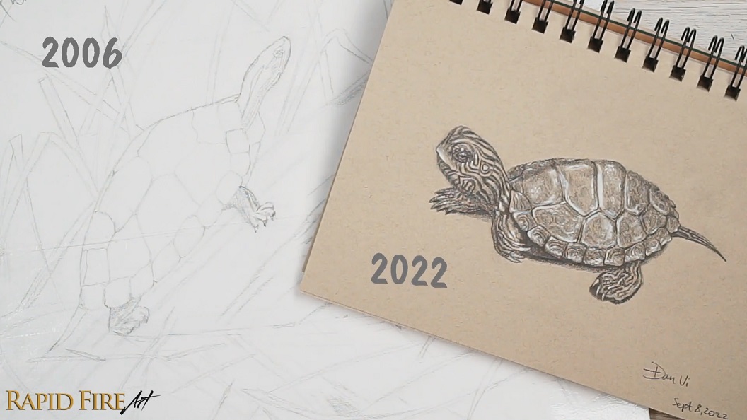
10. Redraw Old Artwork
One of the best ways to remind yourself how much progress you’ve made is to redraw an old sketch. The older the drawing, the better.
I redrew a turtle sketch from 16 years ago and immediately noticed areas I wanted to improve. Back then, I avoided drawing the skin texture because I was afraid I’d ruin the piece. Revisiting it years later made me realize how much more confident I’d become.
Sketchbooks are meant for experimentation, and sometimes it’s nice to look back and physically see your improvement over time. Don’t forget to date your redraws too. Maybe years from now you’ll redraw them all over again!
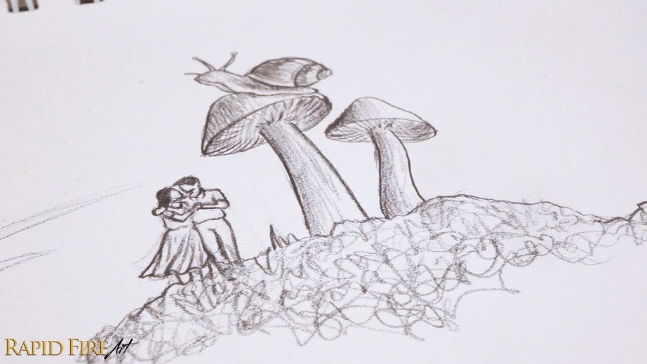
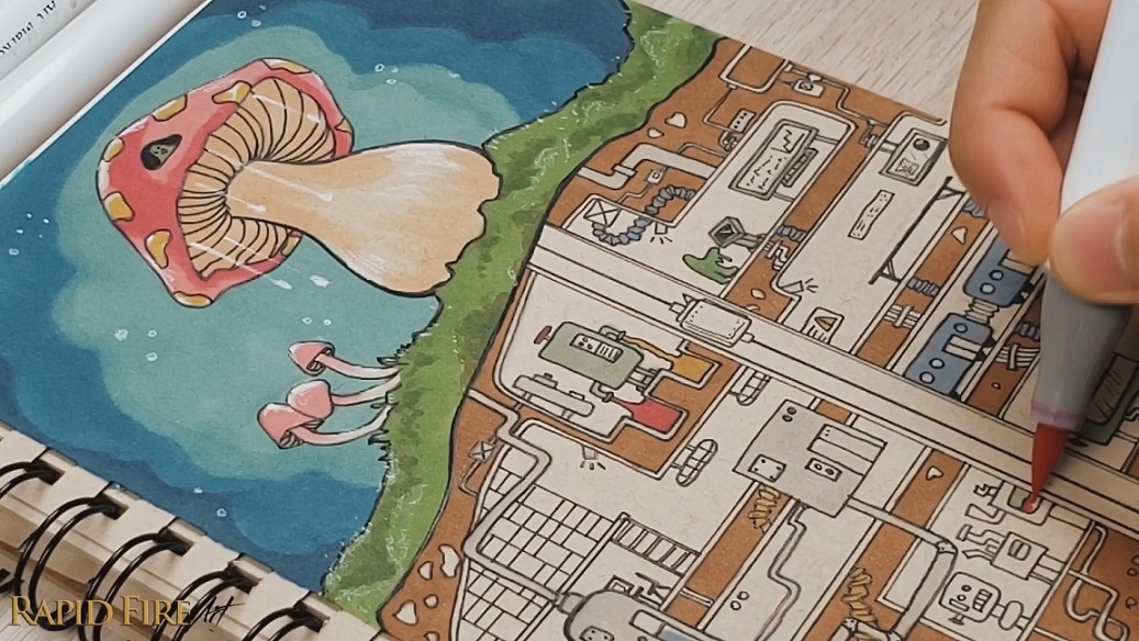
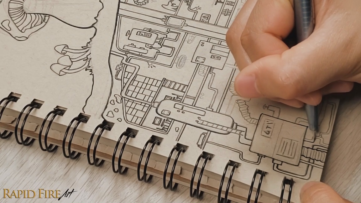
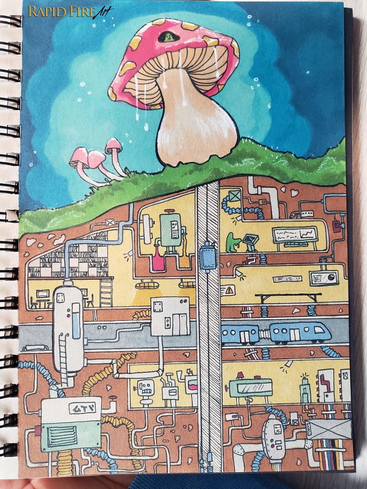
11. Create Contrasting Worlds
This is probably my favorite sketchbook idea because it lets your imagination completely take over.
Create two wildly contrasting environments within the same drawing. For example, I drew a peaceful mushroom forest on the surface with a secret underground tech facility hidden below it. Then I started adding strange slimy characters, pipes that connected to nowhere, slime harvesting systems, trains, hidden guards – the whole world just kept building itself as I drew.
The fun part is you don’t need the full idea planned beforehand. Just sketch one interesting thing and let the drawing evolve naturally.
Try combining ideas that shouldn’t belong together:
A creepy-crawly rock band beneath a Buddhist temple
A luxury shopping mall built inside a collapsing ancient ruin
A futuristic lab inside a giant tree
It’s your world, so nothing needs to make sense.
12. Try a Completely Different Art Style
Sometimes the best way to break out of an art block is to stop drawing the way you normally do.
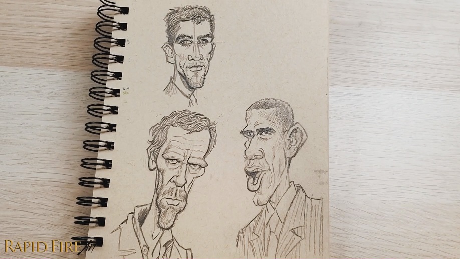
I mostly draw realism, so I started looking at completely different styles of portrait art and eventually got fascinated by caricatures. I loved how artists could exaggerate features so much while still keeping the person recognizable.
At first, drawing caricatures felt intimidating because it was so different from what I usually do. So instead of immediately trying to invent my own, I studied and recreated work from artists I admired like Tom Richmond.
That process helped my brain and hands get comfortable with the style first. By the third attempt, I was already noticing improvement and getting excited to draw more. That’s one thing I love about sketchbooks. You can actually see the learning process happen on the page. Experimenting with completely different styles helped me mentally reset and eventually made me excited to draw realistically again too.
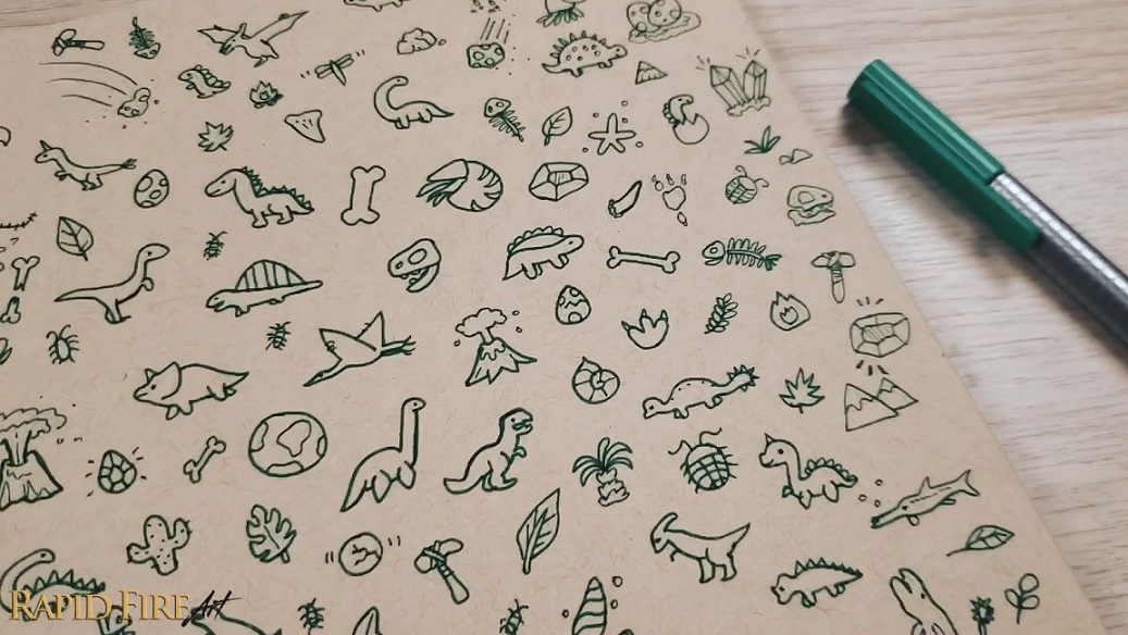
13. Fill a Page With Tiny Doodles
Try to fill a whole page with tiny doodles. Make it a fun challenge by sticking to a theme like:
Prehistory
Plants
Transportation
Space
Food
Going to the beach
Or a super random theme like teeth!
I noticed that after the first 10 doodles, it started getting surprisingly difficult to come up with new ideas. But once I pushed past that point, my brain became weirdly addicted to the challenge! At first, I tried not to repeat the same drawing again, but once the page became so full, it didn’t feel like repeats would be noticeable. Plus, it was actually fun to redraw the same thing from a different angle or in a different pose.
Final Thoughts
When I’m stuck creatively, I’ve found it much more helpful to keep drawing in a low-pressure way instead of stepping away from art completely. A lot of these exercises work because they remove the expectation of perfection. They let you experiment, make mistakes, explore weird ideas, and slowly rediscover the fun of drawing again.
So if you’re staring at a blank page and don’t know what to draw, try one of these ideas and just let yourself play. Do you have any other fun ideas to share? I’d love to know! Leave a comment down below!
Darlene created RFA In 2013 with the goal of sharing simple yet detailed drawing tutorials with other artists on the world wide web. She is a self taught pencil portrait artist and Youtuber.
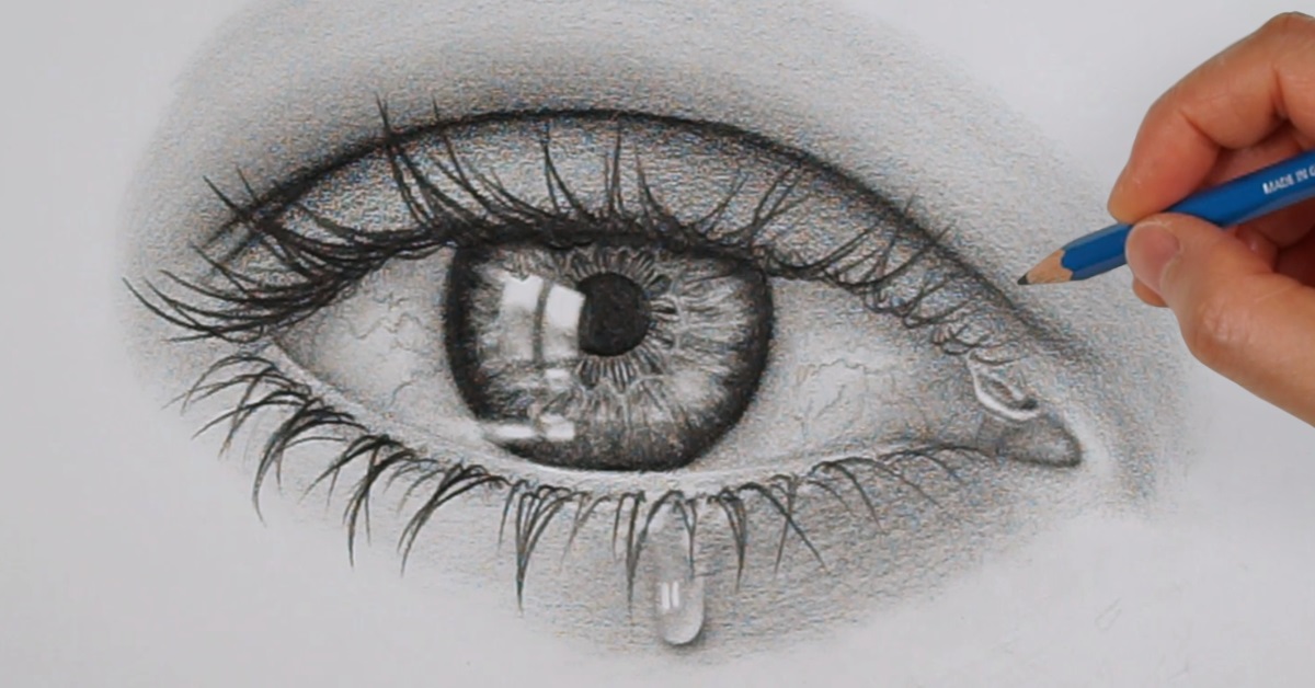
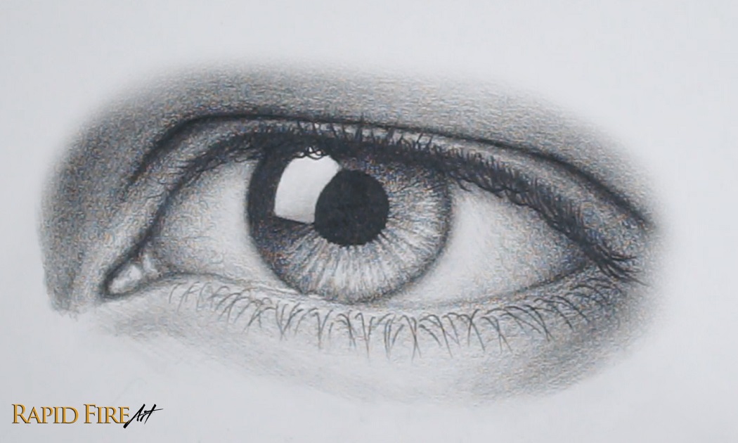
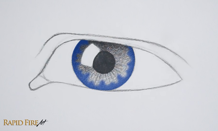
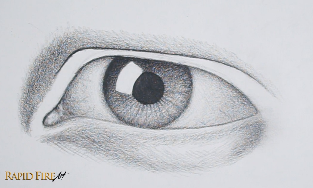
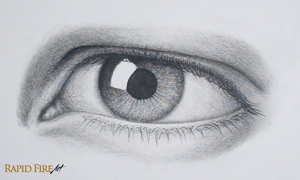
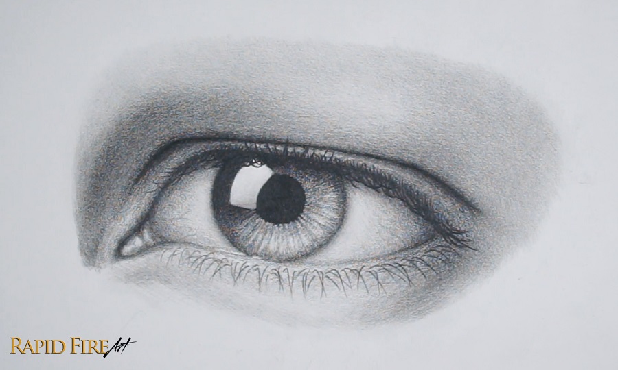
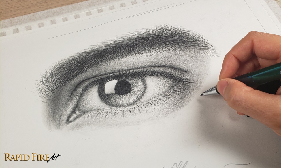
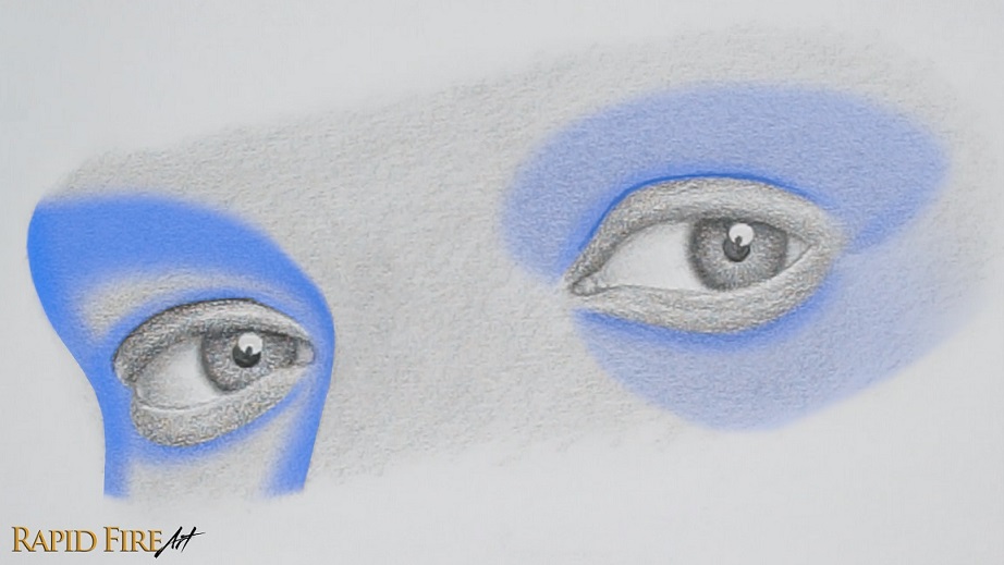
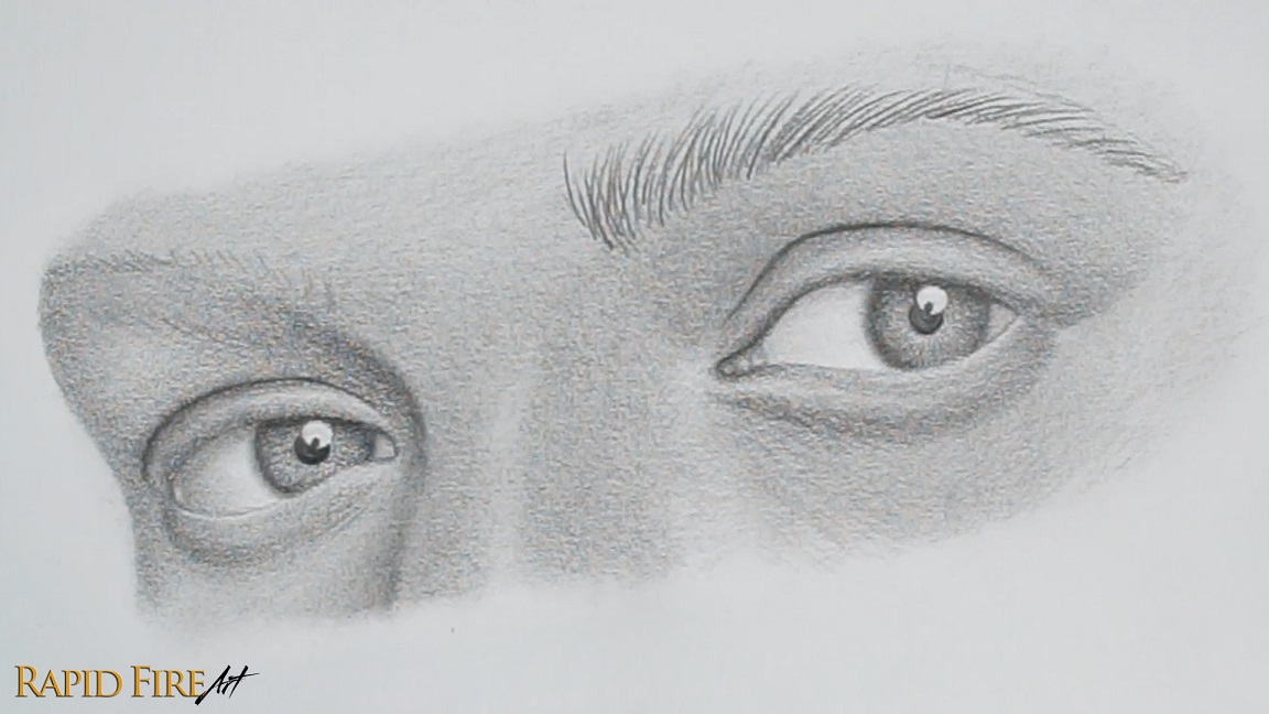
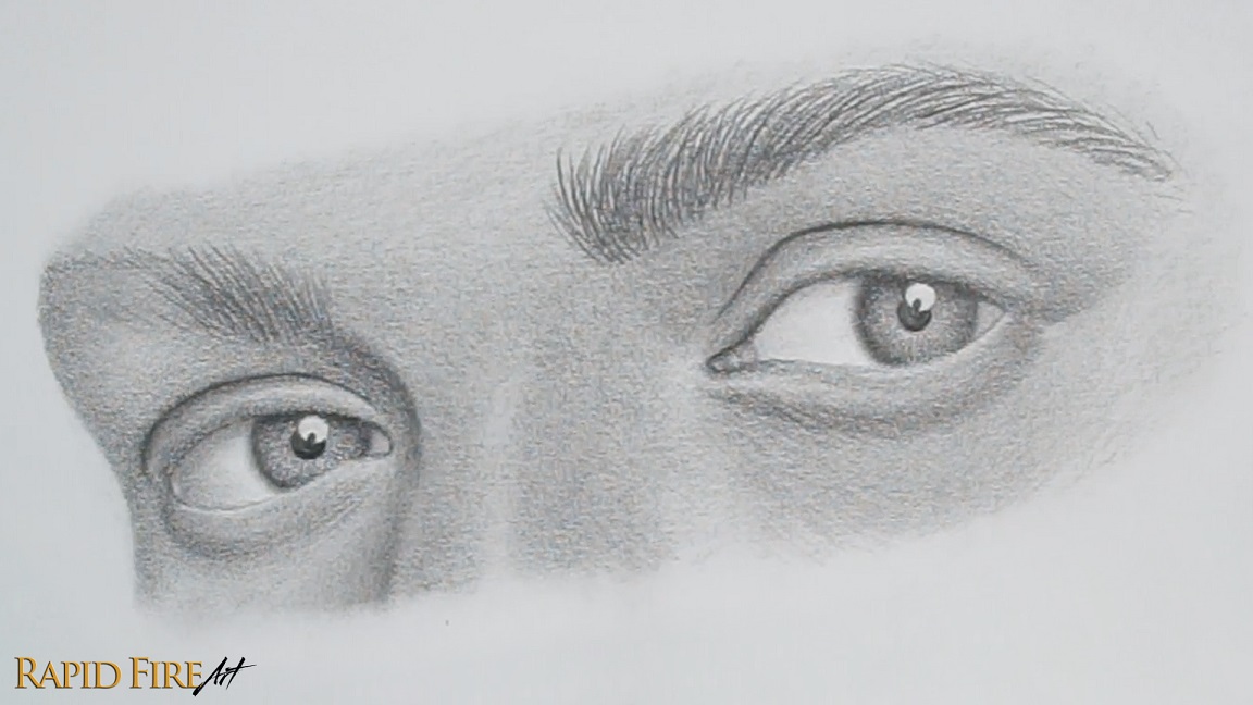
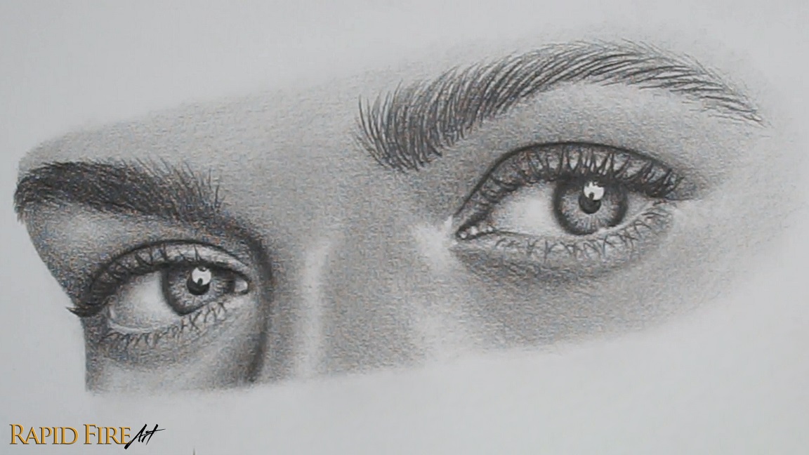
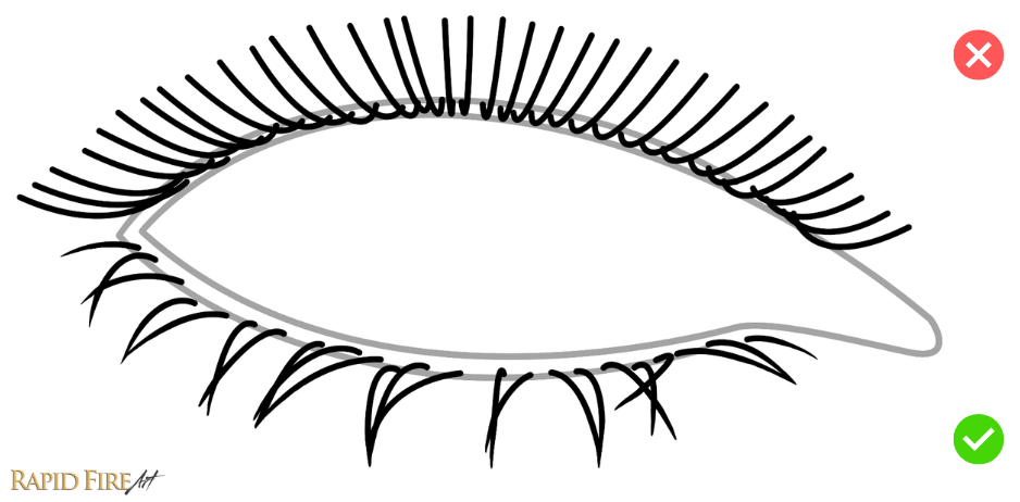
Hey, I’m Darlene and in this tutorial, I’ll show you a simple way to draw a realistic hooded male eye using basic, budget-friendly tools. I’m using a 2B pencil from the dollarstore, but an HB school pencil works fine too. You can blend with a tissue, and any eraser will do the job, though a kneaded eraser gives you more control.
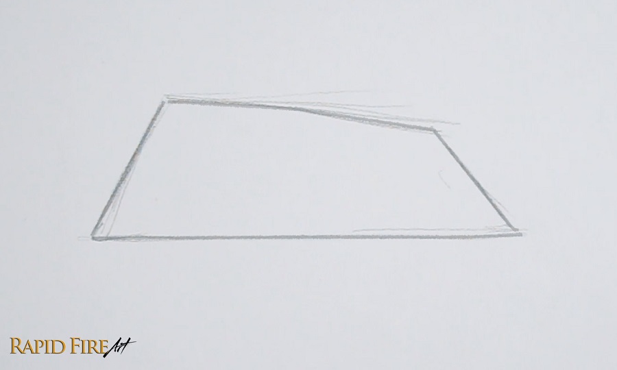
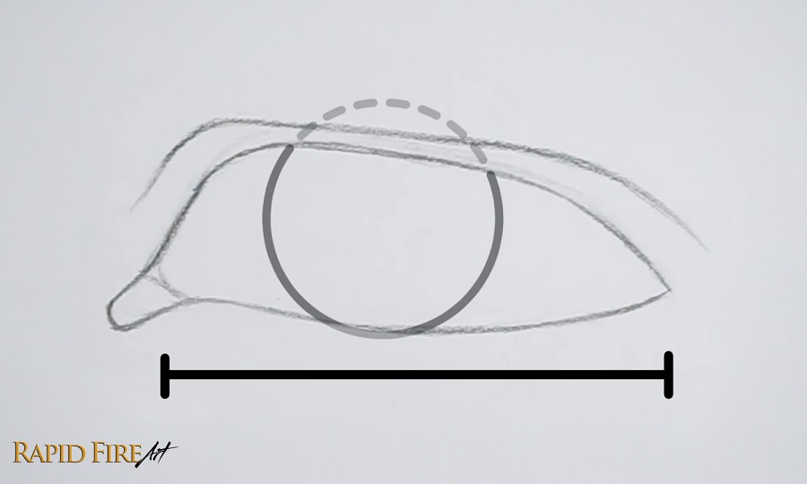
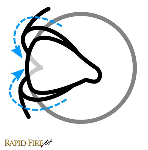
Begin by lightly drawing a simple trapezoid shape. This acts as a rough guideline you can use to draw the actual eyeshape on top of. My trapezoid is more narrow on the right side (tail end of the eye). You can tweak and morph the shape however you want to get a unique eye shape that appeals to you.
If you want a more masculine look, try making the trapezoid narrower since narrow eye shapes tend to read as more masculine, correlated with high levels of testosterone.
In case you want to closely replicate his eye, my trapezoid is roughly 10 by 3 centimeters.
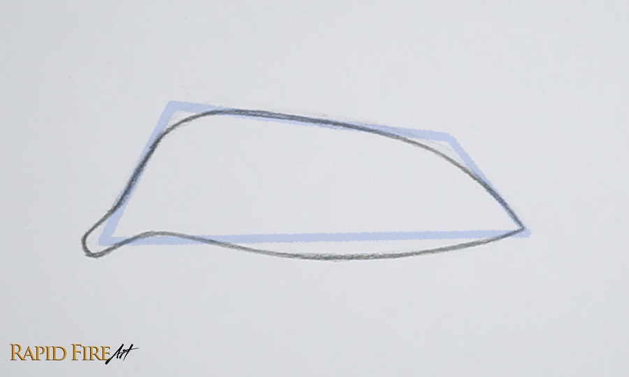
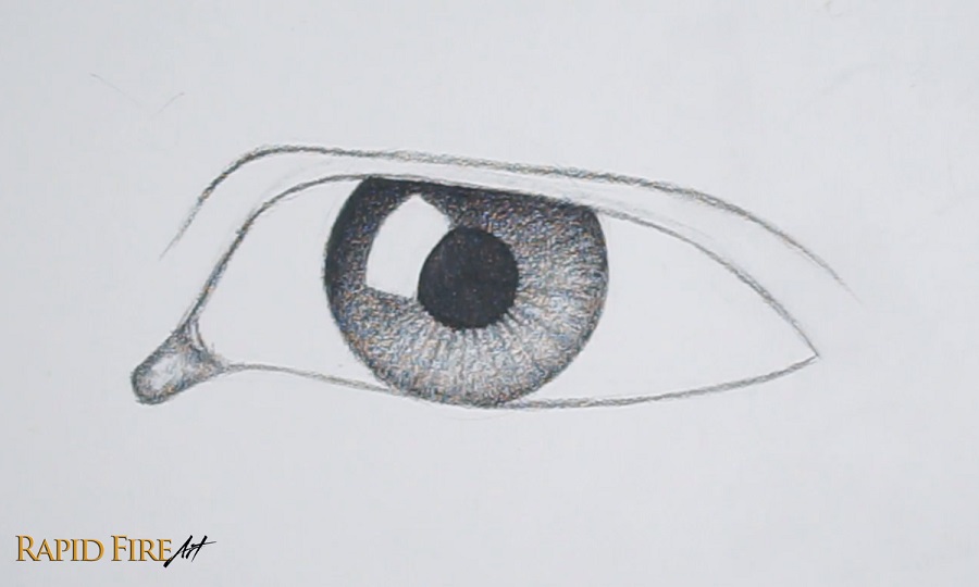
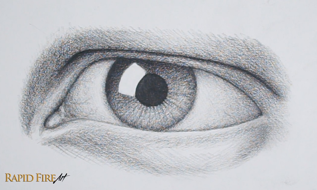
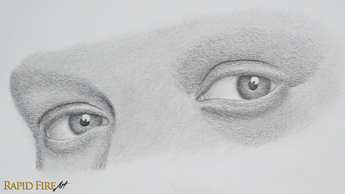
Step 2: Draw the Eye Shape
Now using the trapezoid as a rough guideline, draw the inner corner of the eye, shaping it like a rotated “U” or “V” shape.
From there, draw the lower eyelid as a gentle curve that dips slightly in the middle before rising back up to meet the opposite corner of your trapezoid. Then move on to the upper eyelid, rounding out the trapezoid edges so the eye starts to feel more natural.
Once you’re happy with your eye shape, erase the trapezoid.
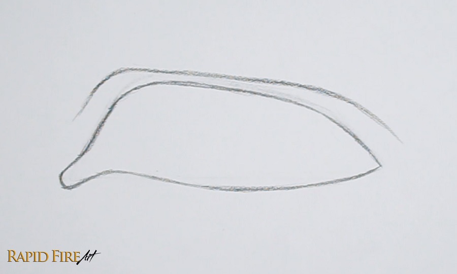
Step 3: Draw the Eyelid Crease
Above the eye, lightly sketch the eyelid crease by following the general curve of the top eyelid. To make the eyelid appear hooded, dip your pencil stroke lower, minimzing the space between the crease and eyelid outline.
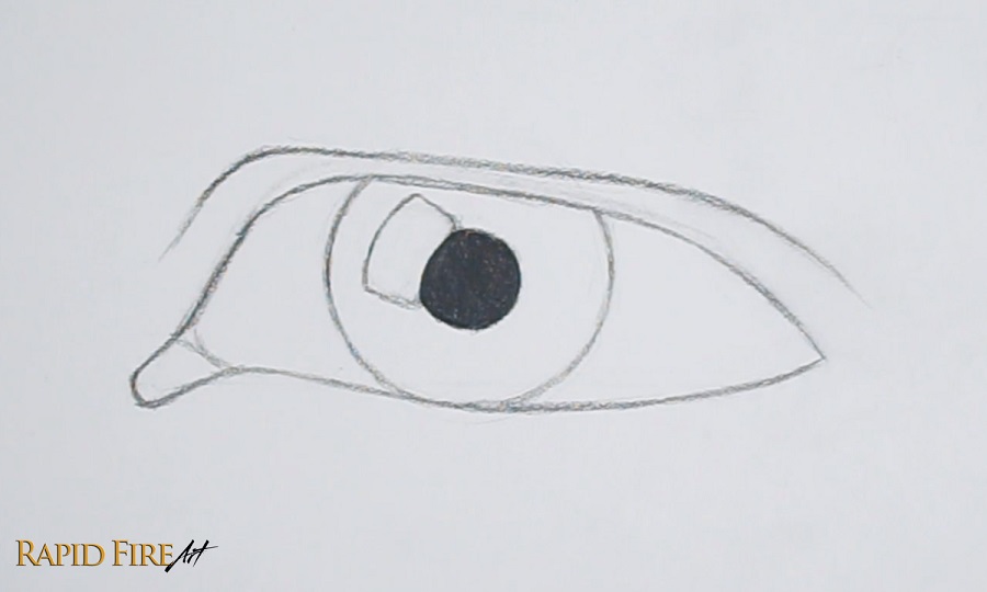
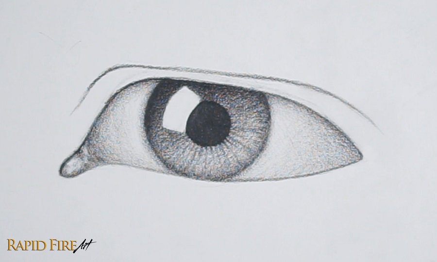
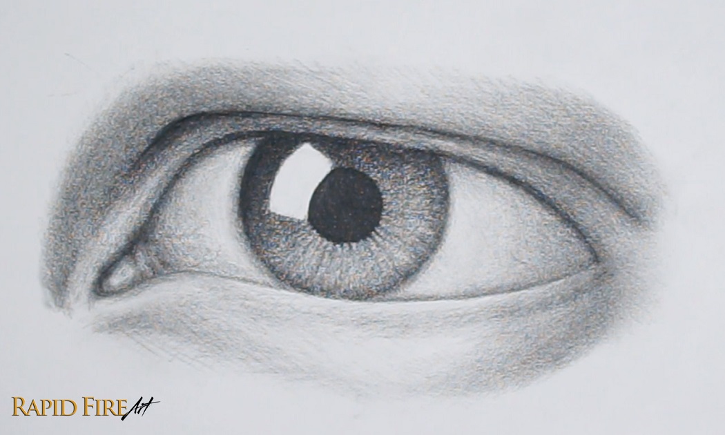
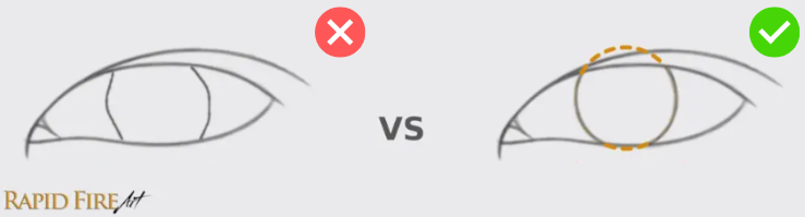
Step 4: Draw the Iris
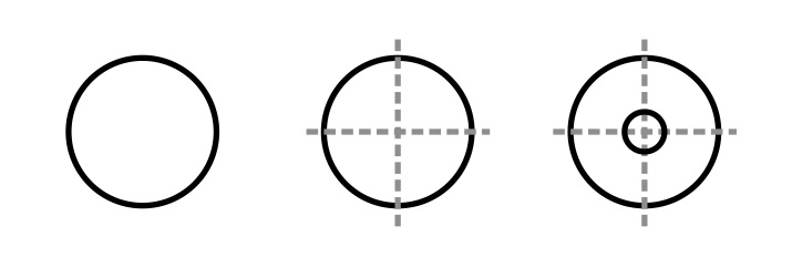
To draw the iris, first measure the width of the eyeball and divide that number by 2 to get the iris size. For a realistic-looking iris, avoid drawing 2 bracket shapes and instead draw a full circle.
Positioning of the iris is important. The bottom of the iris is usually more visible than the top. Also having the iris be slightly covered by the upper eyelid helps create a natural, relaxed expression. Draw it lightly so you can adjust before committing to the final placement.
Over by the tearduct, draw a curve or two to divide the pink fleshy area from the eyeball.
Don’t erase the top part of your iris yet.
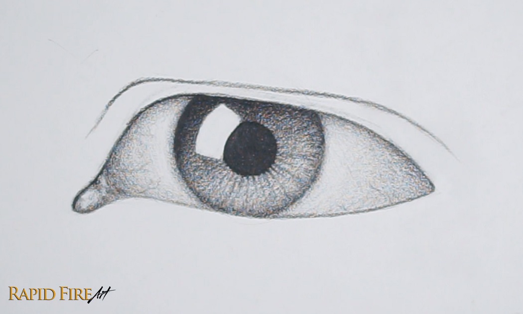
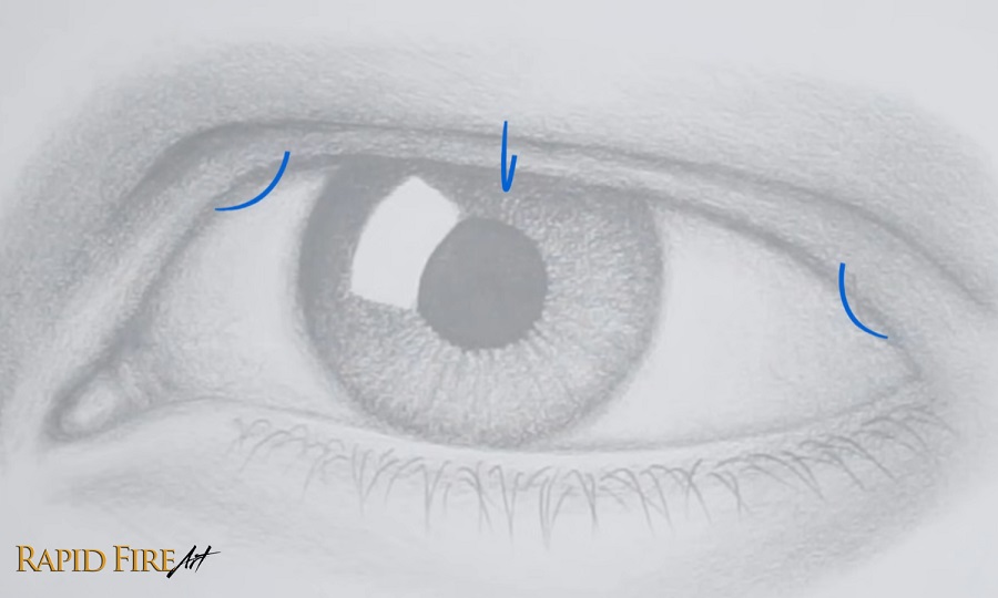
Step 5: Add the Pupil and Decide On Your Light Source
Once the iris is placed, draw the pupil right in the center.
Need help finding the center of the iris? Draw a cross through the iris, using the intersection of the two lines to determine the center.
The size of the pupil depends on how much light is entering the eye. It gets wider in the dark and smaller when it’s bright out, so the size is up to you and how much light you want in the scene.
Now decide where your light is coming from because this will control all your shading. My imaginary light source is shining down from the top left, but you can choose any direction. Based on that light source, add a highlight inside the eye. I like using a simple window reflection shape because it wraps nicely around the round form of the eyeball and helps push the realism.
Shade the pupil as dark as you can get it.
At this point, we can erase part of the iris circle that falls on the skin.
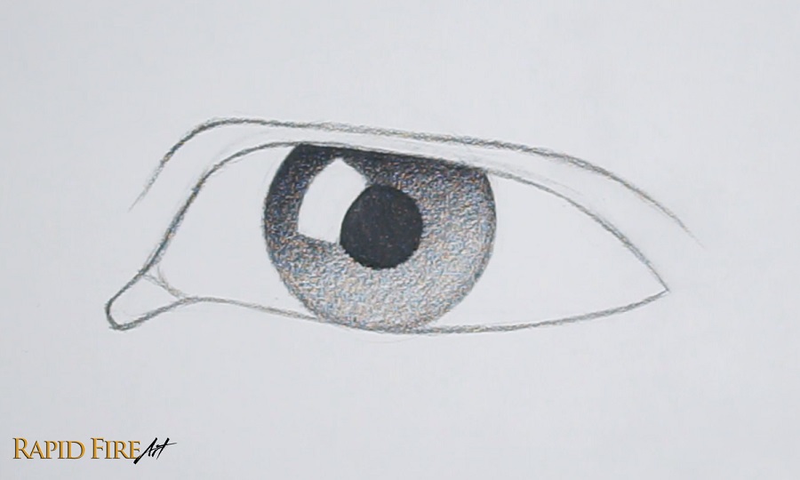
Step 6: Shade the Iris and Add Detail
Now let’s shade the iris. Since my light source comes from the top left and the iris is actually like a concave bowl shape i’m gonna shade the top left side darker because it faces away from the light and then I’ll gradually shade lighter on the bottom right side where the iris curves back out, facing the light more directly.
To account for the cast shadow from the top eyelid, shade darker along the very top of your iris and fade out as you work your way down.
I recommend blending every layer or every few layers of graphite instead of leaving it until the very end. I did the latter to save some time with the lesson.
You can add some texture to the iris by drawing lines radiating from the center, fading them out near the edge of the iris. You can make them look natural by varying the thickness, spacing, length, and value of each stroke.
The key here is to avoid making everything too uniform. Real irises are slightly irregular.
This is also where you can add subtle detailing around the rim of the iris if you want more realism and depth. Start your pencil strokes along the edge of the iris and flick inward to fade your strokes out.
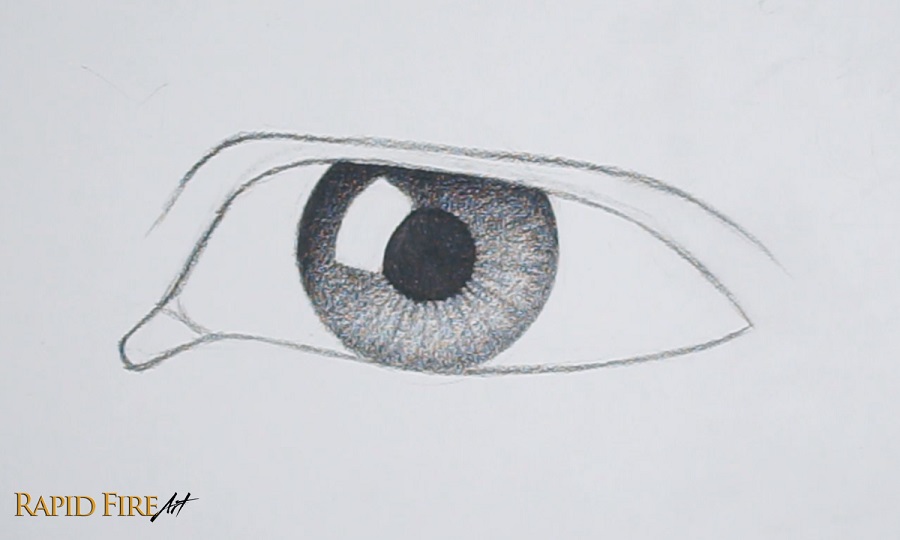
Step 7: Shade the Eyeball and Inner Corner of the Eye
Shade lightly inside the inner corner of the eye. Then darken the edges to make it look convex. Use your eraser to create some highlights, making the surface look moist. You can use a kneaded eraser with a light dabbing or dragging motion.
Learn how to make a kneaded eraser out of a regular solid eraser!
Shade the rest of the eyeball. We don’t want to leave it white so let’s start by shading a very light layer of graphite across the entire area and blend it.
Add some darker shading along the far left and right of the eyeball to communicate the eyeball’s round shape. Add a cast shadow along the top to account for the light being blocked by the top eyelid.
Shade slightly darker along the bottom of the eyeball to show that the surface curves away from the light.
Also shade around the iris to soften the hard edge.
If any of this shading looks too dark for you, I have a trick to easily lighten it – just blend it with a facial tissue, which will lift some of the graphite away in the process.
An optional detail you can include is some subtle blood vessels, which look similar to wiry tree branches. Try not to overdo these because they can easily make the eye look bloodshot.
Step 8: Shade the Skin
With your light direction in mind, shade the skin surrounding the eye.
I’m going to start with the bottom lid. There’s a small ledge that will be visible along the bottom eyelid from this angle and i’m going to use a circular shading technique to outline this ledge. Try to avoid drawing a hard straight line because it might look unnatural. Keep it nice and subtle.
Below this ledge, you can add an eye bag/pouch if you want. The darker you shade the underside, the puffier it will appear. Also, shading the lower eyelid skin too dark can result in a tired look.
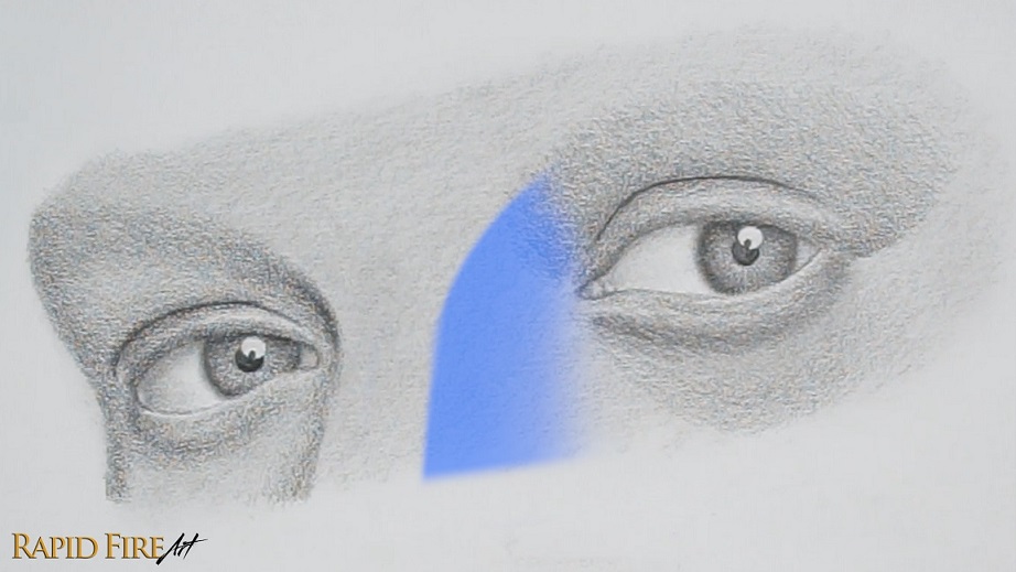
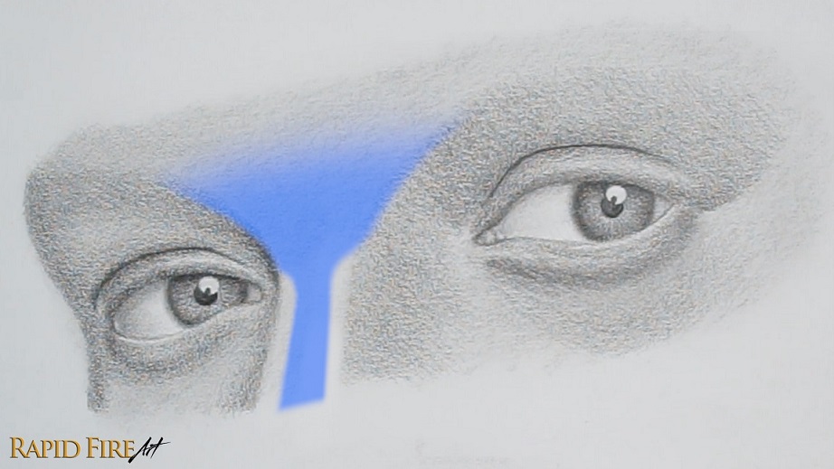
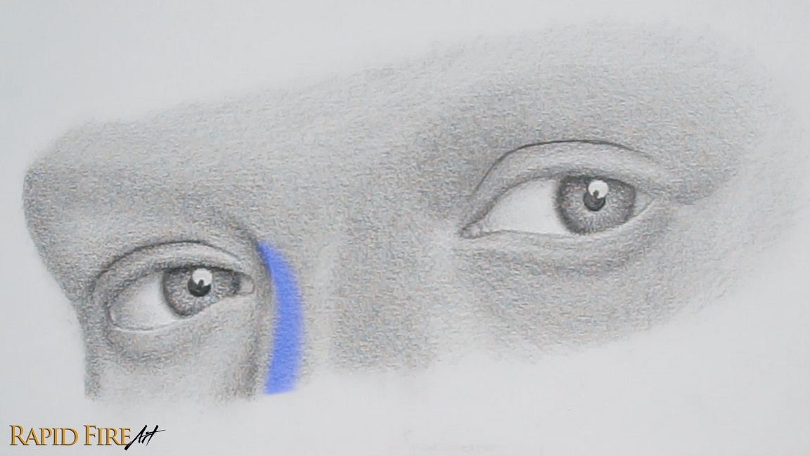
Let’s move to the top eyelid now. If you want your drawing to have a very strong bone structure you may want to really bring out the nose bridge and/or brow bone. You can do that by shading the area beside the nose and below the brow especially dark to show just how much the bones protrude out of the face.
Shade very dark along the eyelid crease and lighten your strokes gradually as you work your way up toward the brow and down toward the eye so the skin looks as though it dips inward.
Shade along the very bottom of the top eyelid to show that the form curves away from the light.
Add a layer of darker graphite along the right side of the eye to make it look like it’s facing away from the light.
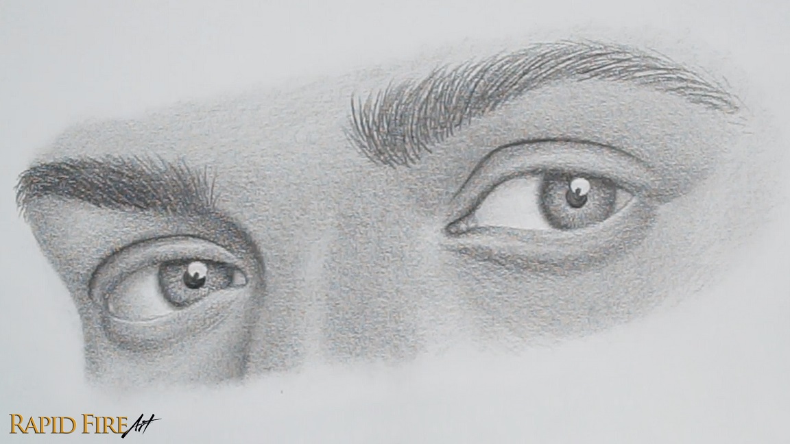
You don’t have to blend your drawing, but if you decide to, I would recommend doing so before the next step. We want to avoid blending after the eyelash details are drawn to avoid smudging those fine details.
I like to use a regular facial tissue wrapped around the pad of my finger to blend large areas, making sure to work from a light zone into a dark one to avoid smearing. I also use a new spot on the tissue each time. For tight spaces, I will either use the tip of my finger or a folded tissue using a special folding technique. Watch the video below to see my blending examples in action.
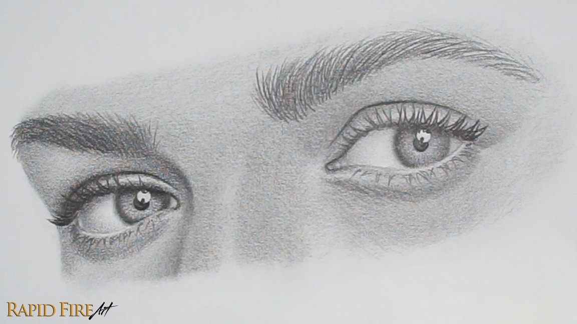
Step 9: Draw Eyelashes and Finish the Eye
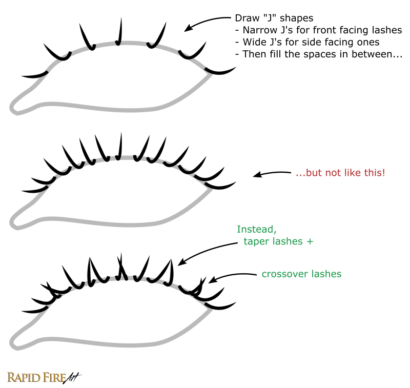
I like to start by drawing 3 lashes on each eyelid to map out the major lash directions. On the left side, the lashes will mostly point toward the left, in the center they’ll mostly point forward, and on the right side they’ll mostly point toward the right. I say mostly because some hairs naturally curve or point in completely different directions. If you have trouble drawing the lash shapes, think of them as the letter “J”. Narrow J’s for lashes facing toward us and gradually wider J’s as the lashes start turning toward the sides.
Once you have your first 3 lashes drawn, fill the spaces in between. There are several ways to make your lashes look natural, such as:
Crossing them over each other
Tapering lashes
Varying thickness
Staggering the roots
…and more! To learn more about drawing lashes in detail and to grab a free eyelash drawing wordsheet, visit this dedicated eyelash tutorial.
Let’s draw the upper lashes now. For a more masculine look, I usually angle them slightly downward instead of up so they don’t look as though they were crimped using an eyelash curling tool.
Once you’re done, let’s add a slight cast shadow directly below the lashes and we’re going to go along the root of each eyelash with subtle circular shading just to add some additional texture to the skin. Don’t forget to add some eyelash reflections in the highlight.
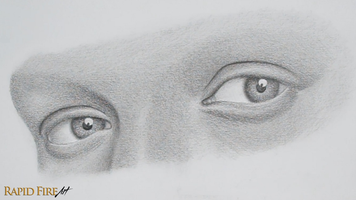
Once the lashes are drawn, go back in and adjust your shading, deepen the shadows, and brighten highlights if needed.
I wanted to increase the contrast to make the eye look less dull, so I:
Darkened areas like the eyelid crease and iris to strengthen the form and push the depth.
Brightened the light side of the iris using my kneaded eraser and a swiping motion, following the existing radial pattern.
Added/brightened highlights such as in the inner corner of the eye and some thin lines where the eyeball meets the bottom eyelid to convey wetness.
I found the highlight too bold for my preference, so I added a slight gradient to the bottom by smudging the surrounding graphite into it to reduce that harsh white area. Another option would’ve been to break up the highlight by adding a reflection or silhouette of any object inside it, which helps it feel less like a flat white shape.
There’s a part two of this tutorial where I go into drawing the eyebrow. If you want to continue this eye into that stage, you can extend your shading upward above the brow to make space for it. Keep in mind that the area above the brow (forehead) is facing the light more directly, so will need to be shaded lighter.
Once you’re comfortable with this process, try changing the lighting or eye shape for more variety. To learn where the eye sits on the head and how it fits into facial construction, visit my Loomis face drawing tutorials.
Darlene created RFA In 2013 with the goal of sharing simple yet detailed drawing tutorials with other artists on the world wide web. She is a self taught pencil portrait artist and Youtuber.
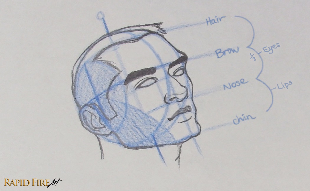
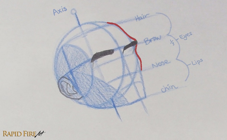
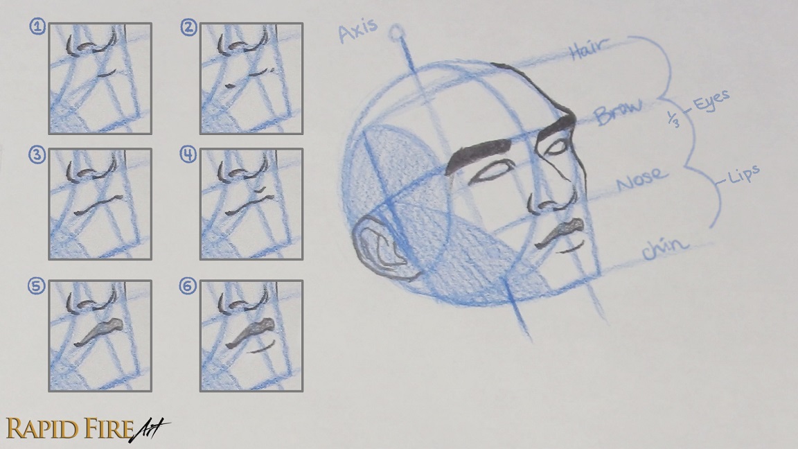
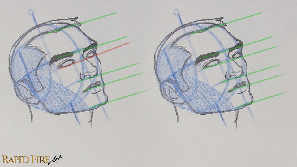
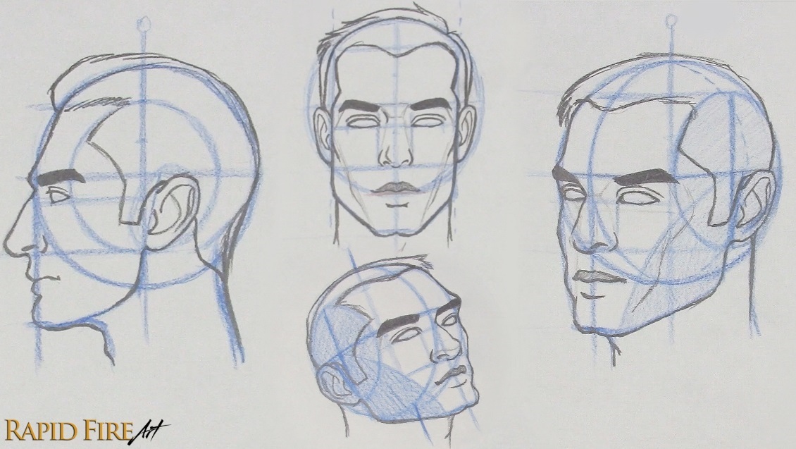
Hey, I’m Darlene and in this tutorial, I’ll walk you through Andrew Loomis’ method for drawing a face from the ¾ view with the head tilted upward. It took me quite a while to fully understand and apply the Loomis method myself. If you’ve read his book, you’ll notice I’ve adapted certain parts and added my own explanations in areas where I struggled at first, aiming to make each step as clear as possible while you draw along.
This is the final part of a four-part series on drawing heads using the Loomis method:
You can follow this tutorial on its own, but it will make much more sense if you’ve gone through the series in order. Each part builds on the last, and seeing the head constructed from different angles makes more complex perspectives easier to understand and helps you draw heads more confidently from imagination over time.
Important Note: Any text marked with an asterisk “*” is intended for viewers following this series in order. If you’re viewing this tutorial on its own, some of these notes may not fully make sense without context from the previous tutorials.
*In this tutorial, the head is tilted upward in addition to being rotated into the ¾ view. Because of this, some construction steps and proportions will be slightly different compared to the previous tutorials. I’ll point these changes out as we go so you can understand how the Loomis method adapts to more complex angles.
At this angle, the upward tilt changes how the forms read in perspective. The feature lines appear more curved, while the underside of the nose, jaw, and chin becomes more visible. These shifts are what create the sense of the head tilting upward rather than simply facing sideways.
Drawing Tools
I’ll use a colored pencil for the construction lines so they’re easier to see, and a 4B graphite pencil for the final drawing for a cleaner contrast.
You can absolutely follow along with just a standard HB pencil if that’s what you have!
Building the Basic Head Structure (3/4 View Tilted Up)
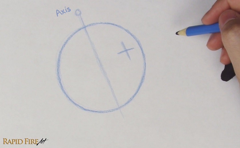
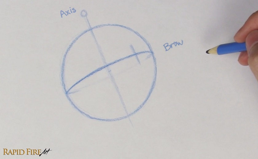
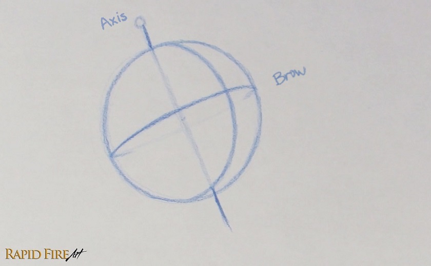
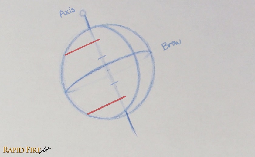
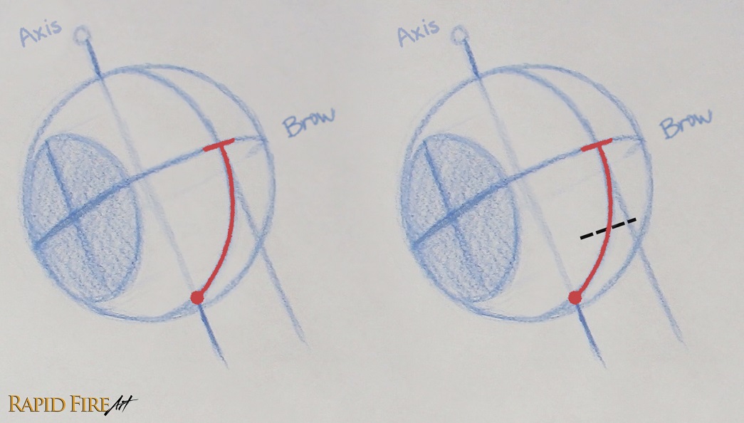
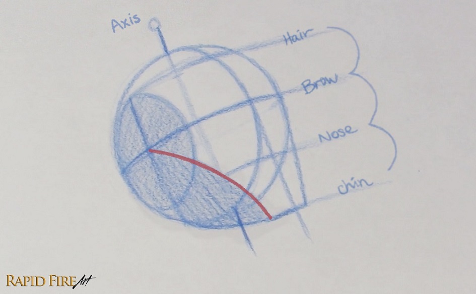
Begin by drawing a circle for the cranium. Then draw a cross to indicate the direction the head is facing, establishing the front of the face. Since we want the head to be facing the upper right, the cross should sit in the upper-right area of the sphere. The lines of the cross should be perpendicular to each other.
*You may be wondering why we’re not starting with the axis like the previous 3 tutorials in this series. For angles like this where both the middle line and brow line are rotated off-center, it will be easier to draw the cross before the axis. But please experiment with both ways to see which order works better for you.
Now draw a long, straight line through your sphere called the Axis. Make sure it’s parallel to the vertical line from the cross. The axis is tilted because the head angle is also tilted. You can think of this line as the axis on which our planet Earth rotates. Where the axis juts out the top and bottom of the sphere, we’ll call those the north and south poles.
Now draw an ellipse that runs through the cross longditudinally. This is where the eyebrows will sit, so we’ll call it the Brow Line. Make sure it’s perpendicular to the Axis (if you draw a line through the longest part of the ellipse, that line should form a 90-degree angle with the Axis).
Tip: If you’re having trouble balancing the ellipse properly, first locate the center point of the sphere. The center of your ellipse should pass directly through that point. It also helps to draw the full ellipse, not just the visible side.
*It might feel weird to draw an angled ellipse after going through the last 3 tutorials because they were either perfectly vertical or horizontal. If this step is a struggle, rotate your sketchbook, so the axis is vertical instead of slanted. Then try drawing the ellipse again.
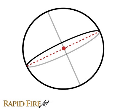
Now draw an a second ellipse that passes through the vertical line of the cross while also passing through the north and south poles (the top and bottom of the Axis). Make sure the ellipse tilts so it reveals the very bottom of the ball – Since the head is tilted upward so much, we can actually see the very bottom of the sphere where the Axis and Middle Line intersect. This southernmost point becomes important later when we start placing the facial features.
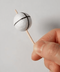
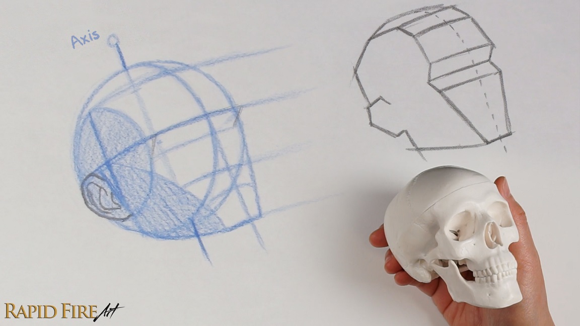
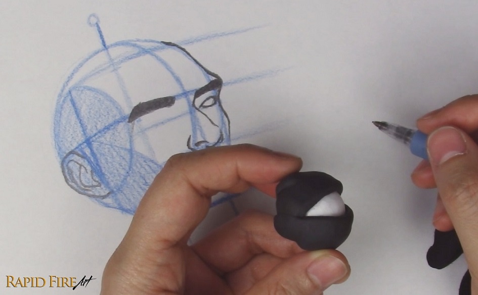
It’s very helpful to have a physical model you can rotate and study in your own hands, especially when drawing difficult head angles like this one. It gives you a better sense of how the feature lines curve around the form and how the head changes as it tilts in space.
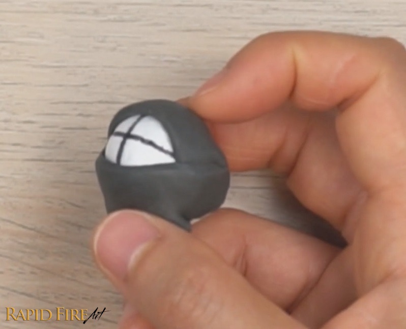
If you want to make a simple drawing reference tool like the one I used for this tutorial, draw a vertical and horizontal line across any ball and pierce a stick through the north and south poles. A transparent ball works even better if you can find one, since it lets you see the full ellipses and better understand how they wrap around the form.
Notice how, as I rotate the model upward, the south pole shifts into view. This is exactly what happens when the head tilts up. We begin to see more of the underside of the sphere, which changes the placement and curvature of the facial features.
To make your own model, you’ll need: – Toothpick – Small ball (I used a styrofoam one, but you can also make one out of playdoh) – Permanent marker The ball acts as the cranium, and the toothpick represents the Axis the head rotates around. As the head rotates upward, this Axis becomes a key reference for keeping all facial features aligned in perspective. It helps you maintain consistent angles so the face doesn’t start to feel skewed as the construction process becomes more complex.
Alright, let’s continue with our head construction!
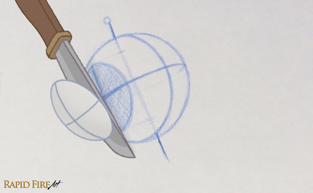
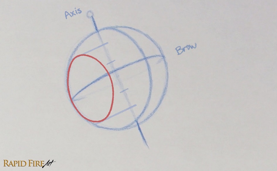
Draw the Side Plane for the 3/4 View
So far, we’ve drawn a sphere, but the human head isn’t perfectly round. The sides are much flatter, so we’ll need to slice 🔪 a section off the sphere to create the Side Plane (side of the head).
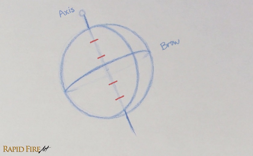
Since the head is rotated into the ¾ view, we only need to draw the visible Side Plane. To size it correctly, split the sphere into 6 equal spaces from top to bottom using small tick marks placed along the Axis.
Locate the topmost and bottommost ticks, then extend them toward the edge of the sphere, making sure your lines are perpendicular to the Axis.
Using those two boundary lines as a guide, draw an ellipse that spans almost half the sphere’s width.
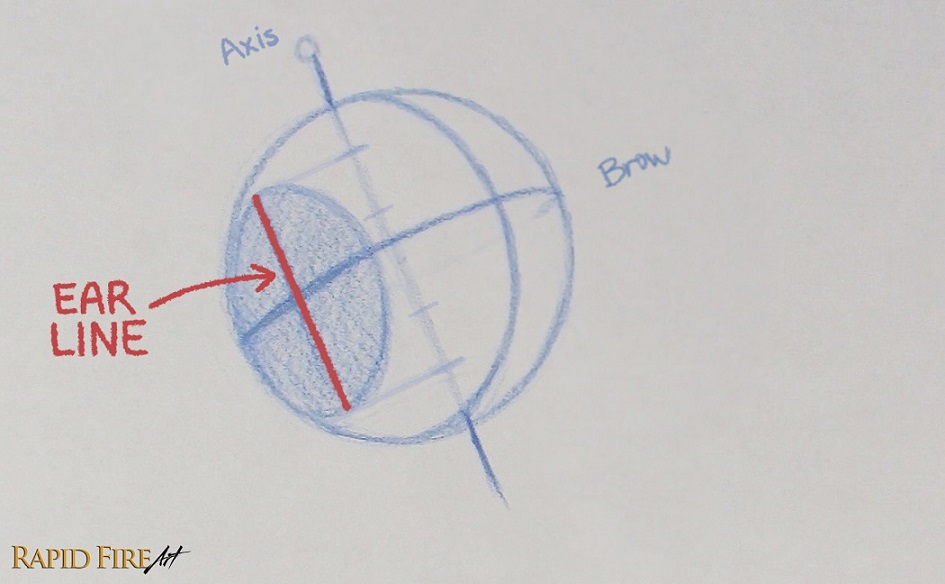
The ear will be drawn on the side plane. If we divide the area into 4 equal spaces, it will be easy to place the ear correctly. So let’s add a vertical line through the middle of the side plane and call it the Ear Line, making sure it stays parallel to the Axis.
You can apply some foreshortening by slightly tapering the Ear Line and Axis for this angle of the head.
Note: If you’re struggling to visualize the Side Plane at this angle, I recommend checking out the front and side view construction first, making this step easier to grasp.
Locate Facial Feature Placement
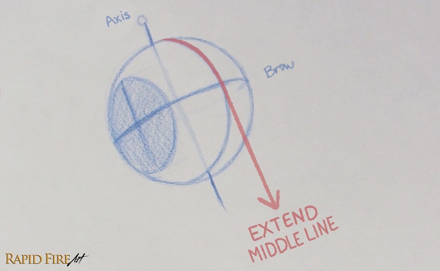
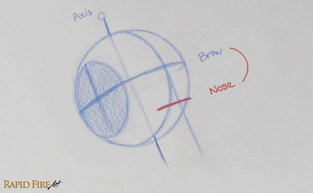
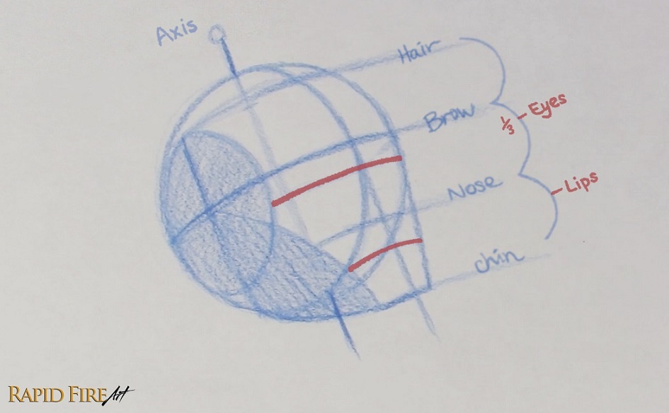
Now let’s map out where all the facial features will sit on the head! Before we can do this, we’ll need to extend the Middle Line so it falls off the face of the sphere. This is where we’ll be placing lines that mark where each facial feature sits. Keep the Middle Line parallel to the Axis or taper it very slightly to account for foreshortening.
Since we already have the Brow Line established, we just need to determine the remaining key guidelines: the Hair, Nose, Chin, Eye, and Lip Lines. These will help us divide the face into accurate proportions before we start drawing the features themselves.
*There are several ways to locate the remaining major feature lines.
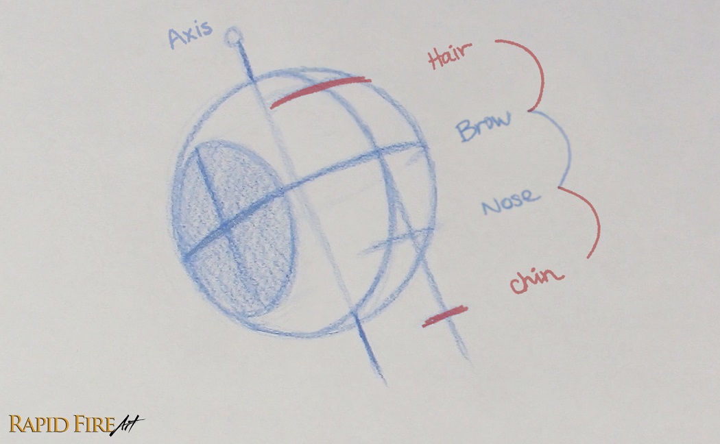
In the previous tutorials, we used the top and bottom of the Side Plane to estimate the Hair and Nose Lines. The Chin Line can then be placed at a similar distance.
In a level head position, we can also find the Hair Line by taking the halfway point between the Brow Line and the north pole of the sphere. However, in this tutorial, the head is tilted upward so much that the north pole shifts to the far side of the sphere, making the Hairline more difficult to estimate accurately.
So for this angle, I’m going to show you a different approach by starting with the Nose Line instead. For a quick, rough estimate, simply find the halfway point between the Brow Line and the south pole of the sphere to locate the Nose Line. Then use similar spacing to place the Hairline and Chin Line.
Since the head is tilted upward so much, we can use the space between the Brow Line and the southernmost point of the sphere to estimate the Nose Line. The midpoint between these two landmarks gives us the approximate location of the nose.
Now measure the distance between the brow and nose. Use that measurement to mark the position of the Hair Line and Chin Line. Make sure to keep the facial feature lines parallel to the Brow Line. Otherwise, the face can look wonky. You can apply some foreshortening, which is much more obvious in extreme angles.
Common Mistake: One of the most common mistakes at this angle is flattening the tilt by keeping the feature lines too straight. This removes the sense of perspective and makes the head feel like it’s facing forward instead of looking upward.
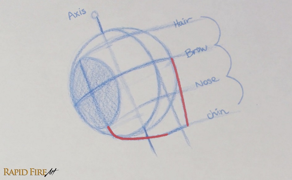
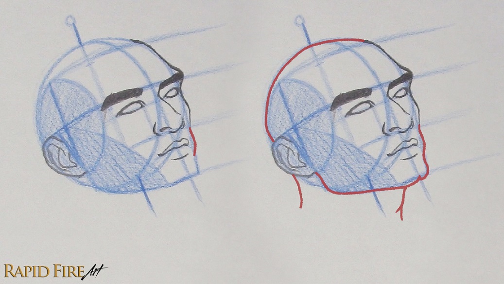
Now let’s add some outlines to make this look more like a human head! Draw a curved line all the way from the Brow Line to the Chin Line, creating the far edge of the face. Then from the bottom of the Ear Line to Chin Line, create the jaw. You can adjust the chin width based on your preference.
To simplify placement of the facial features, let’s divide the head into clearer sections. Draw a curved line from the chin toward the middle of the Side Plane, then lightly shade this new section. This helps separate the side of the head from the front, making it easier to focus on the facial features and how they wrap around the form.
Let’s add 2 more facial feature lines: the eyes and lips! The Eye Line sits about ⅓ of the way down from the Brow Line to the Nose Line. For the lips, locate the space between the Nose and Chin Lines and place a tick slightly above the halfway point. This will give us the general placement for the lips. You’ll notice that my Lip Line is very curved. That’s because the mouth wraps around the curved surface of the teeth and jaw, and this curvature becomes much more noticeable when the head tilts upward.
How to Draw Facial Features from the 3/4 View (Looking Up)
Now that the structure is in place, we can start actually drawing the facial features. In the 3/4 view, nothing sits perfectly centered like it does in the front view – Each feature appears to shift slightly around the form and follows the curvature of the head. We’ll use our construction lines as a guide to make sure everything stays consistent in perspective as we start placing and drawing the features.
How to Place and Construct the Ear
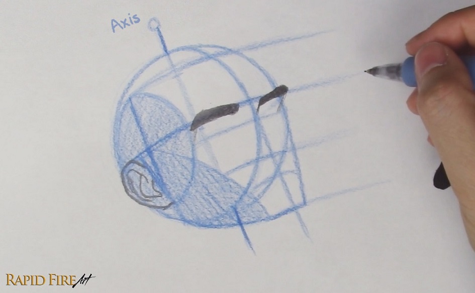
I’m switching to a graphite pencil now so the final drawing stands out more clearly from the blue construction lines. Let’s start with the ear. Draw it in the lower-left quadrant of the Side Plane between the Brow and Nose Lines. Angle it slightly backward using a slanted line. You can follow my numbered steps above or check out my more detailed ear drawing tutorial if you need additional guidance.
To make placing and drawing facial features easier, it helps to understand a couple of key references that work across all angles, not just a single view.
Theplanar headsimplifies the face into flat planes, making it easier to read and construct the features quickly and accurately.
The human skull reveals the structure beneath the skin, fat, and muscle, helping you understand not just where features sit, but why certain bumps or ridges appear where they do and how to place them more accurately.
Over time, studying these forms helps you mentally overlay them onto your drawings, so you can better visualize the head’s structure in your mind’s eye instead of relying only on guidelines. With the planar head and skull examples above, you can probably already start to visualize where the features will sit, so let’s begin with one of the easiest ones – placing the eyebrows along the Brow Line.
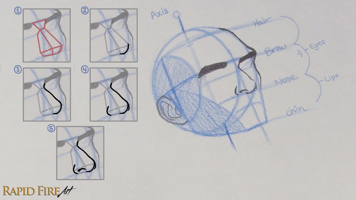
How to Draw the Eyebrows and Nose
With the planar head and skull in your mind’s eye, draw the eyebrows along the brow line while leaving some space in between for the nose. End the left eyebrow where the Side Plane starts.
Use your construction lines as a loose guide while shaping the forehead and cheek area. Try to keep the underlying skull structure in mind as you draw. I’ve given him a more prominent brow ridge, and cheekbone.
The nose can be difficult to visualize from this angle, so it helps to first draw a simple planar/blocky version (shown in red). Even though the nose appears shifted in perspective, try to keep it balanced along the Middle Line so it feels properly anchored to the center of the face as it wraps around the form.
Once the planar nose is in place, use it as a guide to build the actual nose. Start at the point where the Middle Line and Nose Line meet and draw toward the tip. Because the head is tilted upward, the underside of the nose becomes more visible and the tip sits slightly higher than in the previous tutorials.
From here, draw the bridge of the nose up toward the brow, creating a subtle bump rather than making it perfectly straight.
Then wrap your strokes around the sides of the planar nose to form the nose wings.
Finally, add the visible nostril between the wing and tip of the nose. At this angle, the far nostril may barely be visible or even disappear completely from view.
If you want more help drawing noses from different angles, it really helps to study a physical model. You can make a simple one using playdoh by forming a wedge shape and attaching two spheres on the sides. Even a rough model makes it much easier to understand how the nose rotates in perspective. Or visit this ¾ nose tutorial to see more examples.
How to Place and Draw Eyes in the 3/4 View
Draw the eyes along the Eye Line to help keep them aligned properly on the face. The far eye should fit into the narrow space between the nose and the edge of the face, and may be partially hidden depending on nose bridge height and eye spacing.
If you’re having trouble visualizing the eyes from different perspectives, it really helps to make a crude DIY eye model like the one pictured above. As the eye rotates around the form of the head, its shape changes quite a bit. At this angle, the far eye ends up looking more narrow and triangular.
To place the near eye, draw a line (parallel to the Axis) from the outer edge of the nose wing up to the Eye Line. The point where these two lines intersect will give you a good starting point for the inner corner of the eye. This helps keep the eye from drifting too far toward the side of the face or sitting too close to the nose.
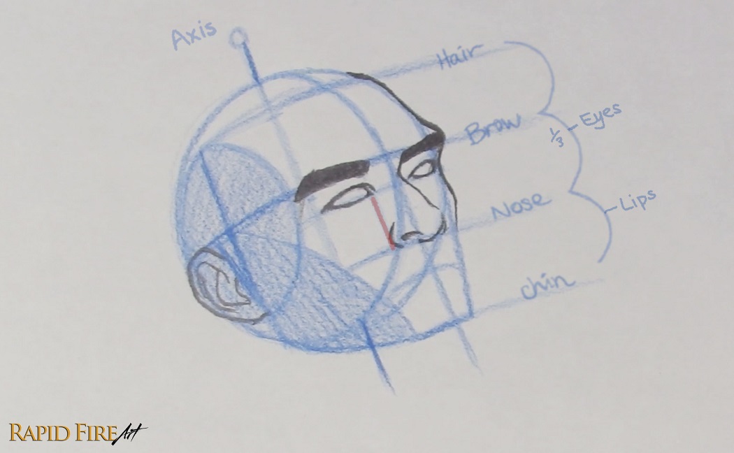
Draw his lips along the Lip Line we created earlier. You can use the numbered steps above for guidance.
Let’s start by drawing the parting line between the lips. Where the Middle Line and Lip Line intersect, draw a shallow “U” shape. Avoid centering it on the Middle Line otherwise the mouth will look flat or even sunken in.
On either side, place a tick mark for the corners of the mouth. Not sure how wide to make the lips? I like to imagine vertical lines running down from the middle of each eye and use those as rough boundary lines to draw within.
Now connect the corners of the mouth to the “U” shape using a soft wavy line. Mine looks like a very stretched out “W”.
Above the “U”, draw a wide “V” shape for the cupid’s bow. Position it slightly farther forward than the “U” so the upper lip feels more rounded. You can adjust the thickness of the lip by moving the cupid’s bow higher or lower.
Now connect the cupid’s bow to the corners of the mouth to complete the top lip.
Draw the bottom lip using a curve that is positioned farther forward so the mouth feels more rounded instead of flat.
Draw the Head, Face, Jawline, and Neck
Now Let’s refine the rest of his head and create the neck.
Along the far side of his face, draw a convex curve next to the mouth. If this shape feels confusing, refer back to the skull image from earlier so you can better understand how the bones project outward from the face. I’m still roughly following my construction lines.
Outline his chin and jawline while softening the harsh edges that we used for the construction lines. I gave him a dimpled chin, but feel free to shape the chin however you like. If you decide to shade the head later, keep in mind that from this angle, the jawline may appear much more subtle
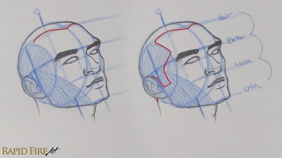
For the top and back of the head, avoid tracing the exact shape of the sphere since the skull isn’t perfectly round. You can flatten the lower back area of the head slightly while giving the upper portion of the head more of a dome shape. Again, the skull reference from earlier will help a lot with this step.
You might be wondering why we’re drawing the full head shape if we’re going to cover most of it with hair anyway. This is so we can understand the underlying shape of the skull and build the hair around it properly. Having the head structure in place makes it much easier to give the hair believable volume, direction, and flow so it looks more natural and realistic.
To draw the neck, continue the line down from the back of the head. For the front of the neck, start just beneath the chin and draw downward from there.
How to Draw Hair From the 3/4 Angle
Now let’s draw the hair!
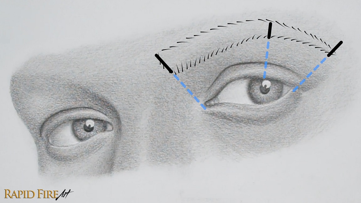
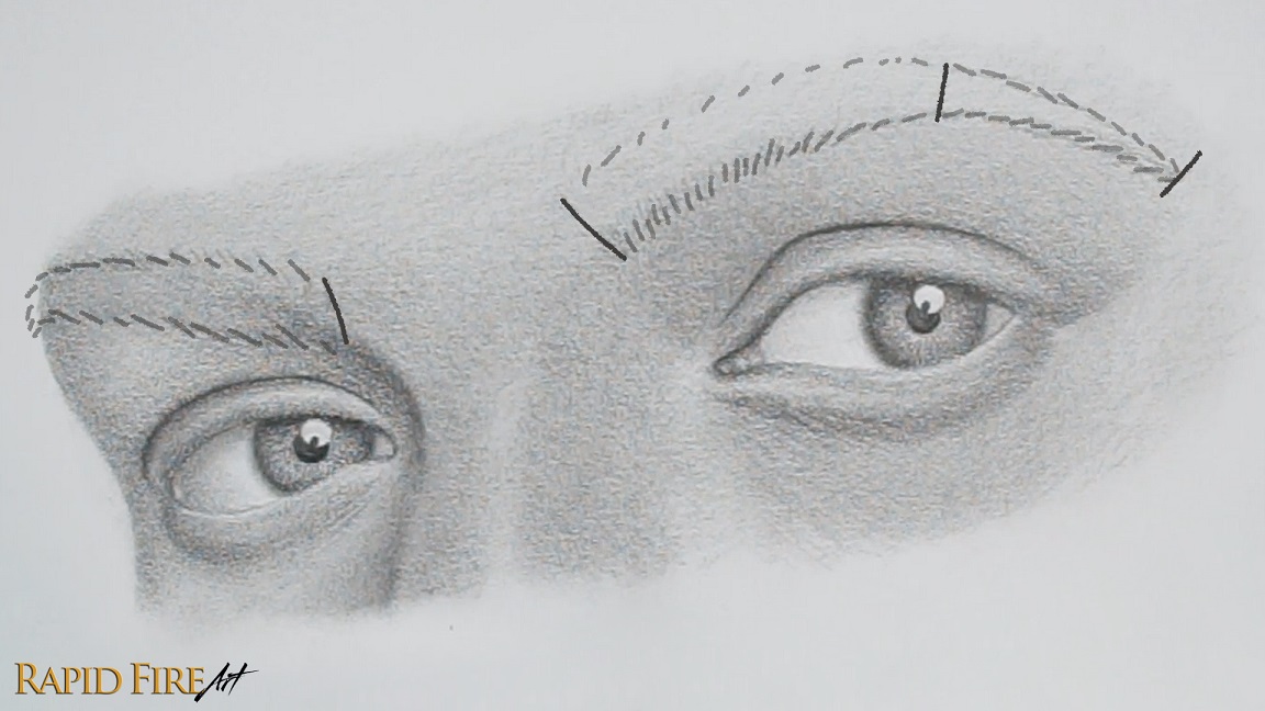
Before you start, decide how large or small you want the forehead to appear. You can use the Hair Line we mapped out earlier as a rough guide. Draw below it for a smaller forehead, on it for a more balanced one, or above it for a taller forehead or even a receding hairline, depending on how high you go.
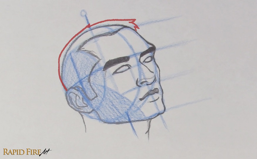
I like to start near the Middle Line and work outward across the head. As the hair moves toward the Side Plane, curve your strokes downward toward the eyebrow area, then angle them toward the ear, forming the sideburn. Wrap your stroke around the top of the ear and continue it down along the nape of the neck if you want.
As you continue shaping the rest of the hair, try not to press it tightly against the skull unless you want a very flat hairstyle. Leaving more space between the hair and the head will create more volume. In my drawing, I added extra space near the top/front of the head to make his hair look fuller and longer in that area.
Final Adjustments
It’s always a good idea to keep checking your measurements and angles as you draw, but even then, small mistakes can slip through. Take a moment to go over your drawing and see if everything feels consistent and aligned.
In my case, I noticed my eyes looked slightly off. They weren’t quite sitting level with the rest of the feature lines. It’s a small adjustment, but fixing it made a noticeable difference.
When I was first learning the Loomis method, I went through a lot of these heads, many versions, many mistakes, and I’m still learning. So don’t get discouraged if your first attempt doesn’t look how you expected. Give yourself some room to experiment and try again. Every pass usually reveals something new, whether it’s a mistake you didn’t notice, a small breakthrough, or a pattern you keep repeating without realizing it. Think of your first attempt more like a warm-up than a final result.
I hope you enjoyed following along with this tutorial, and the rest of the series if you’ve been going through it in order. If you want to keep building on this, I recommend moving on to the facial feature tutorials next, where I break down how to draw and shade eyes, nose, mouth, and other parts of the face in more detail.
Other Tutorials in this Series
Whether you’re starting here or continuing the series, practicing multiple angles will strengthen your understanding and help you draw faces more confidently from any perspective.
Try another angle below to reinforce what you’ve learned:
Darlene created RFA In 2013 with the goal of sharing simple yet detailed drawing tutorials with other artists on the world wide web. She is a self taught pencil portrait artist and Youtuber.
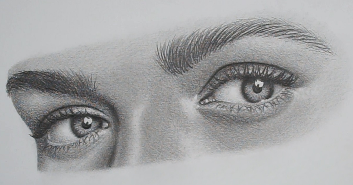
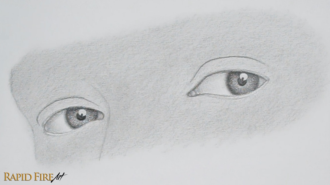
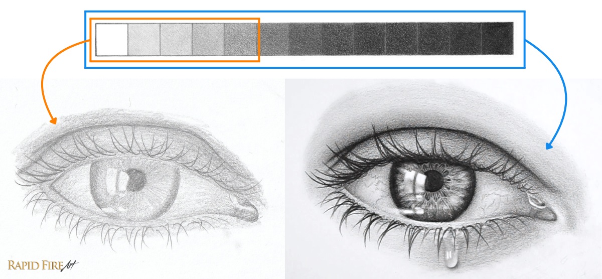
In this tutorial, I’ll show you how to draw eyes from the ¾ view with simple step-by-step instructions and how to avoid common mistakes to avoid, like uneven eye/eyebrow placement, incorrect perspective, and weak value contrast, so your eyes will look more realistic.
Materials Used for Drawing Realistic Eyes
For this tutorial, I’m using just two pencil grades. The HB is for construction, and the 2B is for shading and details. If you’re unsure what these pencil grades mean, you can learn more here.
1. When I mention the “right eye,” I’m referring to the eye on the right side of the drawing, not the subject’s right eye.
2. This is a condensed version of my full video tutorial. Instead of watching a 1-hour lesson, you can follow along in 8 clear, scannable steps.
3. If you need more detail at any point, watch the short clips included or shoot me a question in the comment section. Let’s get started!
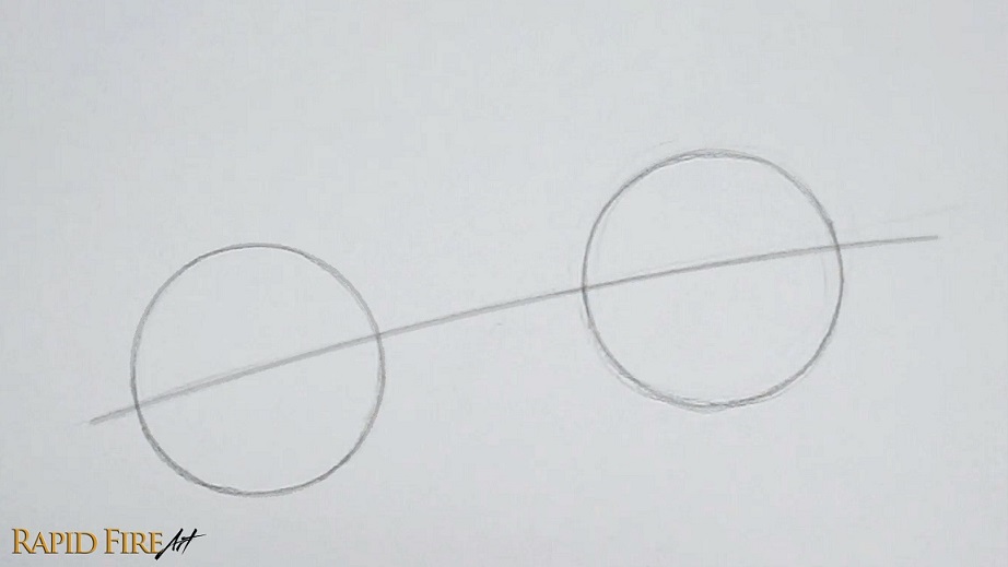
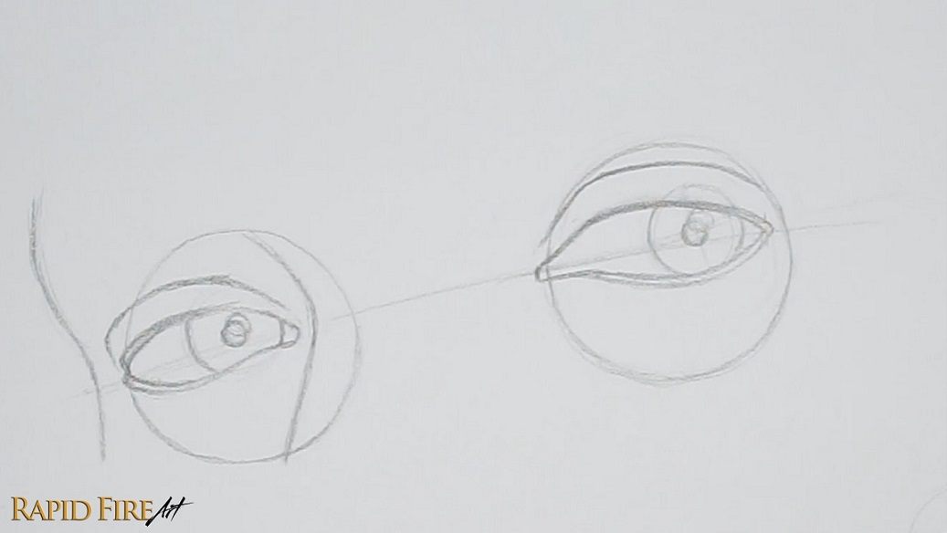
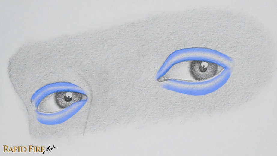
Step 1: Create Guidelines for Eye Placement
Using an HB pencil and light pressure:
Draw a circle for each eyeball
Space them slightly less than one circle apart
Mine are ~4.5 cm in diameter if you want to match scale
Draw a faint curved line through the center of both circles. Curve it slightly downward – this helps keep both eyes aligned so they don’t look uneven.
Tip: If your eyes often look “off,” it’s usually because this guideline wasn’t used or wasn’t followed closely.
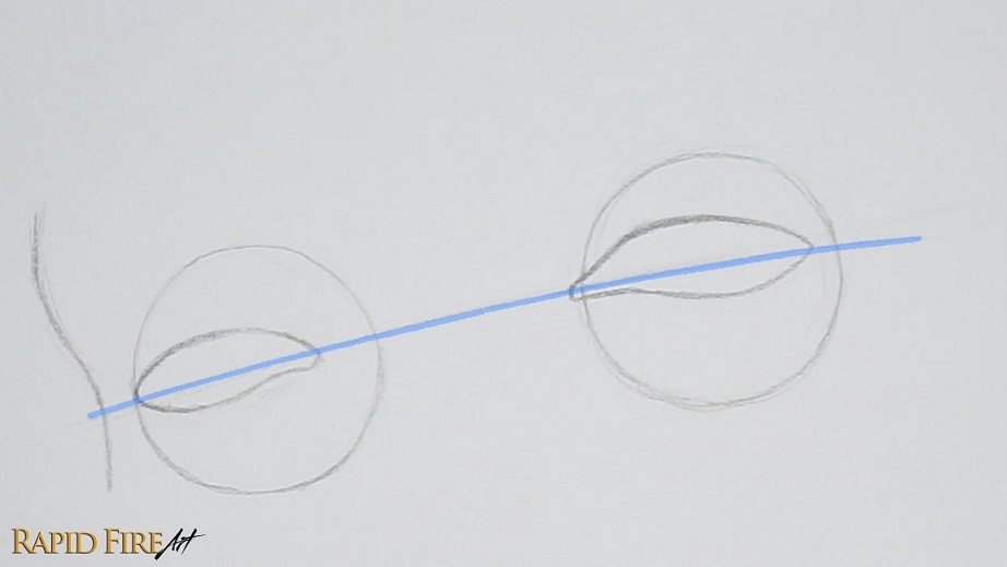
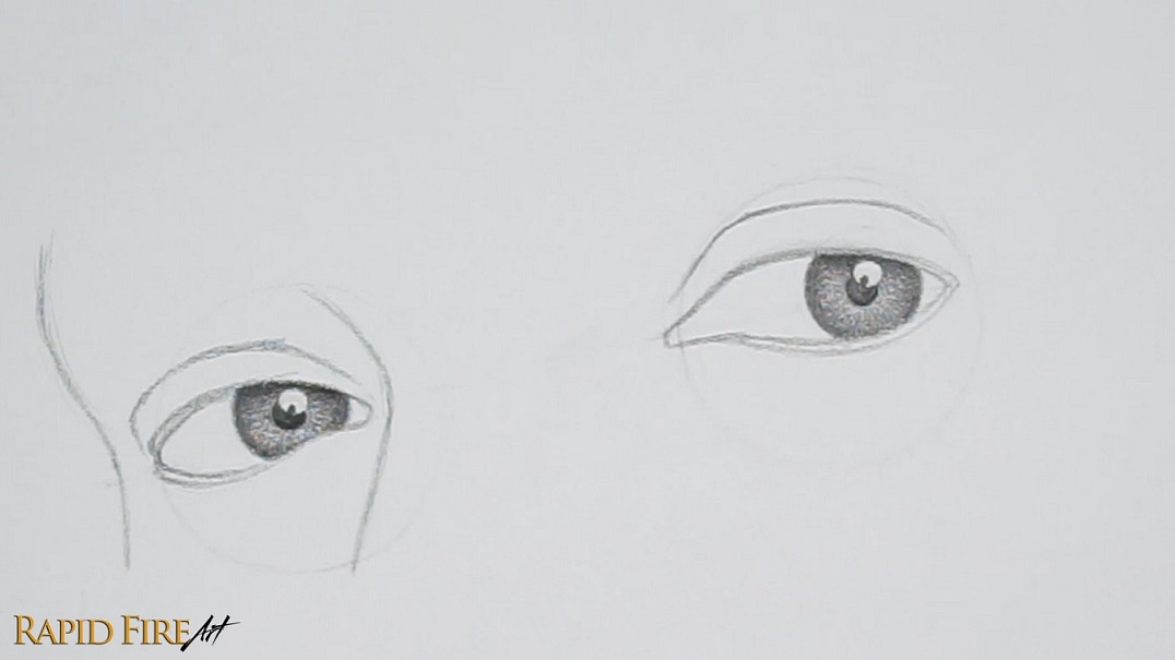
Step 2: Draw Eyes at the ¾ Angle
Eyeshape
Lightly draw each eye, making sure they sit evenly along the guideline highlighted in blue. Notice how the blue line runs through the corners of the eyes?
In the ¾ view, the closer eye (right) appears almost full width against the eyeball circle, while the far eye (left) appears narrower because it wraps around the other side of eyeball
To show this, draw the left eye about ¾ the width of the eyeball.
Common Mistake #1: When drawing eyes in perspective (especially in a 3/4 view), avoid making both eyes the same width. This flattens the drawing and removes the sense of depth.
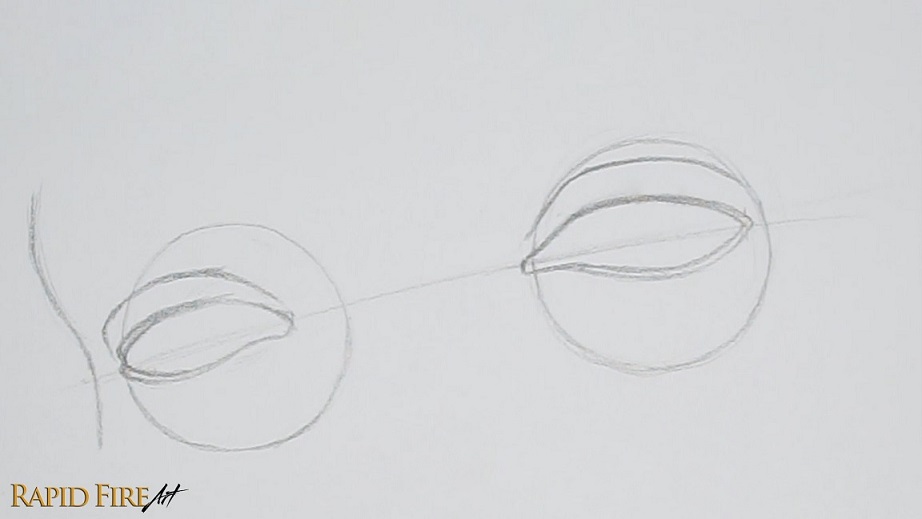
Next, draw the eyelid ledges. Starting with the right eye, draw an outline around the top and bottom lid, tapering your strokes as you get closer to the inner corner of the eye.
Do the same for the left eye, except extend your strokes beyond the boundary of the eyeball so it looks like the eyelid skin is wrapping around a spherical eyeball. The image above shows an exaggerated example.
Then draw an eyelid crease above each eye. At the outer edge of the left eye, angle your stroke down to form the edge of the eyelid.
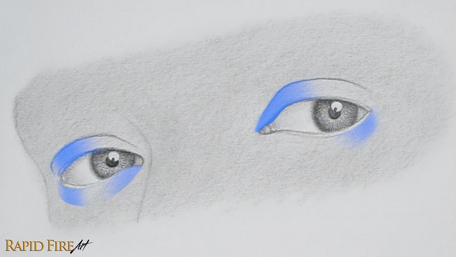
To draw the edge of the face, give yourself a little distance from the eye and draw a slight “S” shape that runs perpendicular to the guideline that runs through both eyes. Curve the top part of your “S” out as much as you’d like, shaping the brow bone to your desire.
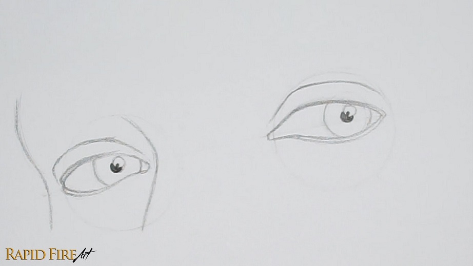
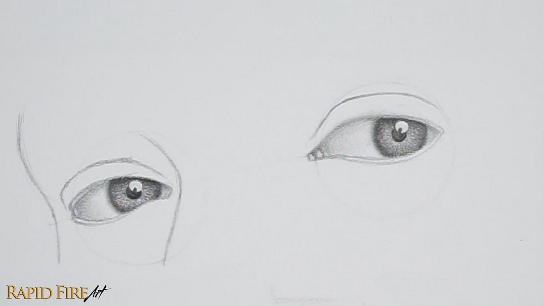
Draw the Irises, Pupils, and Nose
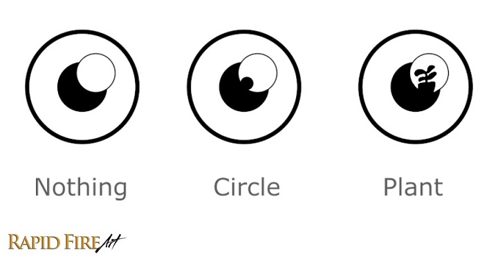
Iris To draw a realistic-looking iris, draw a full circle about half the eyeball’s size. Position it to the far right so it appears as though the eye is looking at us directly. Make sure the bottom half of the iris is more visible than the top.
Common mistake #2: Avoid drawing 2 bracket-shaped irises because they’re harder to size and look less realistic.
Pupil Locate the center of each iris by drawing a vertical and horizontal line through the middle. Where the two lines meet, draw your pupil. Draw your pupil size based on how brightly you want the subject to be lit (Small pupil = brightly lit, Big pupil = dimly lit). You can now erase parts of the iris that fall outside the eye opening.
Highlight Draw another circle in your eye for the highlight. This is a reflection from a light source. Overlap it with the pupil so we can create some high contrast in the eyes, which makes the drawing look more interesting. I’ve placed the highlight in the top right side of the iris to indicate that the light in this scene is coming from the top right.
Nose (Bridge Only) Start near the inner corner of the left eye and sketch a wide “V” shape to form the nose bridge.
Once you’re happy with how your eyes look, erase the guidelines from step 1. Make sure your remaining lines are faint, so they will blend in naturally as we shade.
Common Mistake #3: Dark outlines can flatten your drawing and make it look cartoony.
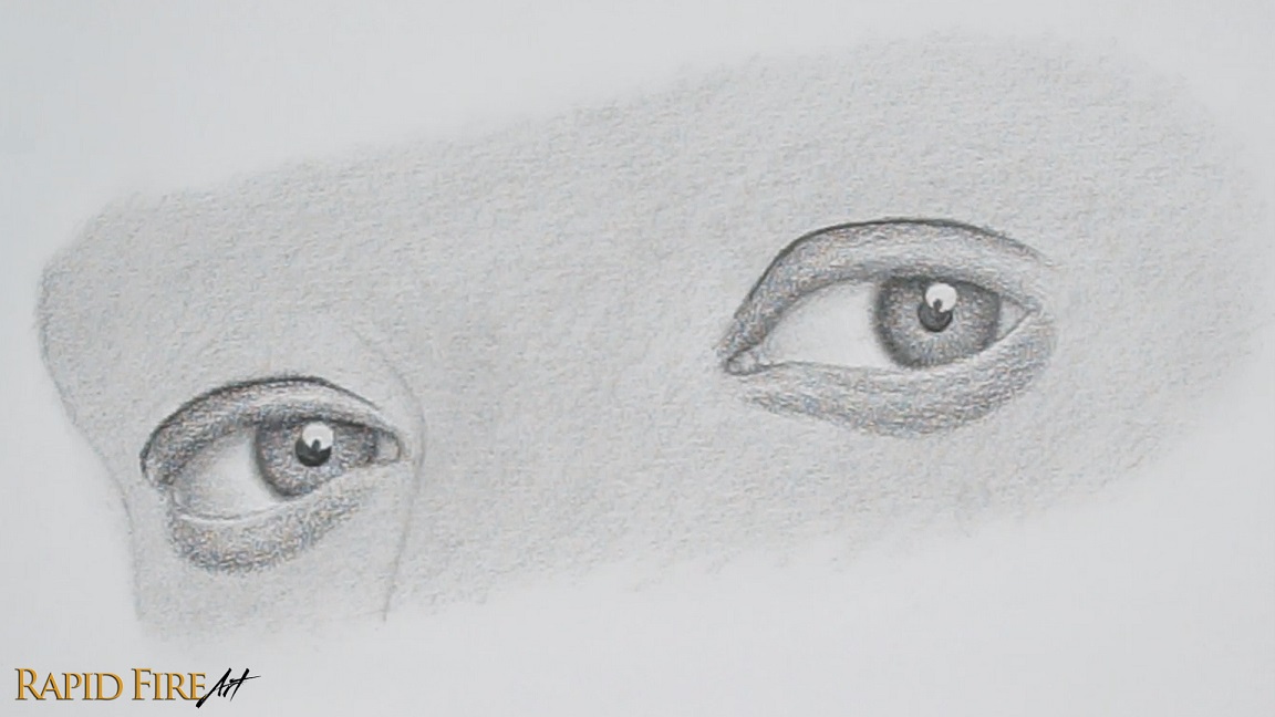
Step 3: Shade Inside the Iris
I’m switching to a 2B pencil to shade. It’s slightly softer than the HB, which allows me to blend my drawing more easily and shade slightly darker without having to use much pressure. Using an HB pencil with a lot of pressure to shade can flatten the texture of your paper, making it shiny instead of dark.
Shade the Pupils
Shade each pupil as dark as possible with a sharp pencil tip to keep edges crisp.
I‘ve added an optional obstruction to the highlight in the bottom left to make the drawing look a little more complex. I chose a circular obstruction, but you can choose any shape you want, such as a leafy houseplant.
Shade the Iris
Lay down a medium value across the entire iris without crossing into the highlight. Then darken the edges, fading toward the pupil. Since the main light source for my subject comes from above, the top eyelid will cast a shadow upon the top of the iris. Shade this cast shadow darkest at the top and fade downward.
To see the iris shaded in more broken-down steps, watch the video clip below:
Step 4: Shade the Eyeball (Make It Round)
Shade the rest of the eyeball using extremely light pressure to lay down a solid base layer. Don’t leave anything white. The lightest areas in the eye should be the highlights. To give the eyeball a three-dimensional appearance, we need to darken areas turning away from the imaginary light. This means gradually shading the left side of each eyeball to create a smooth transition from light to shadow.
For the left eye, leave a very thin sliver of lighter value along the far left edge to account for ambient light
Add a cast shadow along the top, and right side of each eyeball where it touches the eyelid.
Soften the edge of each iris using light shading or blur it using a blending tool (I used a folded tissue. Video example at the end of step 5).
Tip: If your shading is heavy-handed, consider switching back to the HB for subtle shading.
For the inner corner of the right eye, separate this space into sections using 2-3 lines. Shade them all in, leaving a highlight on the right side of each section. Blend to make these look like bumpy flesh.
Optional: Blend your shading, working from light to dark to avoid smudges. Make sure your shading is as smooth as you can get it. If you have any major gaps between your pencil strokes, they may still be visible after blending.
Tip: To blend more precisely using a flimsy tool such as a tissue, fold it in half twice, then create a point by folding it tightly along the edge.
Watch this clip to see how I blend both eyes using a tissue and how to fold it for precision blending.
Step 5: Shade the Surrounding Skin
After you’re done, shade a light base layer across all the skin. Don’t worry about shadows yet.
Blend the skin lightly using a tissue wrapped around the padded part of your finger. Be careful not to smudge the iris details.
Now let’s give the skin some form by darkening areas that turn away from the light.
Shade the top and bottom section of each eyelid, leaving a strip of light along the middle. Make the transition from dark to light gradual. This creates a rounded form.
After you shade along the eyelid crease, it should not look like a line anymore.
If you don’t want the undereyes to look too puffy, lighten the shadow of each eye bag.
Shade the highlighted areas above to make each eyelid feel like it’s wrapping around the eyeball. Create gradual value transitions.
Keep the shadow on the left eyelid slightly darker than the right.
On the far left edge of the left eye, leave a thin strip of ambient light just like we did for the eyeball.
The rest of the face looks flat. Let’s darken some areas to give it more form.
Nose to Brow (Left Side) Shade the left side of the nose. To give it more height, shade darker. If your shading here is too light, the nose may appear flat. Lighten your strokes gradually as you shade further away from the nose. Extend your shading from the nose bridge up above the eye in a big arch to give form to the brow bone.
Left Edge of the Face Along the left edge of the face, darken your shading and lighten up gradually as you work your way to the right, where the form starts curving toward the light.
Right Brow Lightly shade the area above the right eye to give the brow bone some form. Shade slightly lighter toward the right side.
Eyelid Creases and Undereyes For both eyes, shade directly above the eyelid crease to curve the skin inward, shading darkest near the crease and lighter as you move away.
Shade lightly under each eye bag, leading into the cheekbones.
💡 Practice Tip: If you’d like a printable version for offline use with all reference images in one place, you can grab the full PDF here (paid). It includes all* tutorials from my website. If you’ve already purchased the bundle, go to the download link in your email to find the newest added PDF :)
Shade the Rest of the Nose
Shade a little darker along the right side of the nose bridge, making sure to feather your strokes out as you work your way to the brow and undereye.
Along the highest point of the bridge, shade darker, feathering your strokes out along the brow/forehead. Leave a strip of light along the transition zone between the front plane of the nose and the side planes. This accounts for direct light coming from the right side and ambient light from the left side.
To make the bridge look more rounded instead of blocky, shade a dark strip along the left side to show that the form gradually curves away from the light.
If you want to see nose shading in action, watch the short clip below:
Blend
Before blending, check your drawing to make sure there are no major gaps between your pencil strokes. If you prefer not to blend, that’s totally fine. To avoid smudges, blend from a light area into a darker one, and use a clean spot on your blending tool often (I’m using a fresh area of my tissue with each swipe).
After blending, your drawing may look a bit lighter. You can go back in and darken certain areas, or leave it as is if you like the softer look. Just go with what you think looks best. I’m using a budget-friendly blending tool here, so this method isn’t the most optimal. If you want to blend without lightening your values as much, try using a very soft-bristled paintbrush instead.
Now that the skin is smooth, you can add subtle details like fine wrinkles under the eyes. Lightly draw a few fanned-out lines beneath the eye bags. Keep your pencil sharp and your strokes very subtle.
Step 6: How to Draw Eyebrows from the ¾ View
Eyebrow Positioning
Now let’s draw the eyebrows!
We first need to map out where they will go. Height-wise, place your eyebrows along the brow bone, a short distance above the eyes. If you want a better understanding of overall placement, check out my Loomis head tutorial where I break down how the features are positioned on the face.
Use light ticks to mark where the eyebrows begin, arch and end. I’m using the eye as a reference point for each tick:
Beginning of eyebrow: at a slight angle to the inner corner of the eye (for the left eye, the beginning will be almost directly above the inner corner of the eye)
Eyebrow arch: positioned close to the outer corner of the eye
Eyebrow tail: at a slight angle to the outer corner of the eye (for the left eyebrow, the tail won’t be fully visible since it wraps around the far side of the face)
You can adjust these points depending on the eyebrow shape you want. For example, if you prefer a shorter tail, reduce the length.
Now we have some guidelines to start planning the eyebrow shape. We can draw the entire eyebrow outline using little tick marks instead of a solid continuous line. This allows us to plan out the eyebrow shape without having an unnatural outline showing through in the end. The faint ticks will blend in as you draw the actual eyebrow. This is borrowed from my shadow-lining technique.
Keep your outline faint, so you can easily make adjustments if needed.
Tip: To draw matching eyebrows, once you’ve finished one eyebrow and are ready to place the second, hold your pencil up to your drawing and match the angle of the eyes. Lock your hand in place, then slide your pencil upward to align it with the base of the first eyebrow. The point where your pencil hovers above the other eye is where the base of the second eyebrow should sit. You can repeat this to figure out the arch height and even match thickness as well, helping both eyebrows stay aligned.
Watch the clip below for a clear visual example of how to draw symmetrical eyebrows:
Practice Drawing Eyebrow Hair Are you happy with your eyebrow outline and its position above the eye? If so, let’s sharpen our pencils and practice drawing the actual hair. Use a confident swift motion with a lift at the end to create hairlike strokes, making sure the end of each hair is tapered instead of blunt.
Eyebrow Hair Direction Overview
Let’s start filling the right eyebrow. Just so I don’t lose you, here’s a clear illustration of how the eyebrow will be filled in.
I start at the bottom portion of the eyebrow, drawing a row of hair starting from the beginning and then ending at the tail. My stroke angle transitions from vertical to horizontal as I work my way across the eyebrow. At the tail end of the eyebrow, they start pointing downward.
Strokes near the beginning of the eyebrow will be longer and thicker than ones at the tail end.
Then I move up a little, adding more rows of hair until I fill in most of the eyebrow outline. As I approach the upper boundary of the eyebrow, I curve/angle my strokes more toward the tail.
For the top section, my strokes are very light and are all angled downward.
Finally, add some random, faint stray hairs around the main body of the eyebrow if you want the unplucked look.
To make the eyebrow look more integrated with the face, shade it very lightly and give it a slight cast shadow along the bottom. Look between the two images above to see just how light this cast shadow is.
Tip: To make the hair look natural, stagger the roots so they don’t form a perfectly straight line and vary the angle of some hair.
Left Eyebrow Hair
Do the same thing for the left eyebrow, except when you get to the edge of the face, point your strokes out beyond the edge of the face and angle them down. Add a few thin, light hairs further down so it looks like they’re peeking through from the other side.
Step 7: How to Draw Eyelashes from the ¾ View
Let’s draw the eyelashes now. Here’s a quick and simple visual explanation on how to do it:
Start by drawing “J” shapes along the top eyelid. I started at the middle of the eyelid, drawing a very narrow “J”. As I worked my way to the right, my J’s became wider, making them appear as though they are side-facing. For the left side of the eyelid, I just mirrored the shapes.
Fill in more lashes between your initial set, but instead of drawing them like perfect little rays of sunshine, taper some lashes together or cross them over each other.
Once you finish the top lashes, flip your “J” shapes to draw them on the bottom eyelid.
For the left eye, draw your most narrow J’s near the inner corner of the eye since that part of the eyelid is most forward-facing.
For more detailed steps and tips on drawing eyelashes, please read my dedicated eyelash tutorial which includes FREE printable worksheets.
Once you’re satisfied with how your eyelashes look, shade around the base of each lash using the circulism shading technique to add subtle texture to the skin around the roots. You can also add very light cast shadows under the top lashes, as well as subtle reflections inside the highlight of your iris.
Step 8: Polish and Tweeak Your Realistic Eye Drawing
If you’re happy with how your eye looks now, you can stop here, or you can continue tweaking for a more polished result or increase the contrast for a more striking appearance.
For grainy shading, go over it with another layer of graphite and blend those areas specifically. If you’re hesitant to darken the drawing further, switch to a harder pencil like an HB. This helps reduce visible white dots without significantly changing your values.
With a bit of patience, you can also use a sharpened pencil tip to fill in larger white specks (these are just the texture “valleys” of the paper).
Also soften out any harsh value transitions such as the nose, if it appears blocky.
Increase Contrast
Take a few steps back from your drawing to see if your lighting is consistent across the entire face. In my case, the left edge of the face was too light, so I darkened it, which helped the form feel more angled and accurate. After that, the left eyebrow looked too light in comparison, so I darkened both eyebrows to balance them.
I then darkened select areas to make them more shapely or to draw more attention:
For form (shapeliness):
Shadow on the left side of the nose bridge (to increase height)
Eyelid creases (to deepen structure)
Inner corner of the right eye (to add depth)
Left side of the eyeballs (to enhance roundness)
You don’t need to blend every layer of newly added graphite as long as it looks smooth emough for you :)
To draw attention:
Eyelids (increase contrast and help define the eye shape more clearly)
Irises (increase contrast and pull focus to the eyes, making them feel more vivid)
Tip: When the entire drawing is light, it can appear unfinished or washed out. Increasing contrast not only improves form, but also helps guide the viewer’s eye due to stronger visual hierarchy and depth.
At this stage, I’m not adding anything new. Just reinforcing dark areas and refining the balance between light and shadow to further push and pull elements of the face.
To bring back lost highlights, I used a kneaded eraser to lift graphite from the lightest areas. This is especially useful on the nose bridge and eyelids.
Add Highlights
You can make the eye appear wet by placing highlights in strategic spots. Erase inside the inner corner of the right eye to make the area look reflective. Adding a small highlight along the bottom of the eye where the eyeball touches the eyelid can make it look watery. Clean up the highlight in your iris from step 2 if it has become darker.
If you completed this eye drawing tutorial, attach it as a comment on this Facebook post with the text “challenge completed” and I will feature it below with your name and a link to your social media page. By posting your drawing with this text, you give me permission to feature it on my website with credit to you.
Fix Your ¾ Eye Drawing
If your drawing looks off, check these:
One eye too high: Make sure your eyes are balanced on the guideline from step 1.
Spacing too wide: Draw your eyeball circles closer than 1 circle distance apart. From the ¾ view, the eyeballs will appear closer together than from the front view because they are sitting on the same plane and the angle compresses the spacing.
Values too flat: Toggle between the images in step 7 and 8 to see how the introduction of darks and lights affect the form. If you want a deeper understanding of how to show different surface curvatures, check out my in-depth shading tutorial with simple diagrams and practice exercises. Focus on expanding your value range.
Darlene created RFA In 2013 with the goal of sharing simple yet detailed drawing tutorials with other artists on the world wide web. She is a self taught pencil portrait artist and Youtuber.
If your eye drawings aren’t quite matching what you see in your head, even after adding tons of detail and shading, you’re definitely not alone. It usually comes down to a few factors that flatten your drawing or push it into a more stylized look without you realizing it. Here are some of the most common mistakes that can make your eyes look less realistic and what to do instead:
Common Mistake #1: Bold Outlines
Outlining the entire eye with a thick, dark outline is one of the fastest ways to make it look flat or cartoony. In reality, the eye doesn’t have a consistent outline. Some edges are soft, some are sharp, and some almost disappear completely depending on the lighting situation.
What to do instead:
Try to make outlines subtle enough that they blend in or disappear as you shade.
Let your shadows define the form instead of lines.
Keep your darkest lines only where the form actually turns sharply.
A lot of beginners only shade the iris or pupil, leaving the rest of the eye almost untouched. This makes the eye feel pasted on instead of integrated into the face.
What to do instead:
Make sure to shade the entire eye, leaving only your highlights white.
Add subtle shadows to the whites of the eyes since they’re not actually white.
Eliminate gaps between your pencil strokes to avoid making it look like a rough sketch or unfinished.
Common Mistake #3: Lack of Value Variety
If a drawing is limited to lighter tones, it can look dull and flat. Realistic eye drawings rely heavily on contrast to help push and pull elements of the drawing, giving it the illusion of depth.
What to do instead:
Intensify your dark values to make the drawing less “washed out” and bring in some depth.
Use a full range of values from light grays to deep blacks. This contrast is what gives the eye that “alive” look.
Save pure white for highlights. It’s what makes the eye look wet and reflective.
Common Mistake #4: Unrealistic Lashes
Drawing lashes as stiff, evenly spaced spikes that form a predictable pattern can instantly break realism. In reality, lashes are messy, can overlap each other and sometimes point in an unpredictable direction.
What to do instead:
Draw lashes in clusters that taper together and crossover each other
Vary their length, thickness, direction, and curvature to make them look more random.
Avoid making them too evenly spaced or symmetrical
If you want a deeper breakdown, check out my eyelash tutorial here (New: I’ve added free practice worksheets to help you actually apply it on a fully shaded eye).
Common Mistake #5: Wonky Iris Shape
The iris is a circle, but many drawings accidentally squash or distort it. A really common mistake is drawing bracket shapes inside the eye, which usually results in an uneven or oblong shape.
What to do instead:
Draw the iris as a full circle, even if it’s partially covered by the eyelids. You can erase the unneeded parts afterwards. Drawing a full circle also helps with centering the pupil.
If you want a step-by-step breakdown of how to put all of this together, follow this in-depth eye drawing tutorial where I walk through the entire process from construction to shading. You can view the written guide or watch the full video tutorial if you don’t want to miss a single step.
Darlene created RFA In 2013 with the goal of sharing simple yet detailed drawing tutorials with other artists on the world wide web. She is a self taught pencil portrait artist and Youtuber.
What is a Blending Stump? A blending stump is simply a tightly rolled piece of paper with a pointy tip, used to blend mediums such as graphite, charcoal or pastel.
Artists use it to:
Achieve smoother shading
Blend harsh pencil strokes
Soften transitions
And when it becomes saturated, they can use it to shade and blend all in one go. How cool is that!
At the art store, these blending tools can feel expensive for what they are, so in this tutorial, I’m going to show you how to make your own blending stump at home using materials I bet you already have lying around your house! Homemade blending stumps work surprisingly well and can even be customized to your specific needs. I’ll show you how later on in the tutorial!
Materials to Make a DIY Blending Stump
To make a DIY blending stump, gather the following:
Different types of scrap paper
Scissors
Tape or glue
Medium-grit sandpaper (around 100 grit or finer) or something similar, like a nail filer or even a smooth brick from the exterior of your house. Yes, I’m serious.
Optional: box cutter or craft knife (Note to young artists: Please ask a guardian for help before using sharp tools)
Step 1: Choose the Right Paper for Your Blending Stump
To create an effective blending tool, the softness of your paper matters. Try ripping it and looking at the edge. The more frayed it is, the softer the paper, and the better it will blend graphite.
I recommend using different types of paper to see which one works best.
Step 2: Cut a Rectangle of Paper
Start by cutting a rectangle of paper. The exact dimensions are not important. In case you want to follow what I did, my dimensions are roughly 13cm x 7cm. The size of your rectangle simply affects the length and thickness of your blending stump. Later in this tutorial, I will show you how to customize your rectangle size for length, thickness and comfortability.
Step 3: Trim One Corner
We’re going to roll this rectangle up tightly, but it’s difficult to do so with such a long edge. To make it easier:
Cut off the top corner of the rectangle (just on one side).
Leave about 2 thumb-widths because we’ll be rolling with our thumbs.
If you’re able to roll the paper tightly without trimming the corner, that’s recommended!
Step 4: Curl the Paper
Before rolling the paper stump, it helps to first pre-curl the paper using a pair of scissors. Place the paper between your index finger and a closed pair of scissors and gently pull the paper through several times, like how you would curl a ribbon.
Step 5: Roll the Paper Tightly
Now roll the paper as tightly as you can, starting from the trimmed side. Use your thumb and index finger to roll the very edge back and forth until it becomes soft and can be rolled densely. Roll straight across, using both thumbs and index fingers. If you’re having difficulty with this step, it helps to wet your fingers slightly or even the paper itself, but be careful not to overdo it with the water, otherwise, your paper can start breaking down.
This step is extremely important. The tightness of the very first roll determines how sharp the tip of your blending stump will be. A sharp tip is needed for doing detailed work on your drawing, so try to make it as dense as possible.
You will notice that the trimmed end of your paper stump will appear hollow. This is normal!
Why a Pointed Tip Matters
A sharp, firm tip allows you to:
Blend tiny details with precision
Smooth out your shading in tight spaces
Have better control over what you’re blending/drawing
Sometimes you’ll find a paper that’s very soft and spreads graphite beautifully when using the side. However, that same softness can make the tip too weak for precision work. Blending stumps made from this type of paper are better suited for smoothing large areas, while detailed blending may end up looking blurry or muddy. In this case, it can help to keep two blending stumps in your toolkit: one for broad blending and another, made from a firmer paper, for detail work.
Step 6: Tape the End Closed
Once the paper is rolled up tightly all the way across, hold it firmly with one hand and tape it closed. Avoid taping too close to the ends. If you want a clean seal from end to end, you can use a little glue along the edge. Be prepared to hold it closed for a few short minutes before letting go, to make sure it doesn’t unravel.
Step 7: Sharpen and Sand Your Paper Blending Stump
First, make sure you are sharpening the correct end – the solid/dense end, not the hollow one (since we trimmed the paper earlier, one end of the stump will be hollow).
Here are two ways to sharpen your blending stump:
For Young Artists:
Try sharpening your stump using a pencil sharpener. If that fails, use sandpaper to sharpen your blending stump to a point, while holding it at an angle (This takes a few minutes, but is much safer than using a razor or knife).
If you decide to use a sharp object, please ask a guardian for help :)
For Adults:
Use a box cutter or craft knife held at an angle to sharpen the solid end until it forms a point.
It won’t look perfectly sharp yet, so refine it using sandpaper. This process also makes the paper slightly fuzzy, which helps it grab and spread graphite better. Avoid coarse sandpaper since it can tear up the paper and make the surface uneven.
Tip: If you don’t have sandpaper, you can try alternatives such as a nail filer (emery board), pumice stone, or even a clean and smooth brick. (Thanks to my Youtube viewers for suggesting alternative sharpening methods!).
Testing your Homemade DIY Blending Stump
When you’re done, test your stump by simply blending some scribbled graphite or charcoal using the side and the tip. A good blending stump should:
Spread graphite smoothly without any streaks
Be able to draw thin lines when the tip is saturated with graphite residue
Maintain a sharp tip for precision work
Experiment With Different Papers
Try making blending stumps using different paper types. It doesn’t strictly need to be art paper. You can use a paper bag or non-colored newspaper. Each paper will behave slightly differently.
For example, very soft paper may blend graphite extremely well, but as mentioned earlier, the tip may not be firm enough for precise work. In that case, the stump will be better suited for blending broad areas of a drawing, such as large areas of skin, rather than tiny details like the iris or tear duct.
Test multiple types of paper to find the right balance between softness and stiffness for your personal drawing needs.
Alternatives: As one of my YouTube viewers pointed out, paper lollipop sticks can also work as miniature blending stumps. Because they’re machine-rolled very tightly, their dense structure allows you to sharpen them to a fine tip that’s great for blending small details.
How to Customize Your Blending Stump
One great advantage to making your own blending stump, besides being free, is that you can customize the size and shape any way you want to fit your needs.
How to Make a Longer Blending Stump
If you want a blending stump that is ergonomic and feels more like holding a pencil, cut a longer rectangle of paper. A long one will be easier and more comfortable to hold.
How to Make a Thicker Blending Stump
For blending large areas more quickly, cut a wider rectangle. This gives you a chunkier stump that can cover more surface area with each swipe. This is great for blending things like the forehead, cheeks, clothing or large backgrounds. It’s also more comfortable to hold if you have large hands.
If you run out of paper while rolling, simply tape another piece of paper onto the end and continue rolling.
If you want a long and thick blending stump, increase both the length and width of your paper.
How to Clean a Dirty Blending Stump
Once you’ve worked on a few drawings, the stump may become fully saturated with graphite. To clean a blending stump, you can:
Sand it down similarly to how you did when creating it. This also sharpens it again.
Alternatively, you can use an eraser to erase the graphite off. This may not work too well for softer blending stumps where the graphite is lodged deep within the fibers. But it’s great if you’re in a rush.
Final Thoughts
Making your own paper blending stump is not only fun, but also makes use of scrap paper that may have ended up being thrown away. It’s also a great way to test different blending textures to find one that suits your drawing style or to fit different drawing projects you may have. Try making a few and compare how they perform against each other. I hope this was a fun little DIY project for you! I know I had a lot of fun rolling and testing different papers to find the winner!
Darlene created RFA In 2013 with the goal of sharing simple yet detailed drawing tutorials with other artists on the world wide web. She is a self taught pencil portrait artist and Youtuber.
Are you good at drawing facial features from the front or side but struggle with other angles? Today I’m going to share a quick and fun DIY method for making simple 3D models that you can move around to explore facial features from any angle. These are very rough models, just enough to help you think through placement and structure when reference photos aren’t available. You’ll still want to study real faces to draw them realistically, but this can make certain angles a lot easier to wrap your head around.
This eye model was made using a kneaded eraser.
If you don’t have any molding clay, Play-Doh or even a kneaded eraser, you can follow the recipe below to create something that feels similar to Play-Doh. If you already have molding clay, you can skip the recipe section and go straight to the section on how to form a 3D eye, nose, and head model.
Simple Non-Toxic PlayDoh Recipe
To make this non-toxic Play-Doh from scratch, you’ll need:
In a small bowl, mix the salt and flour well. Then add the dish soap in and mix again. You can add a few drops of food coloring if you like. Once the mixture starts clearing the sides of your bowl, feel free to get in there with your hands for a more thorough mix. I found this recipe just right for me, but since it’s likely we won’t be using the exact same ingredients, here are some troubleshooting tips for you:
Mixture too dry? Add more dish soap
Too wet? Add more flour
Too crumbly? Use less salt
Our goal is to get a consistency that is easy to shape without falling apart, crumbling, or being overly sticky. Here’s a test! Can you create a pointy tip (like the end of a witch’s hat) without it falling apart? If it’s falling apart now, it will become worse as you play with it because exposure to air will dry it out further.
Notes: The salt acts as a preservative, so you can keep this Play-Doh in an airtight container for a few months without it getting moldy. Avoid using oil as a substitute for the dish soap because it can actually ruin your drawing if it comes in contact with your paper, even just briefly.
How to Form 3D Models of Facial Features
Making a 3D Eye Model
Create the Eyeball: Roll a piece of Play-Doh into a ball and set it aside.
Create the Eyelids: Roll another ball around the same size as the first one and flatten it down (don’t make it too thin or else it will be difficult to peel off your work surface. 3mm to 4mm worked nicely for me). Cut it in half using a straight edge such as a ruler or butterknife. These halves will be the top and bottom eyelids.
Assemble the Eye: Place the two lids onto the ball, leaving a football-shaped opening to form the eye. Pinch the two lids together so they stay put.
Think of this model as a sketching aid. Rotate it, explore an angle, then translate that view directly into your drawing. It was very helpful for me when practicing the Loomis head drawings.
Making a Nose Model
Create the Base: Form a wedge shape with a trapezoid at the bottom.
Add Nostrils: Attach two round pieces on the sides for the nostrils. Press them in until they look more like half-spheres.
A blocky model like this trains your eye to think in 3D rather than copying outlines and makes proportion or orientation errors easier to spot and fix. Keep it next to your desk as a handy reference tool.
Making a Model Head
Prepare the Base: Make a ball using your play-doh or better yet, a styrofoam ball and pierce it with a toothpick through the very center.
Mark the Lines: Draw a vertical and horizontal line around the ball, ensuring they form a 90-degree angle and that the vertical line goes through the North and South Pole.
These lines help inform where facial features should go when the head is tilted at any angle. Find out more by exploring my tutorials on drawing the head.
You can also convert this into an eye model to help with positioning your pupil correctly (the vertical and horizontal line marks the position of the pupil).
Using Your Drawing Models
These models are simplified representations of facial features and the head. They can help you understand how features might look from challenging angles, especially when your reference image isn’t clear or available. Rotate the model to study foreshortening and observe how planes shift or disappear from view. This kind of practice helps build a mental library for drawing from imagination, but it doesn’t replace studying real faces.
Maintaining Your Play-Doh
If your Play-Doh starts to dry out, remove hardened or flaky bits and then knead it well. Store it in an airtight container or Ziploc bag to keep it usable for months. For a longer-lasting alternative that doubles as an eraser, check out my tutorial on how to make putty erasers from common household items.
Darlene created RFA In 2013 with the goal of sharing simple yet detailed drawing tutorials with other artists on the world wide web. She is a self taught pencil portrait artist and Youtuber.
RFA uses cookies to offer you a better browsing experience, analyze site traffic, personalize content, and serve targeted ads. By clicking accept, you are helping to support my site and keep drawing tutorials free 🙂. Not a fan of cookies? No worries! Adjust your preferences in the settings! Not consenting may affect some features and functions such as embedded video tutorials.
Functional
Always active
The technical storage or access is strictly necessary for the legitimate purpose of enabling the use of a specific service explicitly requested by the subscriber or user, or for the sole purpose of carrying out the transmission of a communication over an electronic communications network.
Preferences
The technical storage or access is necessary for the legitimate purpose of storing preferences that are not requested by the subscriber or user.
Statistics
The technical storage or access that is used exclusively for statistical purposes.The technical storage or access that is used exclusively for anonymous statistical purposes. Without a subpoena, voluntary compliance on the part of your Internet Service Provider, or additional records from a third party, information stored or retrieved for this purpose alone cannot usually be used to identify you.
Marketing (Activating this supports my website via ads, keeping tutorials free)
The technical storage or access is required to create user profiles to send advertising, or to track the user on a website or across several websites for similar marketing purposes.