We have updated our Terms of Service and Privacy Policy. Effective June 18, 2024 (Some Key Updates: contact information, user rights/opt-out procedures, 3rd party services/integrations, data retention policies...). Please review updated pages.
Darlene created RFA In 2013 with the goal of sharing simple yet detailed drawing tutorials with other artists on the world wide web. She is a self taught pencil portrait artist and Youtuber.
If you haven’t heard of Inktober, it’s a fun challenge started by Jake Parker, where you try to draw everyday in the month of October using ink!
I decided to join in on the fun even though I’m most comfortable working with graphite. And I encourage you to join in as well! I think a great way to grow any skill is to constantly challenge yourself by stepping outside of your comfort zone.
Anyway… drawing is drawing – it doesn’t matter what medium you use!
[td_block_ad_box spot_id=”custom_ad_3″]
With my current work schedule, I decided to make a drawing every other day. You can follow me on Twitter to catch me when I post the next one all the way up until Oct 31st! Tweet at me if you’re participating as well! I’d love to see your submissions!!
The most challenging thing about Inktober is that there’s no ERASING! So to up the game even more, I’ll try NOT to use pencil for under layers/rough drafts, etc. Just plain ink on paper.
Here are my submissions so far!
October 1: Robert Downey Jr.
Time: 46 mins
Did this on the Wacom Intuos Pro Paper tablet. It was so fun!! It was a bit of a challenge coloring the portrait because the pen has a 0.4mm fine tip. I got the proportions all wrong and couldn’t erase anything, but still proud that I got my first one done!
October 3: Iron Man & Pepper Potts
Time: 1 hr 10 mins
Huge obsession with Iron Man…
I used Pigma Sensei Pens for this one. The most difficult thing was shading Pepper’s skin, although I think it turned out okay in the end. In areas where I messed up, I used a thick 0.6mm pen to outline it so the mistakes would disappear.
October 5: Drogon Wight
Time: 40 mins
Inspired by Ertaç Altınöz’s digital drawing.
October 7: Bran (Three Eyed Raven)
Time: 45 mins
October 9: Arya Stark
Time: 39 mins
This one was really fun because of the greasy hair. Shading is awful though…
October 11: Hodor Hodoring
Time: 1 hr 20 mins
So frustrated with myself because the drawing didn’t turn out the way I wanted, but I decided to post it anyway… gotta show my fails too!
October 13: Tyrion Lannister
Time: 2 hrs 23 mins
UPDATE: This is where I stopped. I was staying up past 2am to do these and it turns out that was really bad for my health. I got really painful stomach aches which didn’t go away until after a week and other health issues started to resurface, so I decided to not to continue. It was fun, but I just didn’t have time for it!
Here’s my entire list of ideas:
1.) Robert Downey Jr. 2.) Iron Man 3.) RDJ and Miss Potts 4.) Wolverine 5.) Wonder Woman 6.) Lara Croft 7.) Indiana Jones 8.) Khaleesi 9.) Jon Snow 10.) Tyrion Lannister 11.) Arya Stark 12.) Sansa Stark 13.) Jaime Lannister 14.) Jora Mormont 15.) Samwell Tarly 16.) Dragon 17.) GOT Sword Throne 18.) The Mountain 19.) Jaqen H’ghar 20.) Hodor 21.) Bran Stark 22.) 3 Eyed Raven 23.) Brienne of Tarth 24.) Magneto (X-Men) 25.) 26.) 27.) 28.) 29.) 30.) 31.)
If you have any suggestions, leave them in the comments down below! And don’t forget to follow me on twitter where I’ll be posting a drawing every other day.
Do you want to do a month of pencil sketching with me? Let me know if you’re interested and I’ll organize something fun for us :)
Darlene created RFA In 2013 with the goal of sharing simple yet detailed drawing tutorials with other artists on the world wide web. She is a self taught pencil portrait artist and Youtuber.
Let’s cut to the chase! Here are some straight up steps for you to start shading right away. Keep in mind that there are many ways to approach shading. This is just one!
1.) Sketch your subject
2.) Add dark values
3.) Add a light values
4.) Add the midtones
5.) Draw cast shadows
6.) Define the highlights
7.) Final touchups
These are the tools I’m going to use:
Kneaded eraser (you can use a hard plastic eraser too. It’s just easier with the kneadable one)
Pencils – HB, 2B, 4B (or you can use one pencil and vary the pressure for different values)
Step 1: Sketch the Shape of Your Subject
This is my subject:
Use a hard pencil such as an HB to lightly sketch your subject.
I’m sketching darker than I should, so you can see it clearly. But you should keep the outlines as light as possible. We don’t want outlines in our final piece – it takes away from the realism.
Step 2: Add the Darkest Values
Remember the shading techniques from lesson 8? Select a shading technique (or two) for the drawing. I’m using the hatching technique because I think it’s the easiest and fastest way to shade.
Along the darkest areas of your subject, shade a medium layer of graphite. I’m using a 2B. Try to keep those edges fairly soft. If you’re happy with how it looks, darken your shading further. Here, I’m using a 4B.
Step 3: Apply a Layer of Lighter Graphite
Since the subject is fairly light, I’m going to define the highlights at the very end. If your subject is dark, use the shadow-lining technique to outline your highlights now and then shade around it.
Take a look at the reference photo again. Where are the highlights and what value are they?
Answer: The highlights are located on the right side of the body and the brightest areas appear to be white.
We cannot leave any other part of the drawing white because this value is reserved for the brightest point of each highlight.
I see a lot of beginners shade only the darkest values and leave the rest white – which is what I used to do as well. It makes the drawing look flat:
Don’t be afraid to shade your drawing fully. It was a big obstacle for me and it took a lot to get over. It wasted a lot of my time… time I could have spent leveling up!
So use a light pencil such as an HB to shade a medium/light shade of grey over the entire drawing. Since the highlights appear along the outer edge of the subject, I shaded past the body so that later when we add the highlights, there will be a higher contrast between the subject and the background.
Keep those lines thick and close together.
Before we move on, I wanted to darken the facial features and hair so it looks more interesting :)
Step 4: Add the Midtones
Now that we have dark and light values, we’ll need to soften out the transition between the two by adding medium values in between.
Shade a medium value in between the dark and light values to soften out your shading.
I’m using a 2B because it’s between HB and 4B.
If you want to convey a round edge, avoid abrupt shading transitions. The more gradual your shading is, the more smooth your edge becomes.
Take your time and work in layers to build the shading up slowly.
Step 5: Add Some Cast Shadows
Where is the light coming from? Draw cast shadows to give the piece more contrast.
There are shadows on the ground around the feet. Define the boundaries between the feet, belly and ground by drawing outlines where appropriate. This will clean up the outer edges of the drawing.
Remember to draw the outlines no darker than the shadow itself.
Make the shadow darkest where the subject touches the ground and lighter where the shadow stretches away and the edges soften out.
Step 6: Add the Highlights
Use an eraser to add highlights to the lightest areas of the drawing to pull the subject out and off of the sketchbook. I suggest using a kneaded eraser for higher precision.
Darken the background even more to make the highlights pop out really well!
Use your eraser to remove small amounts of graphite from the right side of the drawing. The center of each highlight should be the lightest. If you’re using a kneaded eraser, roll it to a rounded tip and press the eraser onto the graphite a few times until you get a bright white.
To make the transition between highlight and midtone look more gradual, roll the kneaded eraser to a finer tip and press it along the transition zone while using a much lighter pressure..
This particular part isn’t possible with a regular plastic eraser, so use your pencil to smooth out the transition instead.
If your highlights aren’t popping as much as you’d like, darken the background further.
Step 7: Anything Missing?
Do a final check to see if you missed anything. Can you see what’s missing from my drawing?
Answer: Cast shadows on the body and the triangle of light beneath the belly. There are probably others, but these are the major ones.
To get rid of the grainy look, you can blend the drawing so the graphite fills all the crevices on the paper. That’s a topic for another tutorial!
Bonus
Here’s a much simpler example of an apple:
The 2nd and 3rd step are switched: I shaded a base layer of graphite first and then added the darkest values because unlike the sumo, which is made up of a combination of basic geometries, the apple is made up of one basic geometry.
If I were to shade a base layer on the sumo before adding the darkest values, the outlines would all disappear – making it hard to redraw details like the facial features, fingers, toes, etc. Here’s a small example:
Homework Assignment + Challenge
Your homework assignment is to pick any subject and draw + shade it 3 times.
For the first drawing, set a timer for 3 minutes. The second drawing should be set to 5 minutes. For the final piece, set it for 30 minutes. Try to finish the entire drawing within the time frame given.
Feel free to share your artwork with me on Facebook under the Lesson 9 post. I’d love to see it!
If you want to challenge yourself further, draw it within 2, 1 or even 0.5 minutes. If you can do all six timed drawings and post your results on the RFA Facebook page, I’ll feature your artwork down below along with a link to your facebook page! I’ll also be posting my left handed homework when I get around to it (I’m so far behind!).
I hope this tutorial was helpful to you! It’s just an introduction but I hope it gives you a good starting point. If you want to learn more about shading and pencil techniques, visit this detailed guide.
And as always, if you have any questions or think I could have explained something more clearly, please let me know in the comments below. Your feedback is always welcome!
Waiting for lesson 10? Follow me on facebook and sign up through the candy-striped mailing list in the sidebar (on desktop) or at the bottom (on mobile) to get notified when it’s released!
If you like what I do and want to support me, check out my Patreon – where you can support your favorite artists and earn cool rewards at the same time.
Darlene created RFA In 2013 with the goal of sharing simple yet detailed drawing tutorials with other artists on the world wide web. She is a self taught pencil portrait artist and Youtuber.
This is the Wacom Intuos Pro Paper Edition, which was very generously given to me by the awesome folks over at Wacom! Playing around with this tab for a few days already gave me a bunch of cool ideas for future tutorials, so I’m super excited to see what I can do with it!
Thank you Wacom!
This tablet can turn traditional pen and paper art into digital ink right in front of your eyes! How cool is that?
As I familiarize myself with this awesome new toy (*ahem* medium), you’ll see me use it in a lot in upcoming video tutorials. It’ll help me speed up my work flow which means I can finally create content for you guys on a more regular basis! Yay!!
Disclaimer: This is not a sponsored post.
[td_block_ad_box spot_id=”custom_ad_3″]
Unboxing the Wacom Intuos Pro Paper Edition Medium
Before delving into my first impressions on the tablet, I wanted to share a snippet of my unboxing experience with you because… it was AWESOME!
The first box contains a pencil case, clip, ink pen, extra ink and paper. The paper is packaged so beautifully – I just can’t bring myself to open it!
The pencil case is really soft inside. There’s a lot of room for additional drawing supplies and even fits the tablet clip.
The ink pen has a soft rubber grip which feels comfortable to write with. I tested the pen on a notebook and the lines came out very fine without any blotches. The ink dries almost instantly.
I was pleasantly surprised when I found three extra ink refills in the small rectangular package. The method for removing the ink cartridge is genius! By the way, I love how their instructions are all visual!
The second box contains the tablet, stylus, stylus holder and a USB charging cable. The tablet was so beautifully packaged that I felt bad removing it from the plastic cover haha.
The surface feels cool to the touch. It’s thin but doesn’t feel fragile at all.
[td_block_ad_box spot_id=”custom_ad_2″]
There are programmable buttons on the side and one of them is magical! I’ll tell you about it later.
Here’s what it looks like with the clip.
Everything else was hidden under the tablet. I immediately thought of Iron Man’s arc reactor when I saw the stylus holder. It’s such a cool looking holder!
The stylus comes with a silver decorative ring near the tip and there are four other metallic colors to choose from. The rubber grip on the stylus feels a lot more comfortable to hold than the pen and it’s also a little plushier.
Besides looking cool as heck, the stylus holder has other uses as well. It helps with removing the stylus tip and also holds extra tips inside its body.
Here’s the difference between the ink pen and the stylus:
Ink Pen: It writes like a real pen with real ink. When used on the tablet, anything you draw can be digitized. It can be used to trace under-drawings.
Stylus: It’s a digital drawing tool which can be used to paint, draw or even replace a mouse.
First Impressions on the Wacom Intuos Pro Paper Edition
I plugged the tablet into my laptop and got a few prompts to download the software: Inkspace and Bamboo Paper.
Inkspace: As the name suggests, Inkspace is for turning paper sketches into digital ink. I’ll go more in depth down below.
Bamboo Paper: It’s a notebook app that you can draw in! The app looks like a notebook and has flippable pages. I LOVE writing notes, lists, plans and sketching out my ideas on scrap paper. But I always end up losing them! This app is really going to come in handy.
Wacom’s Inkspace app has a really cool live area where anything drawn with the ink pen can be instantly viewed on the screen in real time and a copy is automatically saved in the app. I had so much fun playing with this feature!
I haven’t drawn for leisure in a very long time but for some reason this makes me want to draw more! There’s something about seeing the ink appear on the screen that makes it so much more satisfying. I can’t really explain it.
Side note: When I put my laptop into “stand mode”, the tablet replaces the touchpad and this setup works quite nicely. Bonus point.. The tablet is exactly the same width and length as my laptop which means I can put them both in one travelling case!
All saved drawings are conveniently stored on the main screen of the app. From here, they can be exported into several different formats such as: Text, JPG, PNG, SVG or PSD.
[td_block_ad_box spot_id=”custom_ad_4″]
The app can even convert handwriting into text!
Remember that magical button I was talking about? Whenever I hit the small circle button on the tablet, my drawing gets saved. I don’t even need to be connected to the computer or internet since it can save to the internal memory. So that means I can work on the go even without my laptop and 8 pound scanner! Score!! Usually when I scan my step by step tutorials, it takes anywhere from 1 to 10 minutes per scan depending on the quality I want.
This only takes about 5 seconds!
Every time I save my progress, it actually saves it in layers. This is going to come in handy for capturing step by step drawing tutorials! When I want to turn this into a full image, I simply stack them on top of each other:
Here, I tried tracing a face from a 3 millimeter thick coupon book. It came out exactly how I traced it.
I tried it again. This time focusing on pressure sensitivity. The ink pen doesn’t seem to have pressure sensitivity (not that I know of anyway). If you compare the shading of the nose bridge from one image to the next, you’ll see what I mean. So if I want to shade, I’ll need to overlap lines or play with stroke spacing.
I wanted to test if the stylus had pressure sensitivity, and it does! On the right side, I tried to shade a nice gradient and it worked beautifully! It can almost pass as real graphite!
Here, I’m using the stylus to color the Iron Man drawing I made earlier:
With the stylus, I can only see what I’m doing by looking up at the screen. It’s a completely different experience from using the ink pen but it was just as enjoyable!
I’m really excited to play with this further and see how I can create realistic drawing tutorials using a combination of pen and stylus!
This is going to speed up my work so much! Once I figure things out, I’ll be able to quickly pump out more tutorials (most likely on fundamentals)! Don’t worry, I’m still going to do traditional pencil art as well.
Have you used a drawing tablet before? If so, how was your transition? Also, is there anything you’d like to see me try?
Darlene created RFA In 2013 with the goal of sharing simple yet detailed drawing tutorials with other artists on the world wide web. She is a self taught pencil portrait artist and Youtuber.
This is a long tutorial and I tried to keep it short, so if you get stuck anywhere, please watch the video version (linked at the bottom of this tutorial) or let me know and I’ll try to explain it better or add examples :)
Step 1: Determine the Eye Size
Using an HB pencil, draw 2 light ticks spaced well apart. This will determine the size of the first eye.
Use a ruler to draw a horizontal line through the ticks and extend it to the far right side of your sketchbook.
Measure the distance between the 2 ticks and triplicate it across the horizontal line so you end up with 3 equal spaces.
Not sure how to do this? Check out the video to watch me do it.
Step 2: Draw two Circles
In the left and right spaces, draw 2 circles similar in size. Make sure the circles are large enough to fill the space.
Step 3: Decide on an Eye Angle
Eyes are usually a little slanted. Use a ruler or draw a line freehandedly across each circle at an angle.
Erase the horizontal line to keep your drawing space clean.
Step 4: Draw the Eye Shape
Draw the inner corner of each eye where the circles and slanted lines intersect.
Draw the upper eyelid while staying within the circle.
Draw the lower eyelid but avoid drawing a flat line. Put a little curve into it so it looks more realistic.
Let’s draw the upper crease now. Start from the inner corner and work your way out towards the tail of the eye. You can use the shape of the top lid for guidance. If you want a more detailed tutorial on drawing eye shapes, click here to learn how to draw 8 different eye shapes.
Step 5: Shadowline the Eyebrows
Starting above the circle, use the Shadowlining technique to outline the eyebrows. Shadowlining prevents your outlines from showing through in your final work. Want more guidance on drawing eyebrows? Visit this detailed eyebrow tutorial.
Now erase all your guidelines to get ready for the next step!
Step 6: Draw the Irises
Very lightly draw an iris in each eye using an HB pencil. The iris should take up about 2/4’s of the eyeball horizontally like the examples below:
Your measurement should start from the tear duct to the outer corner of the eye.
To draw a perfectly circular iris, draw a full circle and then just erase the parts that fall outside the eyeball instead of drawing bracket shapes. This helps a lot when drawing narrow eyes.
Step 7: Shade the Face
Shade the face, leaving the eyeballs white. If your drawing is too light, darken it just a little before you shade or else the lines could disappear.
I’m using a sharp 0.5mm 4B mechanical pencil for this step. Starting at the bottom portion of the eyebrow, draw upward strokes. The strokes should be thickest at the base and very thin at the ends.
Do the opposite for the top portion of each eyebrow. Angle your strokes downward and use lighter strokes near the end of each eyebrow. Make sure your strokes taper at the ends instead of crossing over each other forming ‘X’ shapes.
Add a row of hairs going down the center to fill in some white space.
Carefully go over your strokes on the bottom to darken them.
Lastly, add a light shadow by shading the area using an HB pencil.
Step 9: Draw Details in the Eye
This is a really long step because I tried to include as much detail as possible haha. Stick with me guys!
Draw a small circle (pupil) in the center of each iris. Draw a rectangle (or any shape you want) in or touching the iris. This is the reflection of light from a bright window. Curve the sides of the rectangle to make it look like the eyeball is spherical.
Use a sharp 6B pencil to shade the pupil. Try to keep your edges as clean as possible.
Around the pupil, draw a squiggly ribbon using an HB pencil.
Around concave areas, use a sharp 4B pencil to darken the ribbon to give the eye more depth.
From the center of the pupil to the ribbon, draw light spokes.
Darken spokes that fall within concave sections of the ribbon.
Very lightly, draw a second ribbon around the first one. Leave a thin space between them.
Use a dark pencil such as a 2B or 4B (up to you) to darken the ring of the iris. Then use an HB pencil to shade the section between the ribbon and ring.
Grab your kneaded eraser, pinch it and dab it onto your drawing. This will create white spokes.
Use a sharp 2B pencil to make the spokes pop! You can do this by outlining them.
Use a sharp 4B pencil to add more details in between those spokes.
Grab a blending stump and carefully blend everything but the rectangle reflection. If you don’t want to use a blending stump, use an H pencil to shade instead of blending.
Step 10: Shade the Rest of the Eyeball
To make the reflection really pop, shade the rest of the eyeball so the only thing that remains white is the reflection.
Start by shading the inner corner of each eye using an HB pencil. This area is bumpy, soft, glossy and darker than the rest.
Once you’re done, soften the edge around each iris using a blending stump or HB pencil.
Shade the rest of the white space using the contouring method. If you want a more detailed tutorial on shading eyeballs, visit this tutorial.
After shading the eyeball as light as I could, I decided to darken the face to give the drawing more contrast.
Step 11: Draw the Eyelashes
Start by drawing 3 lashes per eyelid. Space them well apart. Use very light pressure just in case you need to erase anything.
Create some triangles by tapering the hair ends together.
Once you’re happy with the shape and placement of each lash, use a sharp 4B pencil to darken them.
Not enough lashes? Thicken the base and body of each one or add additional lashes – making sure not to overcrowd. Once you’re done, use a 2B pencil to shade the upper eyelid skin and an HB pencil to shade the lower lid.
The eyelashes should cast a shadow on the eyeball, so use an HB pencil to shade the top of the eyeball a little darker than the rest (Do not shade into the reflection). Try to make your shading very gradual.
Step 12: Add Eyelash Reflections
Finally, use a sharp 4B pencil to draw several eyelash reflections in the white rectangle. Want the eyes to have more depth? Darken your pupils as much as possible, brighten and/or darken some spokes to make them pop even more.
If you got stuck at any point, please check out the video version of this tutorial on my Youtube channel. It’s more detailed and contains extra steps!
Guys, I really hope you enjoyed this tutorial! Let me know if you have any questions and don’t forget to share this with your friends using the share buttons.
Happy drawing!
Share to Unlock
Want to download a FREE PDF version of this tutorial for offline viewing or printing? Please share this page with your friends using the buttons below to unlock the PDF. Thank you!
Alternatively, you can purchase ALL my tutorials in PDF form at once, for a small price. Click here for more info.
Darlene created RFA In 2013 with the goal of sharing simple yet detailed drawing tutorials with other artists on the world wide web. She is a self taught pencil portrait artist and Youtuber.
You can create a wide array of textures by applying different shading techniques to your artwork. A simple change in the direction or shape of a stroke can turn what looks like smooth skin into rough or dry skin.
Below are a few common shading techniques:
Hatching
This is the most common shading technique as it is easy to learn and allows you to cover more ground in a short period of time. It consists of a series of lines that go in one general direction. You can use it to shade just about anything.
When hatching, angle your pencil down closer to the paper so your strokes are nice and thick. This allows you to minimize gaps, making it so much easier to blend.
If you’re not careful, this technique can work against you. The straight lines can make something such a sphere look flat, like the example above. These unblended lines will work wonders for shading things like brushed steel, wood grain, etc.
Cross Hatching
Cross hatching is where you overlap lines at various angles. It’s great for drawing fabrics like burlap, textured (wrinkly) skin and whatever else you can think of that displays such a pattern. To shade light areas, lighten your lines and space them further apart. In shadowed areas, darken them and bring them closer together.
Circulism
As the name suggests, circulism consists of many overlapping circles. The more circles you draw, the more smooth the texture becomes! You can use it to draw fuzzy fabrics, soft cottony fabrics, realistic skin textures and more.
This technique is time consuming, but the results are amazing!
Apply this method using a sharp pencil for textured skin with wrinkles or use a blunt pencil for smooth skin, as it will be easier to blend.
Contour Shading
Contour shading is similar to hatching and cross-hatching. The difference is that the lines are curved to follow the contours of the subject. So these lines can be drawn horizontally, vertically and even diagonally.
Do you remember what was covered in lesson 3? Contour shading is a great way to practice giving form to your 2D line drawings. This might be difficult for you as a beginner, but try to use your imagination to visualize the shape of the object in a 3D sense and then try your best to draw lines that give the object form.
Combine Shading Techniques
It’s perfectly normal to use several shading techniques in one drawing. All of the above were used to draw the image below.
Circulism: Used to shade a base layer on the hand to give it a consistent base texture.
Contour Shading: Used to shade stretched skin.
Hatching: Used to shade nails and stretched skin.
Cross Hatching: Used to create patterns in the skin and to emphasize deep valleys/crevices.
The combination of these shading techniques helped me achieve various textures commonly seen in wrinkled skin.
Tip: When drawing rough or wrinkly skin, try to avoid blending your graphite.
Homework Assignment + Challenge
Shade 4 different subjects using each of the 4 shading techniques above. Once you’ve completed your homework, feel free to share it on the RapidFireArt Facebook page. I will post my left handed homework there as well :)
Challenge: If you can use all 4 techniques on a single subject, I’ll feature your artwork below along with a link to your facebook page.
Darlene created RFA In 2013 with the goal of sharing simple yet detailed drawing tutorials with other artists on the world wide web. She is a self taught pencil portrait artist and Youtuber.
Do your drawings have good structure but lack depth, weight, texture or realism? In this lesson, we’re going to learn how line quality can:
Accentuate a drawing to make it more interesting.
Allow you to direct the viewer’s eyes where you want.
How it can make 3D objects appear even more realistic.
And more!
The Power of Lines!
The weight (or thickness) of a line is referred to as line quality and can suggest material, lighting, weight and more! Introduce a variety of line weights into your artwork to enhance it further. You can find some examples of this below.
Texture and Material
Thin lines appear softer than thick ones when it comes to drawing textures on clothing or even strands of hair:
The example on the left contains very faintly sketched lines because each strand of silk is very thin. You can probably imagine how the fabric feels just by looking at it. Burlap on the other hand is a very rough and thick material, so each of the lines are bold and blunt.
Lighting
If you’re drawing a scene with high contrast, try using heavier lines for shadowed areas. Any side facing the light should be thin. In certain places, lines can even be non-existent – leading the viewer to fill in the gaps on their own.
The sun and arrows illustrate the direction in which the light is shining. For the wine glass example, there is a good mix of thin, medium and thick lines. The thickest lines can also be interpreted as the thickest areas of glass. While the thinnest parts show how delicately thin the mouth of the glass can get.
Weight
Check out how a simple change in line weight can transform an object from light to heavy!
This also works the other way around. What would you do if you wanted to draw a helium balloon?
Enhance 3 Dimensional Drawings
You can manipulate the viewer’s perception by using thin lines for objects far away in the distance and thicker lines for objects, edges, etc in the foreground. The closer the object, the thicker it should be drawn to better illustrate that 3 dimensional space.
Here are some examples of 3D objects being enhanced so they appear even more realistic:
An object stretching far into the distance appears to become thinner and thinner.
If I want to draw a long road stretching beyond the horizon on the morning of a foggy day, I would gradually lighten and thin out my lines until they disappear into the fog.
Create Interest and Guide the Viewer’s Eyes
A drawing done using the same line weight from beginning to end can look a little boring. Consistent line weight can confuse people because they don’t quite know where to look.
Vary the line weight to guide your viewer’s eyes where you’d like them to go.
Our eyes are naturally drawn to thicker lines. You can use this to your advantage when drawing an image that tells a story!
If you’re drawing a scene with various objects or people, you can draw secondary subjects using medium to thin lines so they don’t stick out as much as the main subject. This is very helpful, especially in a busy scene.
Homework Assignment and Challenge
Go over your sketches and drawings from the previous lessons and transform them using what you learned in this tutorial. Post 10 of your favorite transformations on the RFA Facebook page in ‘before and after’ style like the one below and I’ll feature your work here, along with a link to your facebook page!
Darlene created RFA In 2013 with the goal of sharing simple yet detailed drawing tutorials with other artists on the world wide web. She is a self taught pencil portrait artist and Youtuber.
Here’s a quick and easy way to draw closed eyes for beginners. I came up with this method by combining a few of my other ones, which turned out very well. You guys have been requesting me to draw a pair of opened eyes for a while now. So I’m going to work on that one next!
Canson Sketch Paper (Med Tooth) – Bought this on sale at my local art store (they ran out of Canson bristol paper). Great for sketching but not for blending.
Note: Up until step 6, use only an HB pencil with very light pressure so that your guidelines and mistakes don’t show through in your final artwork. Drawing lightly is also better for erasing. In the examples below, I’m using more pressure so you can clearly see what I’m doing.
Step 1: Determine Eye Size
Determine the size you’ll want for one eye and use 2 ticks to mark the boundaries for that eye.
Use a ruler to draw a horizontal line through the ticks and across the right side of the page.
Then measure the first space and multiply it by 3. You should now end up with 3 equal spaces going across your sketchbook horizontally.
Step 2: Draw Circles
Draw a circle for each eye. Make sure each circle fits within the boundaries.
Step 3: Determine the Angle for Each Eye
Determine the angle you want the eyes to slant and draw a line through each circle, making sure the angles are similar.
Step 4: Draw the Eye Shapes
Draw the inner and outer corners of each eye where the slanted line intersects with the circle. The inner corner of each eye should be deeper and darker than the outer corner or tail of the eye.
When you draw the tail crease, allow your lines to gradually become lighter instead of having a hard edge.
Finally, draw a set of curves to form the eyelids.
Step 5: Draw the Shape for Each Eyebrow
Use my shadow-lining technique to draw a set of eyebrows. I like to draw the eyebrows just above the circles and slightly wider than each eye. In the video, I show you a technique to make the eyebrows match as well as where to draw the arc.
We’ll detail the eyebrows later. Let’s move on to the next step!
Step 6: Shading
Before you shade, make sure the guidelines you drew from step 1-3 are only slightly visible. You can use your kneaded eraser to roll a layer of graphite off those areas.
Let’s start by shading the top eyelids. Use the side of your pencil to shade a shape similar to an almond. The circle around each eye can help you see if your shading on the right eye is similar to the left eye.
Add some light shading for the bridge of the nose.
Once you’re done, erase what remains of each circle.
Step 7: Shade the Rest of the Face
Shade the rest of the face. You can use these two tutorials to learn more about shading:
Here, I switched to my 4B 0.5mm lead. Starting at the lower part of each eyebrow, draw upward strokes. Make sure to lift your pencil up at the end of every stroke to make the hairs look more realistic. For a super detailed tutorial on this, check out this tutorial.
At the upper portion of each eyebrow, draw downward strokes. Add some hairs going down the middle if it still looks bare.
This step is very subtle, but also very important. Use an HB pencil to shade directly underneath each eyebrow. Make sure the transition is gradual. Now the eyebrows look like they belong, instead of just pasted onto the skin.
Step 9: Add Wrinkles to Eyelids
This step is optional… but it’s super fun, so why not do it too?
This one’s more of a crease than a wrinkle. When the eyes open, a crease forms on the eyelid. Use an H pencil and the lightest amount of pressure to draw two creases. The darker you draw them, the deeper they will appear.
Draw a row of curved diagonal lines along the edge of each eyelid. This area of the skin is very thin – wrinkling up when the skin is tugged. You’ll want to use an H pencil for this as well.
Depending on where the light is coming from in your drawing, blend the opposite side of each diagonal line drawn. For example: in this drawing, the light is coming from the top, so the side of each wrinkle that faces the light will be left alone, while the side facing away from the light will need to be blended.
Unless you’re drawing this on a large scale, avoid using a blending stump because the tip will not be thin enough for this job. Instead, use an H and HB pencil to create a nice gradient along each wrinkle.
Using a kneaded eraser, go over areas of each wrinkle that are facing the light and dab it gently with the pinched end of your kneaded eraser to lift a thin line of graphite. The highlights should appear brighter and the wrinkles should become more apparent and shapely.
Step 10: Draw the Eyelashes
To start, draw 3 eyelashes for each eye. One on the far left, far right and another in the middle. The lashes should fan out, angling away from each other.
If you want to be really careful, draw the eyelashes lightly with an H or HB pencil to start. Once you’re okay with the placement, curvature and length, etc… go over it with a darker pencil like a 4B. Here, I used a 0.5mm 4B lead.
Take your time to fill the spaces in between.
It’s okay that some eyelashes touch. It’s actually more natural looking when they form triangle shapes or even cross over each other.
Finally, use an HB or 2B pencil to shade directly under the top eyelid to create a light cast shadow coming from the eyelashes.
Video Tutorial
I created a video to go along with the version you’re reading. You can check it out below! It contains a bunch of extra tips and tricks, which I think you’ll find useful! If you have the time, please leave a comment to let me know what you’d like to see me do differently in a future video, what you liked/disliked or other constructive feedback would also be greatly appreciated. Thank you in advance!
The purpose of the video is not to produce a polished piece, but to show you the steps and techniques in a quick and easy manner. Click here to watch it on YouTube!
This is the first time I’ve done a written tutorial + video tutorial and I want to know what you guys think! Do you like videos in accompaniment to my usual stuff? Does it clear things up for you or would you rather see the video tutorial done another way?
Your feedback is always appreciated and will help me improve upon the tutorials further :)
I’m going to work on creating videos for past tutorials as well. So if you haven’t subscribed to me on YouTube, click here. Youtube won’t notify you when I post new videos unless you hit the bell icon beside the subscribe button as well, so don’t forget to click that too.
Thanks guys!
Share to Unlock
Want to download a FREE PDF version of this tutorial for offline viewing or printing? Please share this page with your friends using the buttons below to unlock the PDF. Thank you!
Alternatively, you can purchase ALL my tutorials in PDF form at once, for a small price. Click here for more info.
Darlene created RFA In 2013 with the goal of sharing simple yet detailed drawing tutorials with other artists on the world wide web. She is a self taught pencil portrait artist and Youtuber.
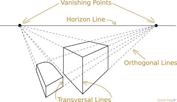
In this lesson, I’m going to introduce one and two-point linear perspective. Perspective drawing is a way for us to express a three dimensional space on a two dimensional surface.
Here are a few terms you will encounter throughout this lesson:
Vanishing Point(s): The point(s) where parallel lines seem to converge and disappear. To put it a different way, it’s the point or points where orthogonal lines come together.
Horizon Line (aka “Eye Level Line”): This an imaginary line represents the farthest distance in the background. In perspective drawing, a horizon line is the height of the viewer’s eyes. So, when objects are centered on the horizon line, they are sitting at your eye level. If you place an object below the horizon line, the viewer will be looking down at the object, while placing an object above the horizon line gives the illusion that it is floating above the viewer’s head.
Orthogonal Lines: Imaginary diagonal lines that are parallel to the ground plane and radiate from or converge to the vanishing point(s). They act as guidelines to help you maintain perspective while constructing a three dimensional scene.
Transversal Lines: These lines are parallel to the picture plane. They connect orthogonal lines at right angles, establishing an object’s fixed width or height.
Introduction to One-Point Perspective
One-point perspective is the easiest to learn because there is only one vanishing point. In the image below, all the perspective lines in the scene originate from a singular vanishing point on the horizon line.
When to Use One-Point Perspective
One point perspective is appropriate when drawing subjects that are facing you directly, instead of at an angle.
This method is a really popular for drawing interior spaces – like the example you’re about to see below.
How to Draw Using One-Point Perspective for Beginners
In this step by step mini tutorial, I’m going to draw a room with several people in it.
Step 1: Draw the Horizon Line and Vanishing Point
Use a ruler to draw a straight horizon line with a vanishing point that you can see clearly.
Step 2: Draw the Room
Let’s start with the wall that’s facing us directly. Use your ruler to draw a rectangle (transversal lines). Make sure the vanishing point is somewhere inside of it.
If the vanishing point is outside of the rectangle and the rest of the room is drawn, we — as viewers — will be looking at the room from the outside.
Use the ruler to align the vanishing point to one corner of the rectangle. Draw a very light orthogonal line that stretches far past that corner.
Do this for the other 3 corners of the rectangle.
Now that your orthogonal lines are in place, draw solid lines to complete the structure.
Step 3: Add Some Detail
You can add things like tables and chairs or even doorways into the scene. For this example, I’m going to keep things fairly simple. So let’s put a glass panel on the left wall to turn this room into an aquarium.
Start by drawing a set of orthogonal lines on the left wall of the room.
Add two transversal lines (or dotted lines if you’re not sure exactly what size you want it to be just yet).
Once you’re confident with the shape and size of the glass panel, draw solid lines to define the new object within the room.
Add a big sea creature into the tank!
Step 4: Add People
Draw Person #1: I’m calling him Gary… for short.
Before I draw Gary, I want to define:
Where he is going to stand
How tall he will be
To do that, draw 2 orthogonal lines. The top one will define his height and the bottom one will define how far from the wall he will be standing (look at the distance from the bottom orthogonal line to the edge of the wall). Make sure your bottom line isn’t too close to the wall or else poor Gary will be flat against it.
Then, draw a straight transversal line to define exactly where he’s going to stand.
Now all you have to do is draw Gary!
Draw Person #2: Her name shall be Lisa.
Let’s draw her along the exact same orthogonal line as Gary. Since those lines have already been defined, all I have to do now is add a transversal line to define where Lisa will stand.
Tip: If you want Lisa and Gary to have the same body proportions like the same head size or waist height, draw an orthogonal line under his chin and another one through his waist. When you draw Lisa, just make sure her chin rests on the first line and her waist intersects with the second line.
Draw Person #3: Pete
It’s getting a little crowded on the right side of the room, so let’s fill the rest of the aquarium while keeping everyone’s height the same.
To do that, use a ruler to draw a dotted horizontal line from the top of Lisa’s head and the bottom of her foot to the far left side of the room. Then draw a vertical line where you want Pete to be positioned.
Draw Pete!
Draw person #4: Tom
You’ve probably gotten the hang of it by now! But let’s draw one more person.
Tom is going to be standing in the middle of the room. To make sure he doesn’t block Gary or Lisa’s view (they’re really enjoying the sharks by the way), draw a transversal line in between Lisa and Gary.
Remember the technique you used to draw Pete? Use the same one here.
Now they can all enjoy the show.
Introduction to Two-Point Perspective
In two-point perspective, there are 2 vanishing points. A single object can be drawn using reference lines coming from both points.
Here, every edge of the shape except for vertical edges can be found by using perspective lines.
How to Draw Using Two-Point Perspective for Beginners
In this example, I’m going to draw two structures and five people.
Step 1: Draw the Horizon Line and Vanishing Points
Use a ruler to draw a straight horizon line and two dots placed well apart.
Step 2: Draw the First Structure
Start by drawing a small vertical line between the two vanishing points. The length of this line will determine the height of your structure.
From each vanishing point, draw 2 perspective lines. Each line must touch the top and bottom of the vertical (transversal) line you just drew).
Step 3: Continue Forming Your Structure
Between each set of perspective lines, draw another transversal line. Now the structure has 3 edges.
The new transversal lines need to be connected to both vanishing points. So draw two additional sets of orthogonal lines to connect them.
Step 4: Define Your Structure
Those orthogonal lines were used to help you form the unknown sides of the structure. Now that you have a nice set of guidelines, use solid lines to define the shape.
Step 5: Draw a Second Structure
Use the same steps to draw a second structure somewhere in the distance.
Step 6: Add people
If you want to add people, draw a vertical line to represent the average height for each person. It can go anywhere you want.
Once you have that in place, draw orthogonal lines coming from each vanishing point. They should touch the top and bottom of the vertical line.
Draw people walking along the dotted perspective lines.
To add more people in other areas of the drawing, employ the same method mentioned in the section on one-point perspective, above.
Here’s a clearer image of what’s going on without the buildings obstructing your view:
How to Find the Vanishing Point & Horizon Line in a Scene
Let’s say you went out for a walk at lunchtime and came across a beautiful cityscape you badly wanted to capture in your sketchbook. With only 25 minutes left to spare, you struggle to measure and draw all 38 buildings and 15 lamp posts in the scene in front of you. Was that enough time to get the job done?
Perhaps the better question is: Was that the right technique to get the job done?
In lesson 4, I covered measuring techniques – and although they’re great to use on several objects or individuals in the same scene, it’s very tedious for something such as a crowded street or a railway with six train tracks.
If you can find the horizon line and vanishing point(s) in an existing scene, it will reduce the amount of guesswork and measuring greatly.
One-point Perspective Example
Here’s a large L-shaped building. Without scrolling down, can you find the vanishing point and horizon line?
You can find the vanishing point of a scene by tracing your way back to its origin using orthogonal lines. Draw a straight line against every side edge of the building. Where each orthogonal line intersects, you have your vanishing point.
To find the horizon line, look at the building’s horizontal edges.
Why is it important to find the horizon line? When it comes to one-point perspective, the horizon line helps you know which angle to draw certain edges of a building or objects within a space. For example: not all photographs are perfectly level, so it’s common to come across a reference image that is tilted/slanted.
Two-Point Perspective Example
Can you find the vanishing points and horizon line for the image above without scrolling down for the answer?
Draw perspective lines along the edges of each shape until they intersect/converge. You should end up with 2 vanishing points.
To find the horizon line, simply connect both vanishing points together using a straight line.
Homework Assignment + Challenge
Here’s your homework and challenge rolled up into one assignment! What does that mean? If you complete the assignment from this lesson and post it on the RFA facebook page, I’ll share your artwork with everyone by posting it below (along with a link to your facebook page).
Sound good? Here’s the assignment:
Find a room in your house or an outdoor space with buildings, structures and/or people and draw it using linear perspective. The more detail the better! I can’t wait to see what you guys will draw!
I’m going to submit my left handed homework too… as soon as I finish the assignments from lesson 4 and 5 haha. I’m a slacker.
If you’re done the assignment and are waiting for lesson 7, sign up to my mailing list over on the right to get updated when a new lesson comes out.
Darlene created RFA In 2013 with the goal of sharing simple yet detailed drawing tutorials with other artists on the world wide web. She is a self taught pencil portrait artist and Youtuber.
This is a short lesson on the importance of paying close attention to what you’re drawing and how to avoid common mistakes.
The format of this lesson is: question, answer and solutions. Try your best to guess what is wrong with each of the examples below. These examples are based on a few few common mistakes I see over and over again. They are meant to make you think more critically about your own work.
Note: Scroll down slowly so you don’t accidentally reveal the answers.
Continuity
A big mistake that beginners make is not paying enough attention to the flow of lines in their artwork. Can you spot the mistakes with the examples below?
Example #1:
What’s wrong with this drawing?
Answer:
The sword’s handle or hilt is not straight. If you put a ruler up against the side or the middle of the blade, you’ll notice that the hilt is not aligned with the blade. It’s crooked.
Solution:
When drawing an object being held in a hand, draw the entire object as if the drawing were an x-ray. Then erase the lines you don’t need.
Example #2:
What’s wrong with this scene?
Answer:
The surface of the table and the horizontal ribbon are not straight. Again, if you use a ruler to check the alignment, you’ll notice that they’re very crooked.
Solution:
Lightly draw the table first and then the objects.
For the gift, draw both ribbons in their entirety without thinking about which one is on the top or bottom. Then erase the lines you don’t need.
Another solution is to use a ruler so you don’t have to draw a continuous line through all of the objects on the table.
Example #3:
Find anything wrong with this tissue box? Hint: there are two.
Answer:
The opening of the tissue box is not forming a proper rectangle because its sides do not exhibit the same width.
The furthest corner of the box hiding behind the tissue makes the tissue box look stretched out, forming a skewed rectangle.
Solution:
Draw the box first to make sure you have a solid shape, then draw the tissue.
Consider The Underlying Structure
This is where I see most people make mistakes. I’m a victim of it too…
Example #4:
Can you spot what’s wrong with this portrait?
Answer:
There’s not enough hair in the upper right, which makes it look like she has a cone-shaped head. This is a common result of drawing the hair first.
The right eye is much larger than the left eye. A common result when an eye is partially hidden behind hair.
The right jaw has a wider angle compared to the left. This is a common mistake when the rest of the jaw is hidden behind hair.
Etc…
Solution:
When drawing people, think about the skeletal structure. You can draw light guidelines before you start drawing in order to understand more of what you’re seeing.
Hair is not a tool to hide things. Whenever you’re drawing a face with features that are only partially visible, always think about what you don’t see and how your drawing will look if the full face were to be drawn. You can even go ahead and draw it lightly to see if the visible features make sense afterward. If not, make the appropriate corrections before you start shading and adding details.
Example #5:
See anything wrong with this boy?
Answer:
For some reason, he has additional joints in his arms. It’s a common result when drawing a character’s clothes before drawing the body.
Solution:
Draw the body first, then draw the clothes last.
Example #6:
What’s wrong with this car?
Answer:
The wheels are too big. Draw a full circle the same size as each tire and see what happens. The dotted red lines show that the wheels would need much more room to fit inside the car’s body.
Solution:
Draw the full shape for each wheel to determine the maximum size the car’s structure allows and then erase the parts you don’t need.
Bonus Example #7:
Last one! I’m not going to give you the answers though. Let me know what you think the answers and solutions are in the comments below.
Conclusion
All the examples above have one purpose… to get you to observe your artwork critically. Whether you’re drawing animals, people or things, you can apply the same observations to correct mistakes which may not have been apparent to you before.
I find it also helps to ask questions while I draw. Questions such as:
How is the vertical/horizontal alignment of ______ ?
Does my drawing make sense mechanically?
Does it look right? Why not?
Is it symmetrical?
Is it still symmetrical when I look at it in a mirror?
Etc…
Constantly ask yourself questions as you draw so you can make sense of what you’re doing and be aware of the choices that you’re making. Attention to detail is very important if you want to draw realistic art.
Homework Assignment
Up until now, you must have a lot of drawings from each homework assignment. Look back at your work and analyze each and every person, object or scene you’ve drawn. Did you find any apparent mistakes that you didn’t see before? Share you findings with me on facebook. Any brave person who posts their mistakes and a fixed version of the drawing(s) will be featured below along with a link to their facebook page.
If you’d like me to pick apart your previous work and share my corrections with other RFA readers on facebook, let me know in the comments below or send me a message on facebook.
Darlene created RFA In 2013 with the goal of sharing simple yet detailed drawing tutorials with other artists on the world wide web. She is a self taught pencil portrait artist and Youtuber.
Proportion simply refers to the size relationships between objects. If you want to draw a subject or scene with accurate proportions, you must employ proper techniques and train your eyes over time.
When drawing, most of my time is spent on measuring, comparing, re-measuring and re-comparing. The more time you spend trying to improve the accuracy of your drawing, the better you will “see”.
How to Draw With Correct Proportions
I’m going to introduce a few techniques to measure and check your accuracy. When you draw, it’s best to use as many measuring techniques as possible. You can use these techniques in any order, wherever you see fit.
I like to measure my subject before, during and sometimes even after I finish my portraits.
Measuring before I draw helps me understand what I’m seeing and familiarize myself with the subject. It’s very helpful when drawing portraits of people I’ve never seen before.
Measuring after I draw is a way for me to do a final check to find mistakes that I may have missed and a way to gain confidence in the finished product. You should never leave measuring to the very end!
Important: If you’re following along, you’ll want to use very light pressure so you can easily erase any mistakes you make.
To draw something accurate in relative size, you can use your pencil and thumb as a measuring tool to measure the relationships between body parts or objects in a scene. Here’s how to do it:
Maintain Accuracy Across All Measurements
Before you make any measurements, it’s important to understand how to maintain accuracy throughout the measuring process.
Raise your pencil up directly in front of your eye without bending your elbow. If you bend your elbow, it will be very difficult to maintain consistent measurements. This could result in compounding mistakes. Since your arm is pivoting from your shoulder, not from your eye, your measurements will not remain accurate throughout the process. To combat this, lower your eye as close to your shoulder as possible to get the most accurate measurements from start to finish.
If you’re drawing from a reference image, there’s no need to worry about bending your elbow or tilting your head because you can measure directly up against the reference photo.
Use the tip of the pencil and the tip of your thumb to measure the height of your subject’s head. To find out how tall he is, move your hand down slowly, counting how tall your subject is in head units. For this example, my subject is equal to 8 heads. These units are relative, so you can draw the subject much larger or smaller compared to the original size of the reference image.
Let’s say I already drew the head and then decided I might as well draw the rest of the body too. Since I know the man is 8 heads tall, all I need to do is measure the head in my drawing and multiply that by 8 to find out where I’ll need to draw his feet.
Width
You can do the same thing for the width as well. Simply measure the head’s length and then turn your pencil horizontally. You can figure out the width of the head as well as the shoulders, waist, etc.
Note: Sometimes, the relationship between two body parts will not be a whole unit. In this case, you will need to search for other relationships or do your best to eyeball that part of the sketch.
How to Transfer that Information to Your Sketchbook
What’s the maximum length you want for your drawing? Once you decide, make a tick at the top and bottom of the sketchbook. It will help if you draw a vertical line down the entire page to align the ticks perfectly.
Since we know the man is equal to 8 heads tall, we can confidently divide the space into 8 equal sections vertically. Double check that the spaces are all even. You can use a ruler to do this. Now that I have my ticks, I know the exact height and width to draw the head.
Measure and Compare Other Parts of the Body
You can use this technique to measure all other parts of the body to get a good idea of the size relationships between each. This is very useful when you’re drawing several people in one scene. How do you know how tall or wide to draw one person compared to another? How big do you draw a child’s head compared to her parents?
Example:
The buttock is equal to 2 head units.
The right shoe is slightly smaller in total width than the left shoe.
Etc…
If there’s another person in the scene, you can compare the 2 bodies against each other so you know how wide to draw the second person or how big their head is compared to person #1.
#2: Check Relationships Between Objects on the Vertical and Horizontal Axis
Getting the sizing right is great, but it’s also important to know where to align everything. Let’s say you already jumped ahead and made a rough sketch. You got the length and width of each body part right, but something just doesn’t seem quite right.
In the examples below, I’m using vertical and horizontal lines to find out where certain body parts are aligned.
If you look at the first row of images, you’ll find that the following statements are true:
Image 1: The right shoulder and right buttock are aligned perfectly on the vertical axis.
Image 2: The middle of the head is in line with the inner side of the right foot.
Image 3: The bottom of the left shoe comes down to the middle of the right shoe.
Image 4: The left elbow is lower than the right elbow.
If you compare the top row to the bottom row, you’ll notice that 3 of these observations do NOT match the sketch. Now I know what’s wrong with my sketch and what I need to fix.
Tools you can use
To get accurate vertical/horizontal measurements of your subject, you can use the following tools:
A pocket level tool
A weight on the end of a string, aka a plumb bob + line (works for vertical measurements only)
Your pencil: Put your pencil up in front of your eye and align it with a straight horizontal or vertical edge, lock that angle in place and then move your hand back over to your subject. You can reference a straight edge such as a flat horizon line or perfectly straight poll if you’re outside. If you’re indoors you can reference the edge of the floor or the side of a wall. Make sure your vertical/horizontal references do not change!
If you’re drawing from a photo reference, you can simply use a ruler or pencil. Press the ruler flat up against the photo and align it to the edges of the paper. For super accurate measurements, you may want to try a drawing board with an inbuilt transparent ruler.
If you’re drawing from a digital reference, you can use an image editing software to draw lines directly onto the photo.
#3: Check Angles
Angles are especially hard to eyeball. For this dilemma, I use a sliding technique. What you want to do is hold your arm out between your eye and the subject without bending your elbow and then tilt your pencil at an angle until the edge of the pencil matches the angle you’re checking. Then carefully slide your hand in front of your drawing while holding the pencil as still as possible.
Important: Your sketchbook must be in a fairly upright position, sitting on something stable such as an easel and aligned fairly close to your subject for accurate results. As a beginner, you want to minimize the amount of travel time while you’re moving your hand from the subject to the sketchpad.
If you lost your grip and lost the angle, don’t worry. Sketch it anyway by making your best guess, then verify your line by repeating the process above until you get the angle just right.
You can use the same sliding technique to measure the relationship between several body parts. For example: the angle from the bottom of the seagull’s foot to the end of its tail feathers.
No doubt this is a tedious process. The more you do it, the faster you’ll become. Over time, you will tune your eyes to draw more accurately, allowing you to do all of this at a quick glance.
#4: Observe Negative Space
If you find it easier to draw geometric shapes like squares, triangles or circles than it is for
you to draw detailed subjects like people and animals, here’s a useful technique you can add to your drawing process.
Look a the negative space around your weirdly shaped subject to find familiar shapes such as triangles or circles that are easy for your brain to recognize. Shifting your focus from the subject to the space around it will change the way you see, perhaps simplifying it, which will allow you to make more sense of things.
Important things to remember
#1: Don’t press too hard
Keep your lines light. Make sure everything is in the right place before you start adding details and shading.
#2: Always triple check and cross-check
Measuring once or twice is not enough. Small errors that you make in the beginning can add up to bigger mistakes in the end. So make sure you do your due diligence. I like to measure my subject before, during and even after I’ve completed the drawing.
#3: Spend A LOT of time measuring to get the best results
The more time you spend, the more accurate your drawing will be.
#4: Use all the techniques above In any order you want
…just make sure you try all of them.
Homework Assignment
I have 4 images here, each with an increasing level of difficulty. Your homework this week is to use the techniques in this lesson plus what you learned in the previous lessons to draw your most accurate representation of each image.
Once you’re done, you can post your work on the RFA Facebook page, which is where I’ll post my left-handed homework assignment as well. If you submit your 4 drawings on Facebook, I will feature your work down below with a link to your facebook page so other readers can check you out. Feel free to draw other subjects or scenes as well!
If you want constructive feedback, please write “constructive feedback request” somewhere in your facebook reply :)
Darlene created RFA In 2013 with the goal of sharing simple yet detailed drawing tutorials with other artists on the world wide web. She is a self taught pencil portrait artist and Youtuber.
RFA uses cookies to offer you a better browsing experience, analyze site traffic, personalize content, and serve targeted ads. By clicking accept, you are helping to support my site and keep drawing tutorials free 🙂. Not a fan of cookies? No worries! Adjust your preferences in the settings! Not consenting may affect some features and functions such as embedded video tutorials.
Functional
Always active
The technical storage or access is strictly necessary for the legitimate purpose of enabling the use of a specific service explicitly requested by the subscriber or user, or for the sole purpose of carrying out the transmission of a communication over an electronic communications network.
Preferences
The technical storage or access is necessary for the legitimate purpose of storing preferences that are not requested by the subscriber or user.
Statistics
The technical storage or access that is used exclusively for statistical purposes.The technical storage or access that is used exclusively for anonymous statistical purposes. Without a subpoena, voluntary compliance on the part of your Internet Service Provider, or additional records from a third party, information stored or retrieved for this purpose alone cannot usually be used to identify you.
Marketing (Activating this supports my website via ads, keeping tutorials free)
The technical storage or access is required to create user profiles to send advertising, or to track the user on a website or across several websites for similar marketing purposes.


 With the stylus, I can only see what I’m doing by looking up at the screen. It’s a completely different experience from using the ink pen but it was just as enjoyable!